


Apple Chose Aesthetics Over Access, Again
The Liquid Glass UI Is Active Discrimination Hidden Behind Shiny Design

Summary: Apple’s new Liquid Glass UI is a harmful, aesthetics-first design that ignores decades of usability and accessibility best practices. Unless public and market pressure forces a correction, it risks alienating users and further undermining the integrity of UX as a discipline.
I was in the middle of writing a blog post about information scent in information architecture when I saw the news about Apple's Liquid Glass UI. I usually write in-depth, 2500- to 5000-word articles about obscure or misunderstood UX topics. To provide unique looks in what we UX professionals do every day in the real world. Today, I only have a few hundred words to write about this crazy snapshot in time.
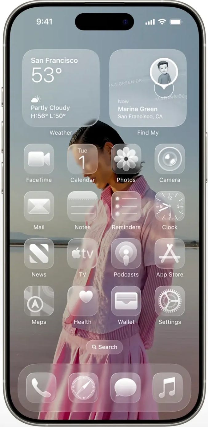
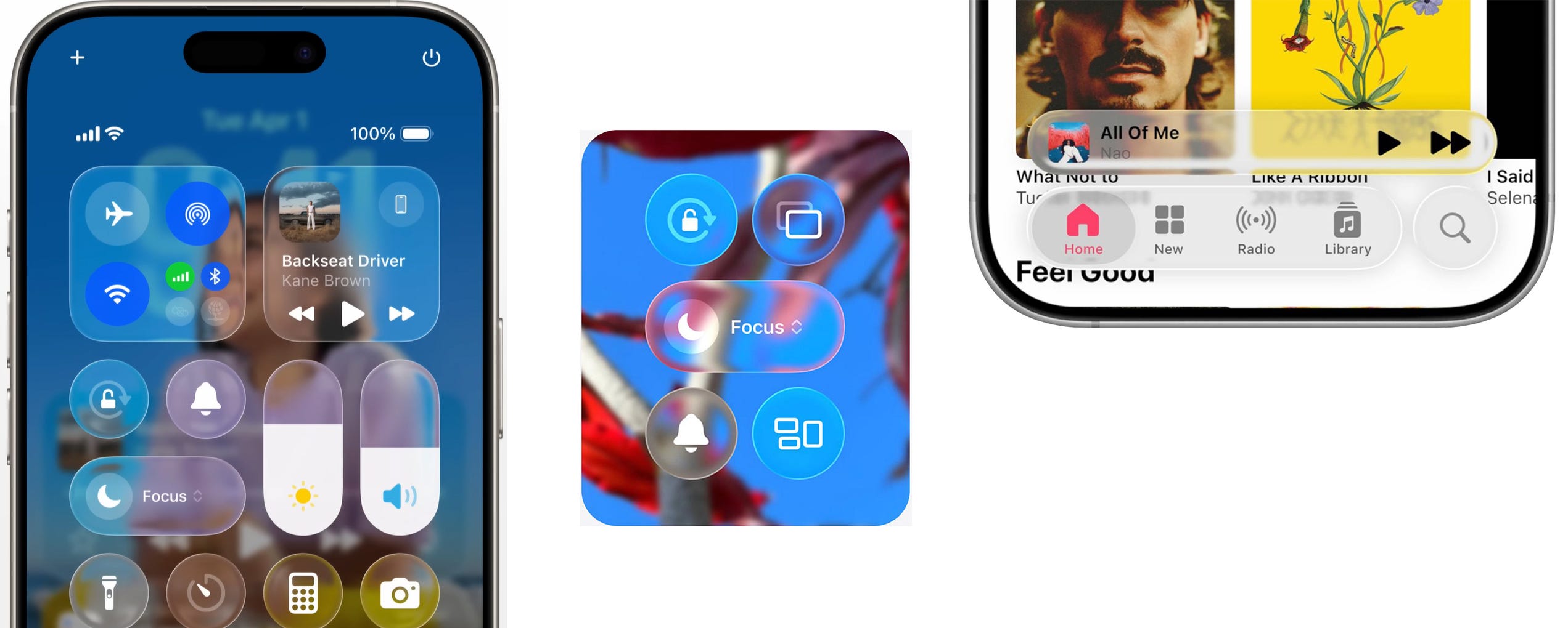
Apple's Liquid Glass UI flies in the face of decades of human-computer interaction and usability knowledge. It is also actively discriminatory from an accessibility standpoint.
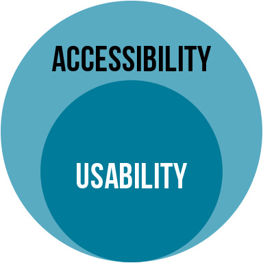
Smaller orgs often claim they can't follow basic accessibility standards due to a lack of expertise or lack of time. I've argued that this excuse falls flat when you scrutinize what building accessible software actually entails in the real world. Spoiler: it ain't that hard to do things correctly! It has been proven to be cheaper because it reduces code debt and eliminates unnecessary design iterations, which cuts down on costs big time. Starting with accessibility cuts down on back-and-forth because good accessibility gets you most of the way to good usability.
The problems show up when aesthetically driven UXers begin with visuals based purely on beauty and then try to layer usability and accessibility on top after the fact. That approach doesn't work.
I've already debunked the claims that scrappy startups run by 26-year-old tech bros can't afford to build accessible products. If it's not an acceptable excuse for them, then it's absolutely not acceptable coming from Apple.
In fact, Apple should be held to a much higher standard. I'm disappointed in Apple's UX professionals. This is unacceptable. This is active discrimination.
I can already hear the pushback: "But Trevor, those are just the defaults. You can fix most of the accessibility problems in Settings.”
Here's my response to that ill-thought-out statement, and I think the designers defending Liquid Glass know this deep down too:
Why wasn't the accessible version the default?
Answer: Because they actively chose not to. Because they actively chose to discriminate.After you go into every single setting and tweak every control, does the Liquid Glass UI meet basic accessibility standards?
Answer: Still no. Because they actively chose to discriminate.Why are users with even minor vision impairments expected to fix their own experience in Settings?
Answer: Because Apple handed them the burden. Because they actively chose to discriminate.
Apple's Liquid Glass UI isn't just a design misstep. It is a deliberate choice to prioritize aesthetics over inclusion, and the result is a product that becomes harder to use not only for people with compromised vision but for everyone.
Accessibility improves the experience for all users, not just a few.
I believe Apple will fix this. The public is already speaking up, and as more people struggle with basic interactions, frustration will spread. If Apple does not respond soon, users will start to look elsewhere. Social pressure and market pressure will grow, and Apple will be forced to release a more accessible version of this design before people actually make the switch.
In the end, meritocracy tends to win. A design that creates this many broken experiences cannot survive. It will push people away, and that is what will ultimately drive change.
But the fact that this actually happened, especially at Apple, is a bad sign for UX. We have to keep voicing our disdain for the ever-growing aesthetics-only mindset in UX. These types of UI designers are not representing us as professionals, and they certainly are not representing their users.
This is spot on! It’s very disappointing seeing this from Apple. I also think they’ll be releasing an updated version soon that’ll be more accessible given the amount of backlash they’ve received already.
But do you think this ushers us into a new landscape for visual design? If that was their intention, I think that perfection is not necessarily the expectation, but rather challenging the status quo of what we’ve known and then pushing the boundaries progressively with every release.