

Every Icon Needs a Label
A Data-Driven UX Recommendation

Summary: Decades of UX research show that unlabeled icons confuse users and reduce accessibility. Despite this, some designers still insist that icons without labels make interfaces look cleaner. In my career, I’ve seen the same results time and time again: icons need labels. In this post, I’ll share real-world examples, simple studies to test this yourself, and clear responses to common objections.
For decades, UX research has shown that unlabeled icons confuse users and make interfaces harder to use. This isn't just a theory. I've tested it 11 times over 19 years at five different companies. The results? Consistently bad usability when icons lack labels. Yet, some stakeholders and designers still push for icon-only buttons, thinking it reduces clutter in a way that equals better usability. This article breaks down why labels matter, shares my research findings, and shows you how to test it for yourself.
Why Labeled Icons Are Necessary
Research from UX experts like the Nielsen Norman Group and the Baymard Institute has proven that labels improve usability and accessibility. If that doesn't convince you, then maybe my work, which has also repeatedly proven this fact, will. Across multiple projects, I've seen users struggle with unlabeled icons, even for tasks they perform daily.
The evidence is clear: labels reduce confusion and help users complete tasks more efficiently.
Here's a quick example:
Unlabeled icons force users to guess their meaning or rely on tooltips, which slows them down and discriminates against users relying on screen readers.
Labeled icons provide instant clarity, saving time and reducing errors for ALL users.
Despite this, the "minimalist" visual approach often wins out because it's said to “look cleaner.” However, a clean design (whatever that means) doesn’t always equate to a functional one.
My Research on Unlabeled Icons
The Problem
Back in 2010, I worked at Minitab, a statistical software company. One of my first projects was redesigning the interface to include Microsoft's ribbon navigation. This required creating over 1,000 unique icons. While the ribbon's icons were labeled, our custom toolbars were not. That's where the problems began.

During usability testing, users couldn't figure out what the toolbar icons represented. It was a mess. So, I decided to test the issue head-on with a simple study design.
The Studies
Study 1: Can Users Match Icons to Descriptions?
Here's what I did:
Created a test document with two columns:
Column 1: Icons in random order.
Column 2: Short descriptions of the commands, also randomized.
Asked participants to match each icon to its description.
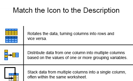
The result? Users couldn't match the icons to their descriptions. Even power users failed, spending wayyyyyy too much time trying to guess the meanings. This made it clear that icons alone weren't enough.
Study 2: Can Users Match Icons to Labels?
Next, I simplified the test:
Kept the same two-column setup.
Replaced the descriptions with command names (labels) to further bias the test in favor of the icon-only design. The idea was that descriptions might have been causing confusion, and providing power users with familiar keywords might highlight the strengths of an icon-only approach.
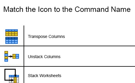
The result? Even with keyword matching, users still struggled. The core issue was clear: icons without labels simply don't work.
Study 3: Do Users Memorize Icons or Locations?
Finally, I tested a new hypothesis. Some team members thought users might improve over time as they learned the icons. To check this, I:
Selected experienced users.
Tested their performance on a task with labeled icons in familiar locations.
Then shuffled the icons around and tested them again.
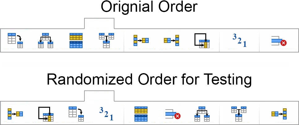
The result? Users relied on location, not icon recognition. When the icons moved, they were completely lost, proving that even experienced users don't "learn" icons, they just memorize where to find them.
Addressing Common Arguments Against Labels
You might be wondering: if this research on this topic is so solid, why have my last five companies insisted on funding these studies? Why can't the past data stand on its own? The reason is that unlabeled icons are one of those counterintuitive findings, something that doesn't feel true at first glance, leading people to actively look for reasons to discount the research. Here are the top four arguments I hear and responses that seem to work.
Argument 1: "Labels Make Interfaces Too Busy."
Response: Clarity beats minimalism. Labels reduce cognitive load, improve navigation, and are essential for accessibility. A clean design that's hard to use isn't a good design.
Argument 2: "Tooltips Provide Labels."
Response: Tooltips are slow and require extra steps. They don't work on touchscreens and disrupt the flow of navigation. Use tooltips for extra info, not critical labels. Also, as a rule of thumb, only use tooltips to provide users with tips about that particular tool. It's in the name of the UI element: "tool" and "tip"! (Hahahaha)
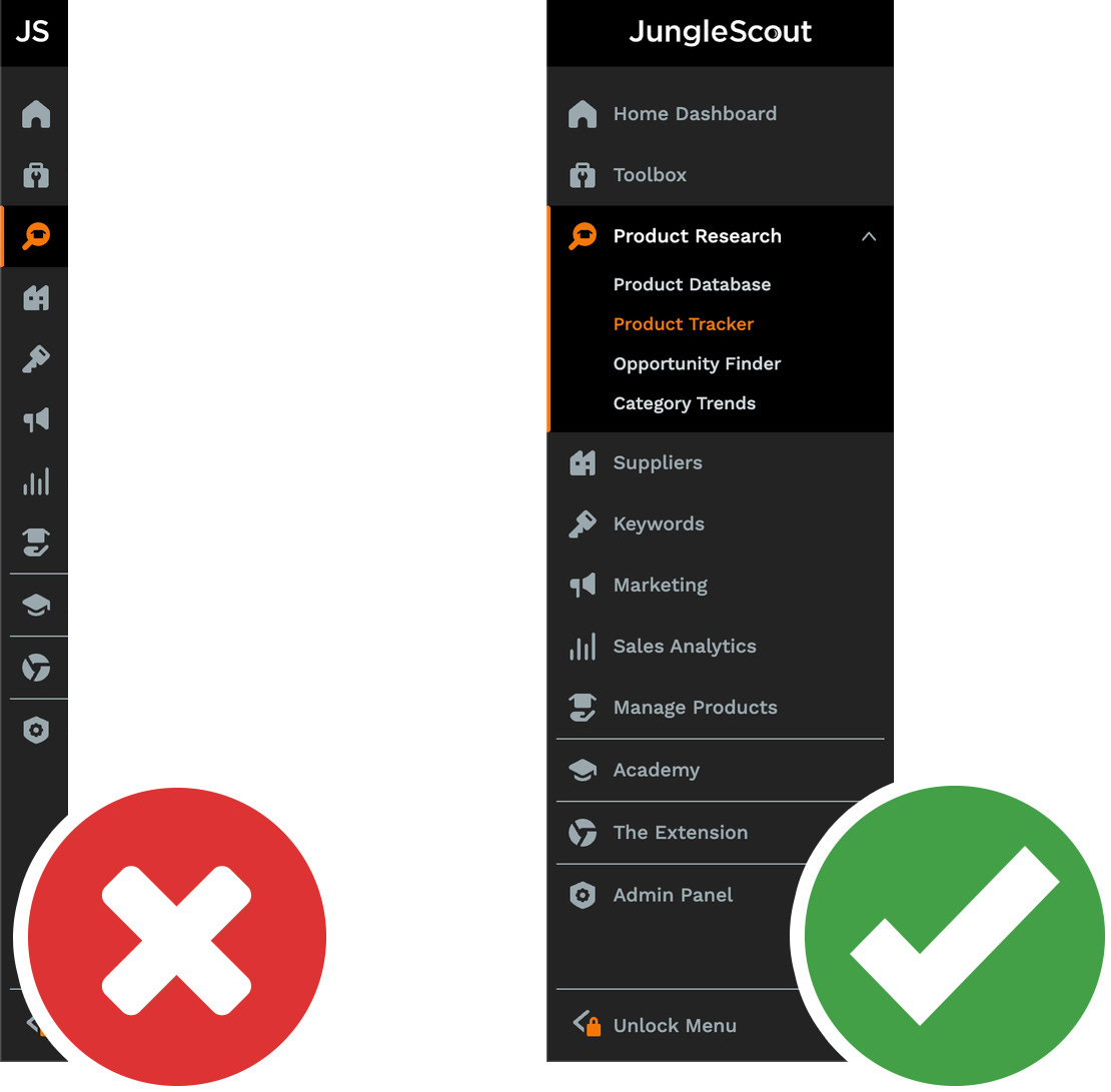
Argument 3: "Other Apps Use Unlabeled Icons."
Response: Some popular apps, like many Google apps, use unlabeled icons, but that doesn't make it a best practice. Google's focus isn't usability, it's being a free, connected suite of products. Their market dominance lets them get away with design choices that wouldn't fly in industries where usability is critical. If you think Google apps aren't easy to use, unlabeled icons might be part of the problem. For the rest of us, the data is clear: label your icons.
Unfortunately for us, Google’s outsized influence has made some of these patterns commonplace.
Argument 4: "Universal Icons Don't Need Labels."
Response: The term "universal" suggests 100% recognition, which is simply not true. Even among the eight universally recognized icons (yes, there are only seven or eight ubiquitous icons, and the hamburger ain't one of them) a small percentage of users will still struggle to understand their meaning without labels. Relying solely on icon recognition without text labels risks leaving these users behind. Even so-called "universal" icons can cause confusion. Labels ensure that everyone, not just those familiar with specific conventions, can use your product effectively.
Final Thought on These 4 Arguments
Two additional points should seal the case for labeling icons:
Development Efficiency: Adding toggled options for labeled and unlabeled icons complicates development, wastes resources, and undermines the credibility of UX recommendations. This kind of request makes UX look stupid and erodes our credibility, reducing our influence within our organizations.
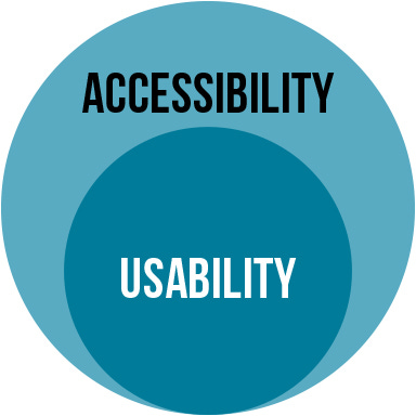
Accessibility Compliance: Unlabeled icons fail accessibility standards and can cause your product to fail ISO audits. Worse, they exclude users with disabilities, which is both unethical and legally risky. Inclusive, labeled icons ensure compliance while improving usability for all.
When in doubt, label your icons. It’s better for your users, better for your product, and better for your team.
How to Test This in Your Product
If you're dealing with stakeholders who insist on unlabeled icons, here's how to prove them wrong:
Run a matching test.
Create a two-column document with icons and descriptions or labels.
Ask users to match them.
Test icon recognition.
Shuffle the icons' locations and observe how users perform.
These simple tests consistently show that labels improve usability. They've worked for me 11 times, and they'll work for you too.
Conclusion
Labeled icons aren't just a UX best practice, they're essential for usability and accessibility. Decades of research and real-world testing prove this. If you want to create products that are easy to use, stop debating and start labeling. It's better for your users, your business, and your bottom line.
It's not your fault, Substack is to blame, but it's funny that right next to the opening paragraph of the article there are 3 icon-only buttons and none of them are labeled, not even for AT: https://i.imgur.com/Qxf5Jh3.png