Summary: This post details the UX research best methods and tools for having users rank items.
Have you ever been asked to determine the best way to rank items based on user importance? In the past, I approached this ask in an overly simplistic and uninformed way. I'd create a list of items, ask several users to rank them, and then begin comparing, consolidating, and scoring the list of items. For instance, in a list of five items, I'd give five points to the top-ranked item, four to the second, and so on, with the last item getting just one point. However, like many others who've tried this approach, I quickly learned it doesn't work well at all.
So, after making that terrible mistake a handful of times, it eventually took me down a rabbit hole of ranking methods. What I described above is called Simple Majority Voting or the Plurality Method. The Plurality Method has each voter select their top choice, and the option with the most votes wins. It's straightforward and easy to understand.
The main limitation is that this method fails to consider the intensity of preferences and can result in a winner that a majority of users may actually dislike.
It only accounts for the first choice of users, ignoring their subsequent preferences. In scenarios where there are multiple options, it's possible for an option to win with a small plurality while being strongly disliked by a larger group of users.
The Schulze Method
After some Googling, I discovered the best ranking method, called the Schulze Method. The Schulze Method is a powerful technique preferred by ranking experts because of its depth of analysis and accuracy. The method excels in handling complex preference data through several steps:
Pairwise Comparison: It starts with comparing every pair of options and identifying which is preferred by the majority.
Preference Matrix: This forms a matrix reflecting the collective preference, showing how many users favor one option over another.
Strongest Support Paths: The method finds the strongest paths of support between options, ensuring the most preferred option is accurately identified.
Determining the Winner: The option with the strongest overall support emerges as the winner.
Sounds super complicated, right? Well, that's because it is. Hahaha. After blowing my mind trying to understand all of this, I searched for a tool that would do all these ranking steps for me. That's when I discovered Forcerank.it. Forcerank.it is a simple little app that does just this one thing: forced rankings. It works so well and costs so little; I still use it to this day! I encourage you to check it out.
After doing all this work, I figured if this happened to me, maybe I could share what I found to help others. To make the value of this more apparent, let's take a look at a real-world example.
Real World Example
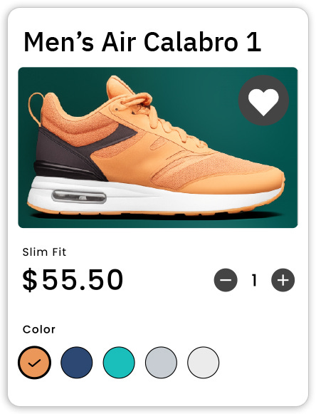
I recently had the opportunity to assist a B2C company's UX design team with a critical aspect of their user interface design. The challenge was to determine the most user-preferred details to display on a product's card element and their order of importance. Cards were a pivotal part of the UI, as they would be the first interaction point for users when browsing products.
The Challenge:
The UX designers were faced with multiple opinions and ideas about what information should be prioritized on the card UI. Without a clear direction, this could have led to a time-consuming process of trial and error, creating multiple design variations and debating their efficacy. Sound familiar?
The Approach:
To tackle this efficiently, I proposed using a force ranking exercise via a tool similar to Forcerank.it. We formulated a list of potential details to be included on the card UI, such as product name, price, user ratings, and other specific features. The aim was to send this list out to a representative group of users and ask them to rank these details in order of importance.
Execution:
I input the options into the force ranking app and sent the link to around 200 representative users. The simplicity and familiarity of the task, thanks to the app's intuitive drag-and-drop interface, encouraged quick and active participation.
Results:
In less than two days, we received over 100 responses, providing a rich data set for analysis. The force ranking app excelled in synthesizing these responses, offering a clear and comprehensive overview of user preferences.
Impact:
The outcome was a well-defined hierarchy of information for the card UI, aligning perfectly with user preferences. This not only saved the design team from going through multiple iterations but also put an end to any opinion-based debate about what users considered most important. The designers were able to focus on creating a single, targeted design, and confident decisions were made in a user-centered way.
Reflection:
The success of this exercise demonstrated that involving users in the decision-making process, especially in aspects as crucial as information hierarchy, not only leads to better outcomes but also significantly reduces the time and resources spent in design debates and iterations. The use of technology to facilitate this process proved invaluable, showcasing how modern tools can enhance the efficiency and effectiveness of UX research methods. This case study serves as a testament to the fact that when users are placed at the heart of design decisions, the results are not only satisfying but also strategically sound and business-effective.
Conclusion
In UX research, where understanding nuanced user preferences is key, the Schulze Method offers an in-depth view that simple tallies just can't provide. If you want a quick and simple way to get reliable data around user preferences, I highly recommend trying this out. So the next time a UX designer needs to understand the priority order of user preferences for a product's features, remember this article and turn to a force ranking app like Forcerank.it. Apps like these offer a quick and intuitive way for users to express their preferences, making the research process both efficient and user-friendly.


