


Pen"Dos" and Pen"Dont’s" of Pendo
A Ready-to-Use Onboarding Template

Summary: This article covers how to utilize user engagement tools like Pendo responsibly, ensuring that onboarding and guidance enhance UX rather than disrupt it. It also provides practical guidelines for building just-in-time help that’s meaningful and unobtrusive.
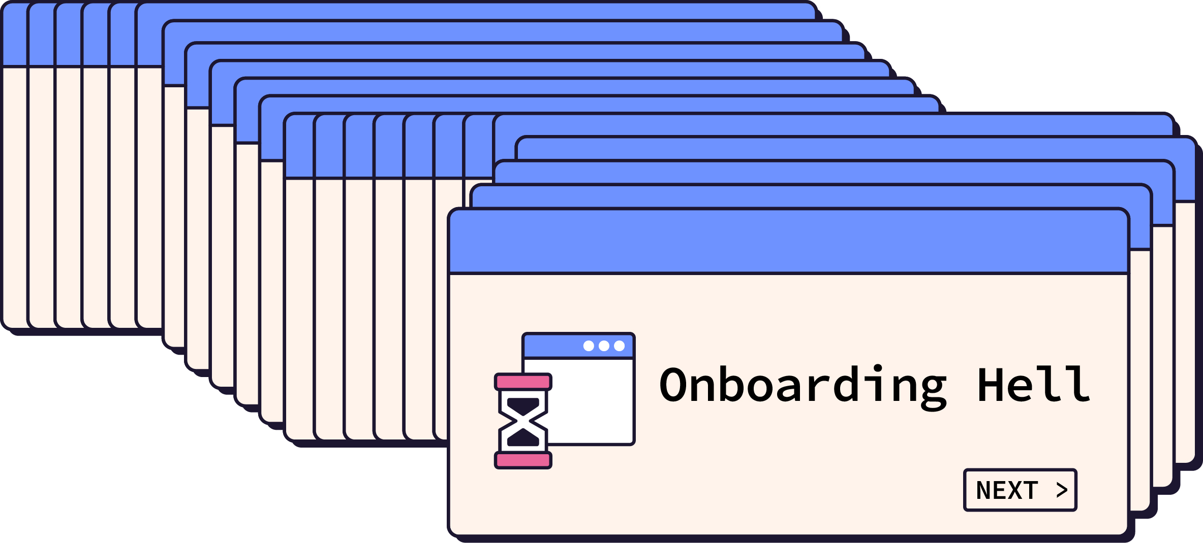
Pendo, and apps like it, can be real timesavers for building new features, announcing product updates, or offering help right when users need it. But here’s the catch: Pendo also makes it way too easy to interrupt users with pop-ups, multi-step tutorials, and other bells and whistles that often add more clutter than clarity. And trust me, I’ve seen this firsthand.
This issue was so prevalent at one of my former jobs that I wrote what I liked to call a "Pendo Usage Guide," aimed at keeping product managers from overloading users with pop-ups every time we launched a new feature. In my experience, most PMs aren’t trying to be disruptive; they genuinely want users to notice new features or engage with the product. But without some clear guidelines, it’s easy to fall into the trap of using Pendo as a vanity tool rather than a tool that actually serves users.
So, here’s the big idea:
Onboarding interruptions should be rare and reserved for moments when they’re genuinely helpful to the user.
When we, as product makers, disrupt a user’s flow, we’re essentially saying, “Hey, my priorities matter more than yours right now,” and that’s not exactly a great user experience.
In this article, we’ll explore some best practices based on research from the Nielsen Norman Group (NN/g) on user onboarding, and I’ll share insights from my own guide to responsible Pendo usage. By the end, you’ll know how to keep the power of user engagement platforms like Pendo under control and use them in ways that truly respect your users’ goals. Because, spoiler alert: your users, just like all humans, don't like being interrupted unless it’s absolutely necessary.
The Problem with Intrusive Onboarding
Onboarding pop-ups, tutorials, and notifications can feel more like a roadblock than a helpful guide. NN/g found that while tutorials and push notifications can grab attention, they often fall short of actually helping users in meaningful ways. Instead, they interrupt the user’s flow, distract from the task at hand, and are quickly forgotten.
Here’s an example: you’re logging into an app to complete a specific task, and suddenly you’re hit with a pop-up showcasing all the new features you didn’t ask for. Now, instead of getting to your task, you’re sifting through slides or a multi-step tutorial you didn’t even want. This approach, known as a "push revelation," is built around the idea of showing users what’s new or how to use a feature right when they log in. Unfortunately, in many cases, it backfires. A mountain of evidence now shows that most users simply skip these onboarding tutorials, making the whole experience a forgettable distraction.
And then there's the ego factor: often, these intrusive elements aren’t there to improve usability but to satisfy a marketing goal or a metric on the dashboard. For instance, product teams may want users to engage with a new feature or spend more time in the app. But what they sometimes overlook is that more time in the app doesn’t equal a better experience. If we’re interrupting users just to boost numbers, we’re missing the point of good user engagement. It’s our job, as UX researchers, to advocate for the user experience in these cases and not allow shortsighted business metrics to dictate display layer workflows.
For onboarding to be effective, it has to feel like a natural part of the user's journey, not an obstacle. This is where the real power of contextual help comes in, offering guidance only when it’s relevant and desired. So, let’s get into how we can use these tools without losing sight of the user experience.
The Case for Contextual Help
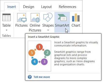
Let’s get into why contextual help, also known as "pull revelation," is a better approach for user onboarding. Unlike push revelations that force information on users the moment they open an app, pull revelations show help only when it’s relevant to the task at hand. Contextual help respects the user's flow and feels natural, providing information only when a user indicates they need it, like when they hover over a tool or click for additional guidance.
One example is Microsoft Word’s approach to guiding users through tools and features. Instead of forcing a lengthy tutorial whenever the app updates, Word provides subtle, well-timed help cues. For instance, if a user hovers over an icon in the toolbar, a concise tooltip appears with a brief description and, if relevant, a shortcut. This method keeps information accessible only when it’s needed, allowing users to stay immersed in their work while getting just the right amount of help at the perfect time.
So why doesn’t everyone just do this? Simple: push revelations are wayyyyyyyy quicker and easier to build. It’s much simpler to pop up a tutorial or notification for everyone than to customize help based on specific actions. But this comes at the cost of user frustration. In fact, as UX researchers, we know that taking the time to set up contextual help can significantly improve engagement by making the experience feel seamless.
Using contextual help effectively requires a few basic principles:
Make help easy to dismiss and recall: Users should be able to close the tip if it’s unneeded, but also have a way to bring it back when they’re ready to learn more.
Use progressive disclosure: Offer simple information upfront, with options to dig deeper if needed.
Avoid asking users to memorize: For multi-step processes, provide help at each step to minimize cognitive load.
Skip the obvious: If a feature follows a standard design pattern (like a settings icon), you don’t need a tooltip explaining it.
Good contextual help keeps the user in control, providing help only when and where it’s beneficial. This approach reduces interruptions and allows users to stay focused on their goals. When used well, contextual help elevates the experience, offering assistance without shouting for attention.
So, if the goal is a smooth user experience, contextual help is the way forward. It takes a bit more planning, but it’s a user-first approach that supports rather than disrupts the journey.
Implementing Responsible Onboarding
Now that we’ve established the value of contextual help over forced tutorials, let’s talk about putting these principles into action in the real world. Tools like Pendo, while incredibly versatile, need guidelines to prevent them from becoming clutter machines that ultimately frustrate users. When used responsibly, these platforms can actually enhance the experience rather than hinder it.

Define Your Purpose
The first step is to ask the right question: “Is this onboarding element actually necessary?” If the answer is to meet a marketing goal or hit a vanity metric (like “increasing time on page”), think twice. Users shouldn’t feel they’re being sold to every time they open your app. Onboarding should be used sparingly, only when it provides direct value to the user, like explaining a new feature they’ll benefit from or notifying them about a critical system update.
Using Contextual Elements with Care
Contextual elements are more than just tips and tooltips; they’re subtle nudges that provide help only when it’s relevant. Here’s how to make them work effectively:
Tooltips and Hints: Use these sparingly to provide concise guidance. Avoid showing tips every time a user returns to a familiar feature, as this can become just as annoying as a forced pop-up.
Example: A tooltip that appears the first time a user interacts with a complex feature, but doesn’t return unless the user actively seeks it out (through a help icon, for example).
Walkthroughs as a Last Resort: Sometimes, a multi-step guide is genuinely necessary, like when a major feature overhaul has changed a familiar process. Even then, limit walkthroughs to essential steps and make sure users can skip them if they’re comfortable figuring things out on their own.
Guideline: For a typical onboarding sequence, aim for a single-step guide or a maximum of three steps. Studies show drop-off rates increase dramatically after the first step, so keep it relevant and concise.
Temporary Pop-Ups: If there’s a critical update or maintenance event, a single pop-up can be a helpful way to inform users. However, these should have expiration dates, so they disappear once the information is no longer relevant.
Best Practice: Show these pop-ups no more than once per user. If they’ve seen it and dismissed it, they don’t need to see it again.
Principles for Responsible Use
These are a few guiding principles to help ensure that each onboarding element aligns with the user’s needs rather than imposing on their experience:
Prioritize Dismissibility: Every element of onboarding or guidance should be easy to dismiss. Users who know their way around should be able to skip unnecessary information quickly. And if they need to find that information later, it should be accessible from a “Help” or “Resources” section without being intrusive.
Progressive Disclosure: Not every user needs an in-depth explanation from the get-go. Offer simple, concise tips initially, with the option for users to dive deeper if they’re interested. This keeps the experience lightweight for most users while still providing support for those who want more details.
Avoid Repetition: Showing the same onboarding content repeatedly is one of the quickest ways to annoy users. Ensure that contextual help, pop-ups, and walkthroughs recognize when they’ve already been viewed or completed.
Next up, we’ll dive into some real-world examples and best practices for integrating these principles without overwhelming your users.
Interruption Examples
Let’s break down what makes some user interruptions necessary and others just plain annoying. When done right, interruptions can help users navigate complex systems or complete tasks with confidence. But when interruptions are unnecessary or poorly timed, they can frustrate users and push them away. Here are some examples to clarify the difference.
Good User Interruptions
Banking and Security Verification: Imagine opening your banking app to check your balance. Right away, the app prompts you to verify your identity through two-factor authentication. While this could feel like an interruption, it serves a critical purpose: protecting your account and ensuring that only you have access. This kind of interruption, though unavoidable, is brief and essential for functionality and security.
🛠️ Why It Works: This interruption directly benefits the user by safeguarding sensitive information, making it a valuable and justifiable disruption.
System Maintenance Alerts: For SaaS apps, scheduled maintenance might mean downtime for users, and a brief, well-timed notification about the upcoming outage can help users plan accordingly. If a message appears a few days before maintenance begins, it’s helpful without being intrusive.
🛠️ Why It Works: This interruption respects the user’s needs, giving them enough time to prepare while not overwhelming them with repetitive messages.
Feature-Specific Guidance for New Users: When a user first interacts with a complex feature, a short tooltip can appear to explain its functionality. For example, if a user is trying out a new reporting feature in a project management app, a single, unobtrusive tooltip could highlight how to generate a report, only appearing when the feature is accessed.
🛠️ Why It Works: This type of contextual help is specific to a feature that users might genuinely need assistance with, and it only appears when the user seeks out that functionality. It’s just-in-time help.
Bad User Interruptions
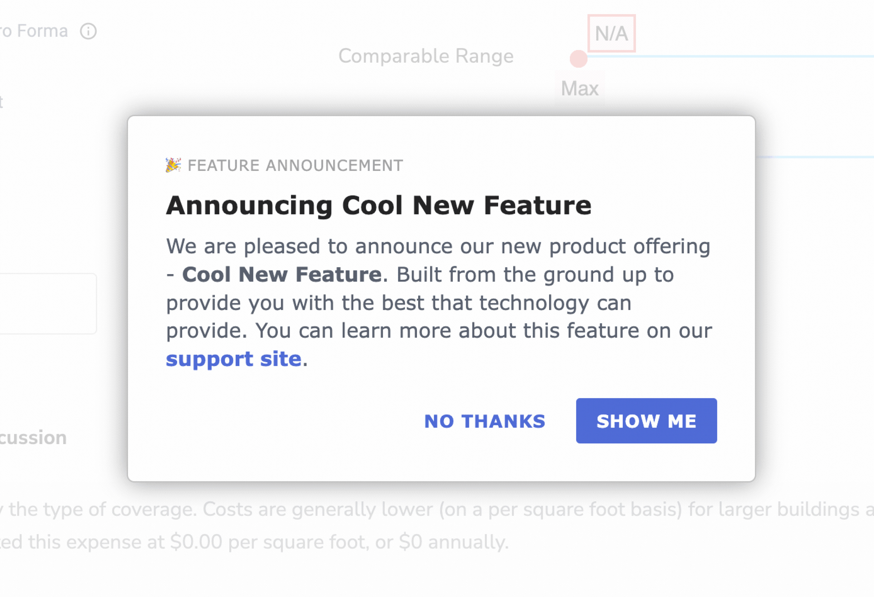
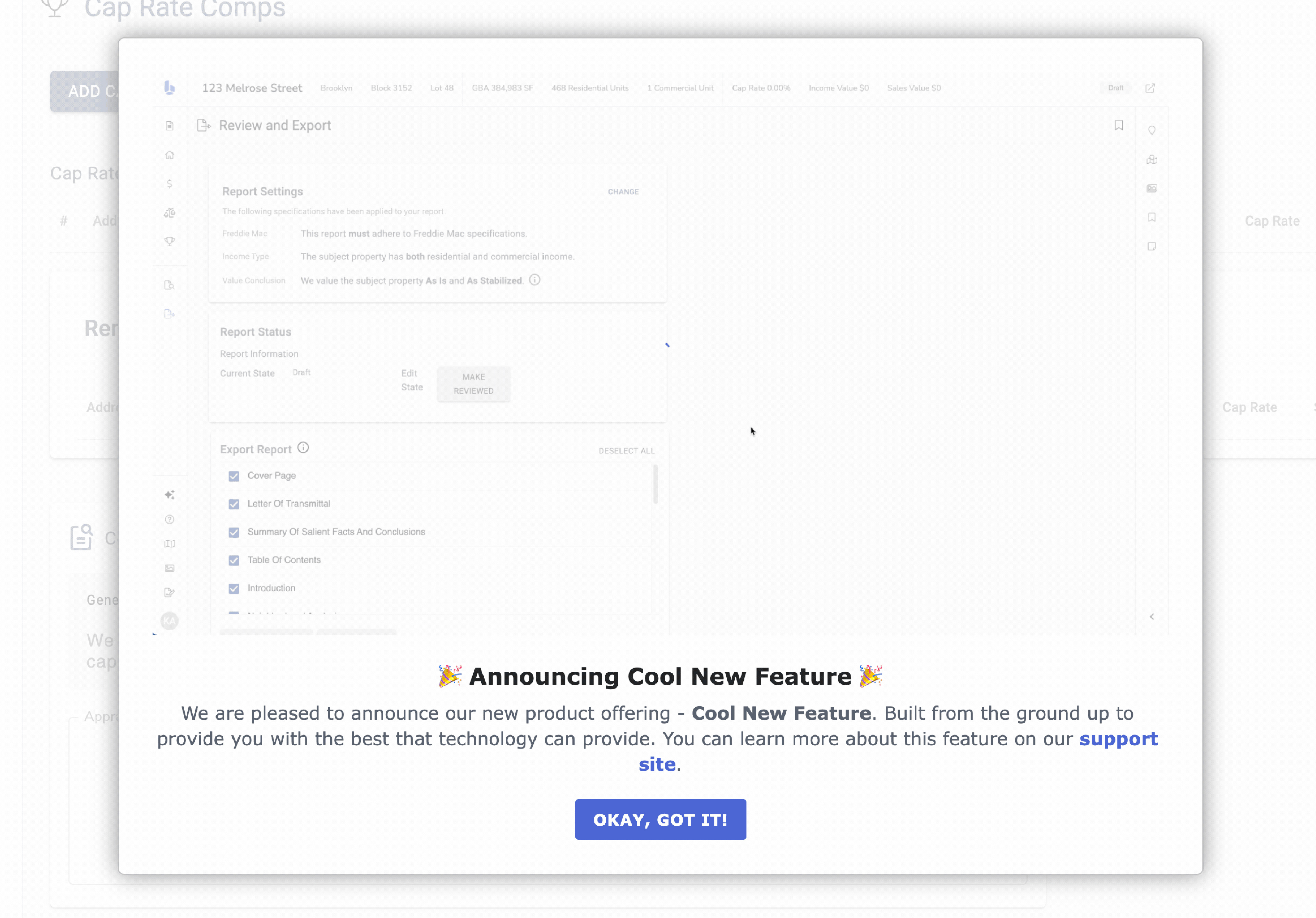
Unprompted Product Tours Upon Login: Picture this: you’re logging into a project management app, focused on updating a deadline, and a full-screen tour pops up, highlighting recent feature updates. You didn’t ask for this, and all you really want is to get to work. This uninvited interruption disrupts your flow and forces you to dismiss the tour to access your tasks.
👎 Why It Fails: This type of push revelation is irrelevant to the immediate user goal and creates a hurdle rather than assisting the user, especially if it happens every time there’s a feature update.
Marketing Pop-Ups for Upgrades or Promotions: Let’s say you’re in the middle of editing a document, and a pop-up appears suggesting an upgrade to the app’s premium version. It’s an offer that has nothing to do with your current task and provides no value at that moment. Interruptions like these prioritize marketing goals over user needs and often irritate users more than they engage them.
👎 Why It Fails: This type of interruption doesn’t serve the user; it serves the company’s bottom line. Users are more likely to ignore future pop-ups after repeated unwanted interruptions like this.
Repeated Tutorial Prompts for Basic Features: Imagine a tooltip repeatedly appearing every time a user hovers over a standard icon, like “Settings,” which most users already recognize. Not only does this distract users from their tasks, but it also comes across as condescending, implying that users don’t understand basic functionality.
👎 Why It Fails: This interruption doesn’t respect users’ existing knowledge or familiarity with standard UI elements, and it disrupts their workflow needlessly.
What We Can Learn from These Examples
Good user interruptions focus on providing clear, necessary information that aids the user’s immediate task or future interactions. Bad interruptions, on the other hand, serve more as distractions, prioritizing marketing goals or over-educating users on basic tasks.
When we, as UX researchers and UX designers, focus on relevant, well-timed, and non-intrusive help, we respect the user’s time and task goals.
This balance is the core of responsible onboarding, where guidance supports the user journey rather than sidetracking it.
Example Rules Document
Here is the document I created at a previous job that shows the basic guidelines for using Pendo onboarding and help features. While these might overlap with points covered earlier in this article, I wanted to display them in a format that’s easy for you to copy, paste, and share. They worked like a charm for me, and I hope they’ll work for you as well.
⚠️ Disclaimer: All of these recommendations and guidelines are based specifically around Pendo, but the information is transferable to most user engagement platforms.
Pendo Usage Guidance
Pendo makes adding content into user interfaces very simple, which has tradeoffs. Although this ability will help us communicate better with our users, we have recommendations that will help avoid the pitfalls of adding too many and/or inappropriate communication into our tech products.
General Recommendations
Adding the types of content under the Dont’s list will likely increase active time on app, lower our ASAT scores, and make users less likely to interact with Pendo pop-ups in the future.
Dos
✅ Use for contextual user help (e.g., beefed up tooltips or content currently hidden under the info "i" icon)
✅ Use for temporary content with an expiration date
✅ Use for general product and new feature announcements
✅ Use for systems maintenance
Don'ts
❌ Use for marketing communications and promotional content
❌ Use for company news and announcements
❌ Use for training content (e.g., content describing company processes as opposed to how to use the user interface)
❌ Use for evergreen content that users needs each time they interact
Walkthroughs (Recommended Tool)
📔 NOTE: Walkthroughs are the name given to this feature within Pendo. Walkthroughs are also referred to as onboarding or feature tutorials.
What is a Walkthrough?
Walkthroughs are contextual, modal guides that can have one or multiple steps. They are similar to large Tooltips, except they pop up when a UI element is selected and require user interaction. Walkthroughs are ideal for more granular and specific content.
When to use Walkthroughs?
Use a Walkthrough when a new feature or feature set has launched and requires some in-app guidance.
Walkthrough types
Showing users what changed - Single step, or multi-step guide that provide users with contextual UI interaction information
Showing users how something works - Single step, or multi-step guide for large UI and/or functionality change in which users would benefit from a tutorial style demonstration
Recommendations
Use the smallest number of Walkthrough steps possible. (1 step is ideally for usability, retention, and accessibility.)
📔 NOTE: Research has shown a significant drop-off rate after the first step, so make each step as relevant and compelling as possible.
Walkthroughs have no expiration date. Instead, they go away once a user has interacted with them one time.
Walkthroughs should not contain training content for users. However, you may provide a link to an external resource for supplementary, non-app help within a walkthrough guide popup.
Lightboxes
📔 NOTE: Lightboxes are the name given to this feature within Pendo. Lightboxes are also referred to as as modal dialog boxes.
What is a Lightbox?
Lightboxes are customizable modal dialog boxes that appear overtop your app or page. They can contain text, images, videos, links, and CTA buttons.
When to use Lightboxes?
Use a Lightbox for:
general product announcements that are best communicated in-app
upcoming systems maintenance that is best communicated in-app
Recommendations
General app and Feature announcements
Scheduled for 1 week before the launch or occurrence
Expires after the 1st occurrence
Only have one slide (do not use the slideshow functionality)
📔 NOTE: Research has proven only 11% of users click to the 2nd slide in a slideshow and even less on every subsequent slide.
Systems Maintenance
Only used when the maintenance has a critical impact on the users (e.g., downtime)
Scheduled for 1 week before the maintenance
Expires after the 1st occurrence
Include the time frame the maintenance is scheduled for in the content
Include a statement about how the maintenance will impact the users in the content
Provide a contact link for users who want more information in the content
Conclusion
Creating a seamless, user-centered onboarding experience takes thought and restraint. While platforms like Pendo and similar engagement tools offer quick, powerful ways to reach users, they need to be managed thoughtfully to avoid overwhelming or frustrating them.
The goal is to guide users without imposing on their experience, providing just-in-time help that’s there when they need it and invisible when they don’t.
Effective onboarding and contextual help aren’t about vanity metrics or checkboxes; they’re about enhancing usability. By focusing on clear purpose, contextual assistance, and respect for the user’s journey, we create an experience that’s engaging, useful, and ultimately frictionless for our users.
So, as you implement these guidelines, remember that great onboarding is subtle and respectful, anticipating user needs without interrupting. When done right, it strengthens the relationship between the user and the product, making interactions easier, more intuitive, and genuinely helpful.