

Reframing Accessibility
Accessibility Is Usability Under Real-World Conditions

Summary: This article reframes accessibility as a real-world usability standard. I argue that, in practice, accessibility is not a separate step in the design process, but a proxy for good usability best practices, both upfront and as a second-order effect.
One time, while consulting with a large org, I was reviewing a website with a team that was feeling really, really good about how everything on the site looked. And I totally understood why. The UI design was clean, there was the perfect use of white space, and the typography stack was balanced and well thought out. It had that kind of modern visual quality that makes people in design reviews feel like they are looking at something very well-crafted and high-end.
Then we started walking through the end-user top tasks. We were simply trying to use the thing in the way a real-world user would. That is when the vibe in the room started to change. Important help content was hidden behind hover interactions. Important placeholder text disappeared once we clicked into a field. Some prime nav bar interaction choices behaved differently on desktop than they did on mobile. Information that users clearly needed to compare was tucked inside tabs, which meant they had to rely on memory instead of simply seeing the content side by side. Any of these issues sound familiar?
None of these interaction friction points seemed too bad in isolation to the aesthetic-minded UXers in the room, but once they experienced them back to back in an actual workflow, the flaws became pretty obvious. The design looked clean, partly because the interface was offloading more effort onto the end user. I have thought about that moment a lot over the years because it connects to something I talk about all the time, how soooooo many teams still confuse polished UI with strong UX. If something looks modern, organized, and intentional, people start giving it credit for being intuitive before it has actually earned that credit.
That same confusion shows up all the time in accessibility conversations. A lot of teams still think accessibility is a separate concern, something technical, something specialized, or something you evaluate after the main UX decisions have already been made. From what I have seen, that framing is completely wrong and backwards. Accessibility is often the first place where weak UX becomes impossible to ignore.
Reframing Accessibility and Usability
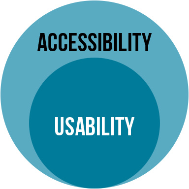
The main idea I want to make in this article is pretty simple, accessibility is usability under real-world conditions. I do not mean accessibility replaces usability, or vice versa. I mean accessibility can be used as a lever to reveal whether the usability of an interface was actually strong to begin with.
In my experience, when teams talk about usability in the abstract, they often imagine a pretty forgiving or overly narrow scenario. They picture a focused user in a static environment with their full attention on the product. Everything is in this idealized user’s full vision, full dexterity, good memory, a stable device, a standard browser, no time pressure, no interruptions, and no physical or cognitive limitations affecting the interaction. That is not the real world, and I think that distinction matters more than a lot of product people realize.
We all know the real world is much, much messier than that. People are distracted, people are tired, people switch devices, and people forget what they just read. People come back after long gaps, use keyboards instead of mice, rely on screen readers, have low vision, have motor limitations, have temporary injuries, are older, and are trying to complete real tasks in imperfect environments while also dealing with everything else in life.
Once you evaluate an experience against that reality, a lot of so-called “good UX” starts looking like aesthetic-only smoke and mirrors. That is why I think accessibility is better understood as a real-world standard, not a side topic. It gives us a more honest way to judge whether an interface really works.
Quick Level-Setting
When we talk about usability, we are usually talking about whether people can use something easily and successfully. Can they learn it, move through it efficiently, remember how it works, recover from mistakes, and feel reasonably confident while using it? That is the broad frame most UXers already understand.
When we talk about accessibility, we are talking about whether people with disabilities can perceive, operate, understand, and reliably use the same interface. Those two things are obviously related, but I think the relationship is stronger than many teams realize.
So my super basic and obvious theory is that a lot of the practical building blocks of accessible design are also just the building blocks of strong UX.
I have no clue why so many UXers struggle with this concept, but in my experience, they do, which is why I’m writing this today. It’s pretty simple: keep important information visible, make interactions predictable, support multiple ways of navigating, reduce memory burden, write clearly, structure content well, avoid unnecessary complexity, make controls understandable, and ensure the experience holds up across contexts. And furthermore, while I’m on this rant, that should not be perceived as a niche list. That list is the foundation for basic interaction quality.
A Simple Framework I Use
When I explain this to teams, I usually try to simplify it into something practical. The framework I use is this:
4 Signs Your UX Breaks in Real Use
If a design depends on any of these 4 things, it is probably weaker than it looks.
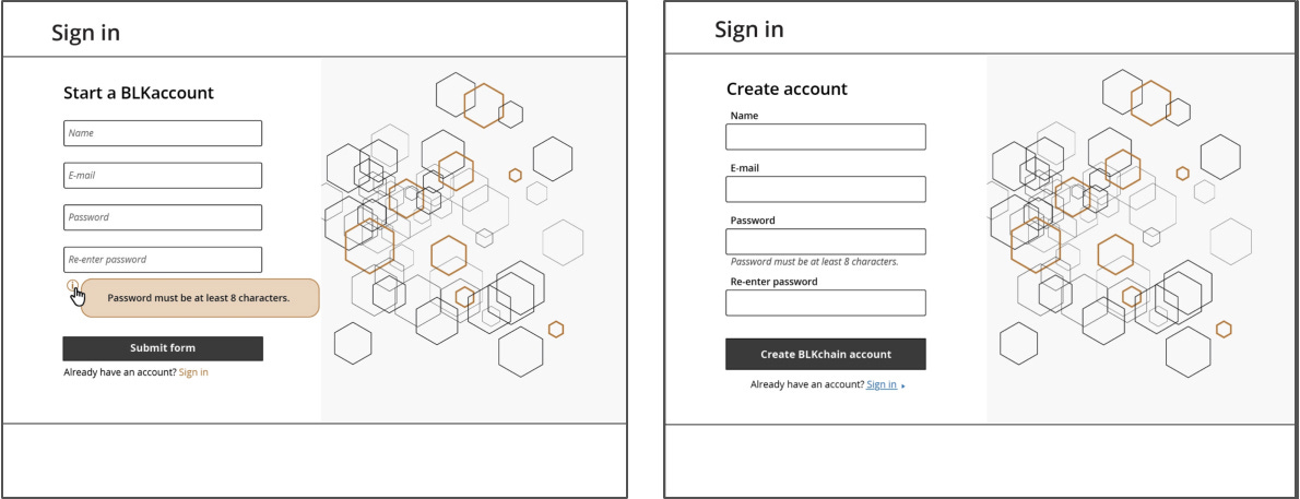
1. It relies on memory
If users need to remember instructions, labels, previous content, hidden options, or what a control used to say, the experience is already asking too much of them. This is one reason I dislike labels inside form fields so much. Once the user starts typing, the label disappears, and now the interface has taken a simple recognition task and turned it into a memory task.
That is not just an accessibility issue. It is a usability issue that becomes even more fragile for users with cognitive load, divided attention, or screen reader needs. The more a design depends on recall instead of recognition, the less forgiving it becomes in the real world.
2. It hides important information
Users should not have to hunt for content that matters. When key information is hidden behind tabs, accordions, tooltips, carousels, or hover-only interactions, the design may look cleaner, but the user now has to do more work to understand the experience.
That extra work does not affect all users equally. It gets highly amplified for people using only the keyboard, assistive tech, smaller screens, or less stable attention. But decades of HCI research have proven that even outside of formal accessibility concerns, it still makes the interaction worse for all users. This is one of those areas where accessible design and usable design are almost impossible to separate.
3. It changes behavior across contexts
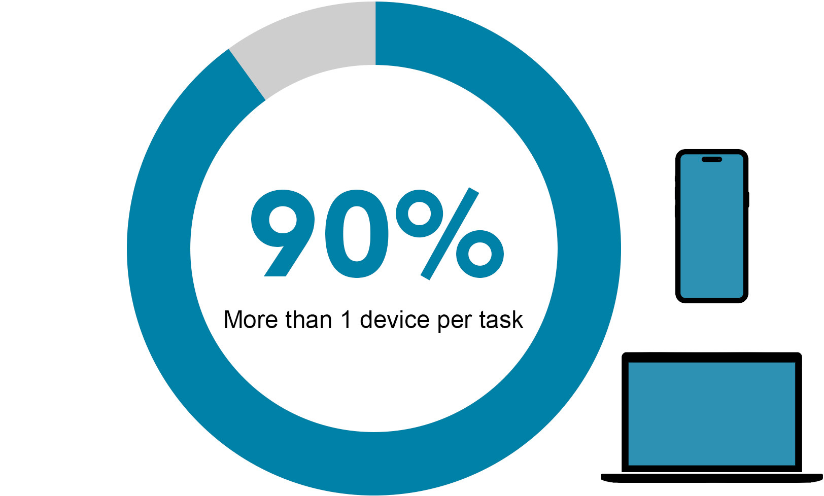
The more an experience changes from desktop to mobile, mouse to keyboard, or visual browsing to assistive browsing, the more relearning the user has to do. A lot of people start tasks on one device and finish them on another. They revisit products in different contexts, and they shift between interaction methods depending on the situation.
So when navigation, menus, or control logic behave very differently across those contexts, the experience becomes less trustworthy. That is not just a consistency problem. It is a real-world usability problem because it adds friction exactly when users need stability.
4. It rewards precision instead of clarity
If the interface only works well when someone can hover precisely, click tiny targets, interpret subtle cues, or decode visual minimalism correctly, then it is relying too much on precision and not enough on clarity. Strong UX should not require users to be unusually careful just to succeed.
I see this show up in prime nav bar menu designs all the time. Hover-based navigation, ambiguous click targets, split buttons, overly subtle controls, or menus that ask users to guess what will happen next all create unnecessary fragility. Accessibility simply makes that fragility easier to see, but the weakness was already there.
Taken together, these 4 signs work as a stress test for UX. They help reveal whether an interface is genuinely clear and resilient, or whether it only feels usable when conditions are perfect. The framework is less about catching isolated accessibility issues and more about exposing the deeper design choices that make an experience fragile in the real world.
What This Looks Like in Practice
Once you start using this framework, a lot of design decisions become way easier to discuss upfront. Take content hidden inside a tooltip. The question is not just, “Is this accessible?” The better question is, “Why is this information hidden at all if the user needs it to proceed?”
Take form labels inside fields. The question is not just, “Will a screen reader handle this?” It is also, “Why are we removing visible guidance in a task that already depends on accuracy?” Take radically different mobile navigation. The question is not just, “Can users technically get through it?” It is also, “Why are we making them relearn the system when they change devices?”
This is why I like the reframe so much. It stops accessibility from feeling like a separate audit category and pulls it back into the core UX conversation where it belongs.
Once that happens, teams can start evaluating design decisions in a way that is more grounded in actual use.
Familiar Does Not Mean Boring
Another point worth making here is that accessible design is not about making everything plain or lifeless. It is about making things understandable. I think some teams hear “accessible” and imagine a stripped-down, rigid, or visually uninteresting product. That has not been my experience at all.
Don’t get me wrong, you can still build beautiful interfaces, and you should. You can still build distinctive products that solve real problems in the real world. And you should still make something feel polished and intentional. The difference is that the visual decisions cannot come at the expense of interaction clarity.
The rule of thumb here is that the UXer’s burden is to 1st prioritize making designs accessible, and then, and only then, shift to making them look aesthetically polished.
That is where a lot of UXers get in trouble. They are not really choosing between beauty and accessibility. They are choosing between surface elegance and actual ease of use. Those are not the same thing, and once we start talking about it that way, accessibility stops feeling like a limitation and starts feeling like a design discipline that protects what matters. We, as a discipline, need to stop assessing our interfaces like artwork.
So my argument is this: does the experience still hold up when the user cannot rely on hover, cannot see subtle cues, is using keyboard-only navigation, cannot remember instructions from prior pages, is trying to get something done quickly, switches devices, is distracted, or needs things to be explicit rather than implied? That is a far more honest framing and test of UX quality.
I think that is part of why accessibility work is so valuable beyond simple compliance. It gives teams a better lens for evaluating whether the product is actually usable in the first place.
Accounting for accessibility compliance should be step number 1 in your process. This makes accessibility a proxy for good usability best practices, both upfront and as a second-order effect. Instead of asking whether the interface passes a narrow review, ask whether the experience can stand up to use under less-than-ideal conditions.
Conclusion
Over the years, I have come to think about accessibility less as a separate domain and more as a reality check for usability. It is one of the clearest ways to find out whether an interface was designed for real use or just for a surface-level, smoke-and-mirrors style of design review.
If the experience only seems usable under perfect conditions, then the UX is not nearly vetted enough to move forward. If it falls apart the second someone needs more explicit structure, more visible guidance, more predictable interaction, or more resilient navigation, then those were not edge cases. They were the stress test, so there was no need to test with end users at that point yet. Instead, follow accessibility best practices first, then incorporate usability best practices, and lastly look at aesthetics within those constraints. This is the best order of operation for UXers.
That is the shift I hope more folks make. Not seeing accessibility as a final layer, not seeing it as a side checklist, and not seeing it as something separate from UX. Accessibility is usability. I would much rather see teams treat it as one of the most practical ways to tell whether the experience can survive contact with the real world.
At this point, that is the standard I care about most. I care less about whether the interface looks clean in a static frame and more about whether it still works when real life shows up.
Have you seen teams treat accessibility like a side checklist instead of a basic test of whether the UX actually works? If so, comment here or DM me. I’d love to hear the patterns you’ve seen in the real world. Thanks for the support, everyone!