

Reframing Interaction Design Basics
How I Simplified Some Web UX Ideas to Help Early-Career UXers

Summary: Working with some early-career UXers on website redesigns revealed gaps in their understanding of basic interaction design principles. To address these challenges, I developed training module content, shared here as a quiz, to simplify key concepts and help bridge those gaps. Take the quiz yourself, trust me, it’ll be fun!
I was recently asked to work with a group of early-career UX researchers on a series of website redesigns. I was taken aback by the lack of general interaction design understanding among the folks I was working with. Eventually, I created a little training module to help clarify some of the most common misconceptions and errors I saw during the project. Not sure if this will help anyone else, but I decided to share it here.
Below is a subset of the training module I made to help these peeps quickly upskill in basic interaction design principles. I posted it here in a quiz format. As you read, I encourage you to simulate the quiz environment and see how many you get right. Try your best not to cheat and look at the answers below. hahahaha.
⚠️ Disclaimer: This is by no means a comprehensive list. It’s just the most common errors I saw early-career UXers make in the context of website redesigns.
Top Misunderstood Basic Interaction Design Ideas
Before we get into the quiz, I wanted to break down the top misunderstandings I repeatedly saw while working with these early-career UX professionals.
I’m not using the academic definitions of these concepts but instead the reframed explanations that seemed to resonate best with the early-career UXers. The order here is important and will help frame the answer key to the quiz questions below.
Fitts's Law
My reframing: Put stuff as close to the user's cursor as possible, and make the most important things bigger.Law of Magic Pixels
My reframing: Users look for stuff in corners and can easily reach the corners.📝 NOTE: These two laws contradict each other. If it’s best to put stuff near the predicted cursor location but also best to use corners, what should you do? My point here is that these basics can work together to form a bigger picture of user behavior. My advice: Context matters. Use corners for global elements and place contextual UI elements closer to the cursor.
Hick's Law
My reframing: Break stuff into categories and steps when it gets complicated.Progressive Disclosure:
My reframing: Show users what they need when they need it (just-in-time).📝 NOTE: These two principles can seem contradictory. Breaking content into user-centered categories and then disclosing information incrementally creates powerful navigation. This often comes up with primary navigation menus.
Miller's Law
My reframing: This doesn’t mean lists should have seven items or less. It means don’t make users remember stuff or think too hard.Affordances & Signifiers
My reframing:Affordances - Make UI elements look like the interactions they enable.
Signifiers - Explicitly tell users what will happen when they perform an interaction.
F-shaped Reading Pattern
My reframing: Designing for the F-shaped reading pattern, where users scan content like the capital letter "F", is a safe bet for large content blocks.Jakob's Law
My reframing: Users spend more time on other websites than yours. Leverage their familiarity with common patterns. (Aka. Don’t reinvent the wheel with your designs.)📝 NOTE: Jakob's Law is the guiding principle that overlays all the other ideas here. When in doubt, default to Jakob's Law.
The Quiz
Now that we’ve set the reframing, let’s take the quiz! Keep the eight topics above in mind while answering. Good luck!
Quiz Scenario
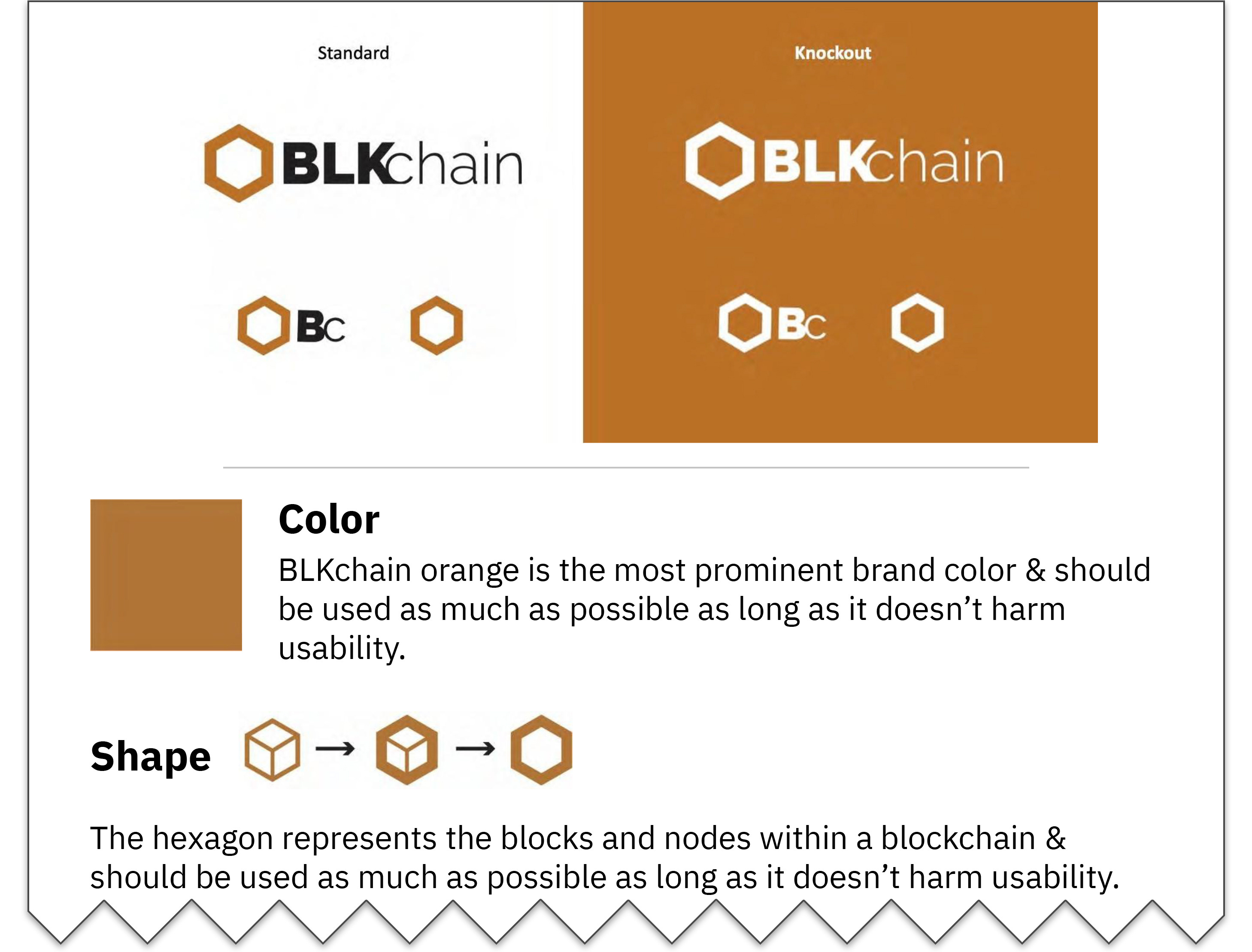
You’re redesigning a website for a blockchain company called BLKchain. The client hands you their brand style guide. Study the guide below carefully, then move on to the questions.
Question #1
Which of the following is the best primary navigation bar design according to usability best practices? (These examples show only the desktop view.)
Don’t cheat and peek!
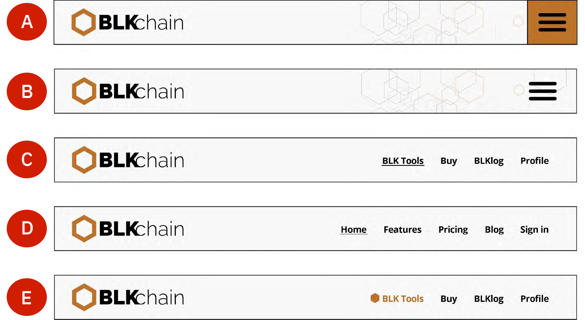
Answer:

Reasoning:
A and B both use a hamburger menu as the default navigation design, which violates Progressive Disclosure principles. Hamburger menus hide options that should be immediately visible, forcing unnecessary interactions and increasing cognitive load for users. Additionally, this design choice often assumes users will recognize and interact with the icon, which isn’t always intuitive.
C and D introduce novel language and unconventional link stylings, which create unnecessary friction for users. These choices breach Jakob's Law because users rely on familiarity with common patterns when navigating websites. The inconsistency also disrupts Fitts's Law by failing to make critical navigation items prominent and accessible.
Finally, the lack of clear visual cues in these designs breaches the principles of Affordances and Signifiers. Navigation items should look and behave in ways that align with user expectations, reducing ambiguity and guiding interactions effectively.
Here are some primary navigation bar best practices:
Users must select a nav item to execute its action (no hover-triggered actions).
Primary nav items linking directly to a page shouldn’t have menu expand indicators/icons (e.g., a down arrow).
Items opening menus need expand indicators/icons (e.g., a down arrow).
Menus should close via click-out, toggling, "Esc," or loss of focus.
Pressing "Esc" should return focus to the triggering UI element.
Question #2
Which homepage design is better for usability?
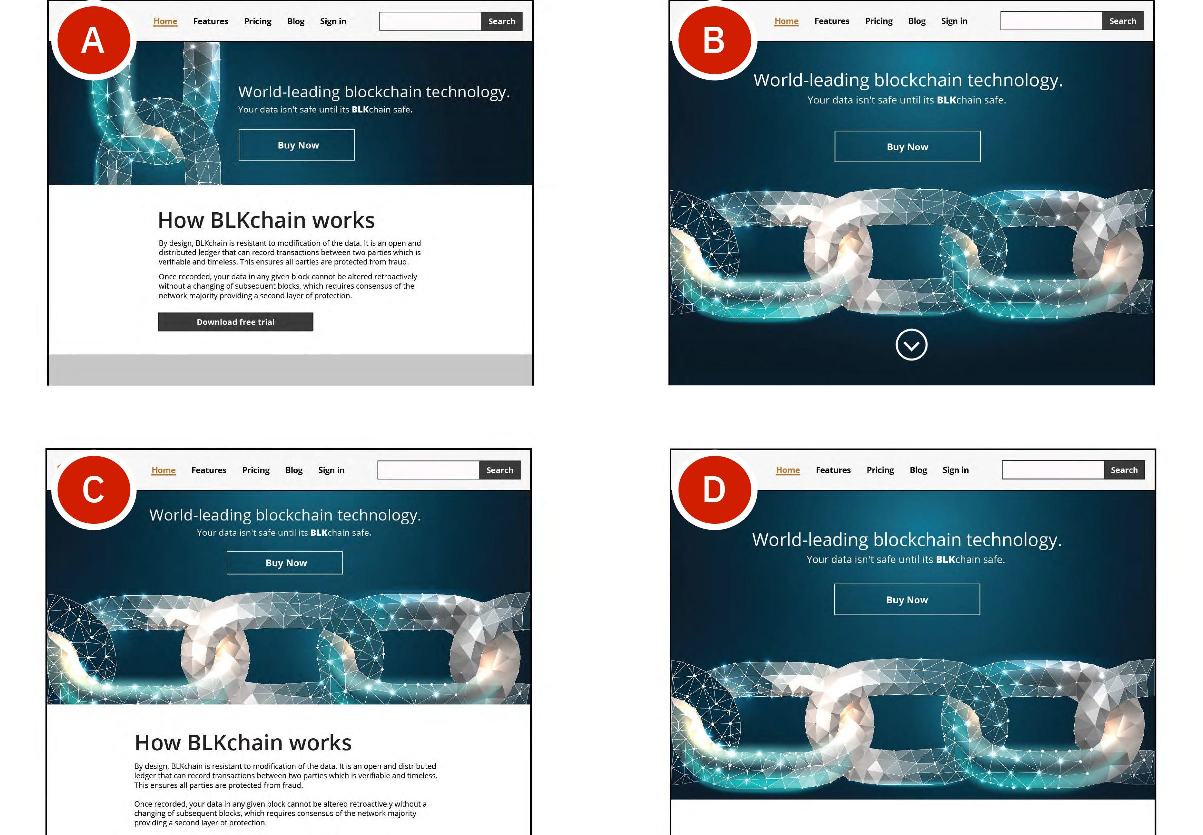
Answer:

Reasoning:
Options B and D fail to prioritize Progressive Disclosure, resulting in a "false floor" effect where users are misled about the available content. This creates unnecessary scrolling and cognitive dissonance as users try to make sense of the layout. Option C performs better but wastes valuable above-the-fold space, reducing its overall usability.
Option A best balances key usability principles. It adheres to Fitts's Law by placing interactive elements in easily reachable areas and optimizing their size for interaction. Hick's Law is also applied effectively by organizing content into manageable categories and steps, reducing complexity and guiding users through the interface intuitively.
Question #3
Which product comparison page is better for usability?
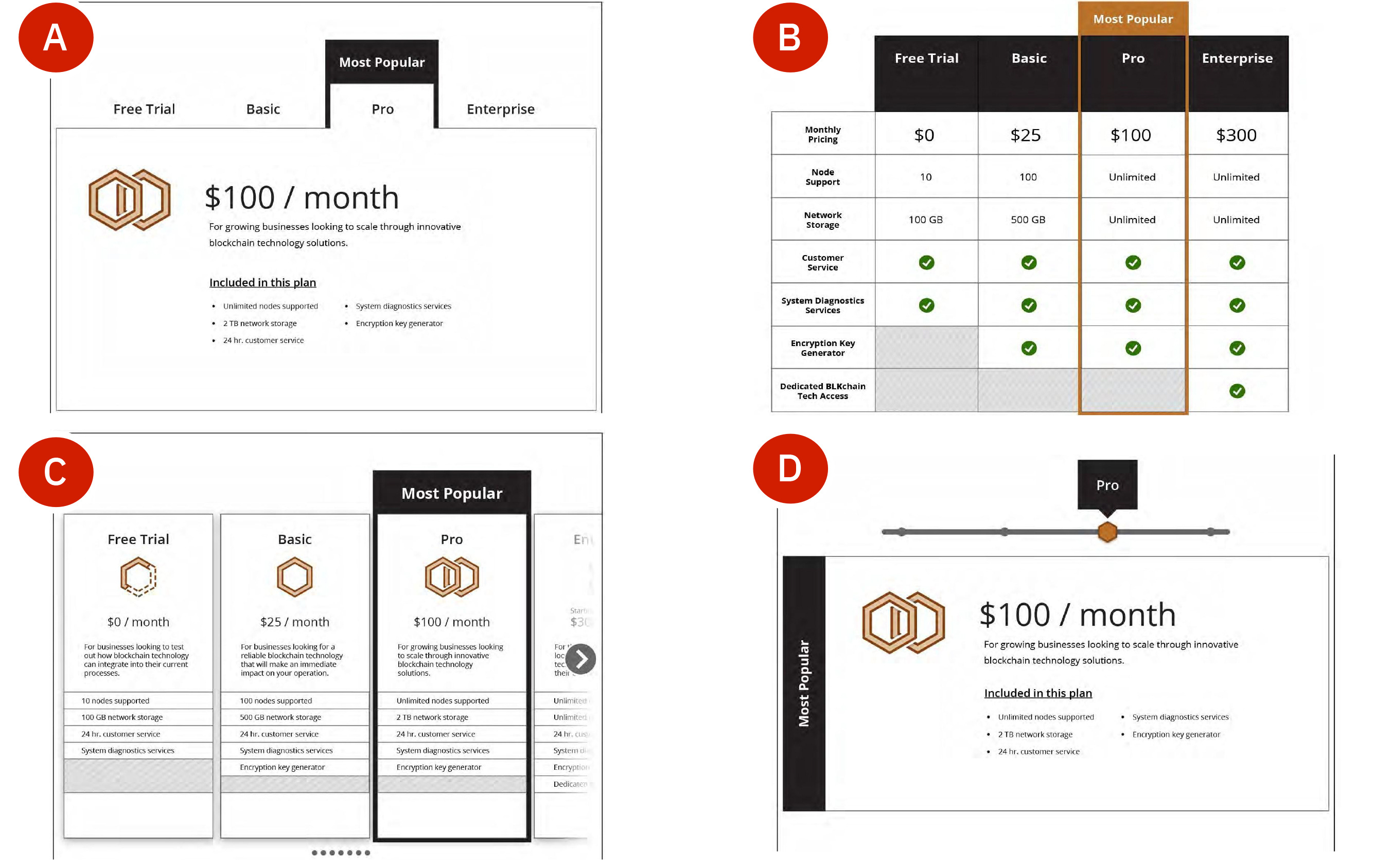
Answer:
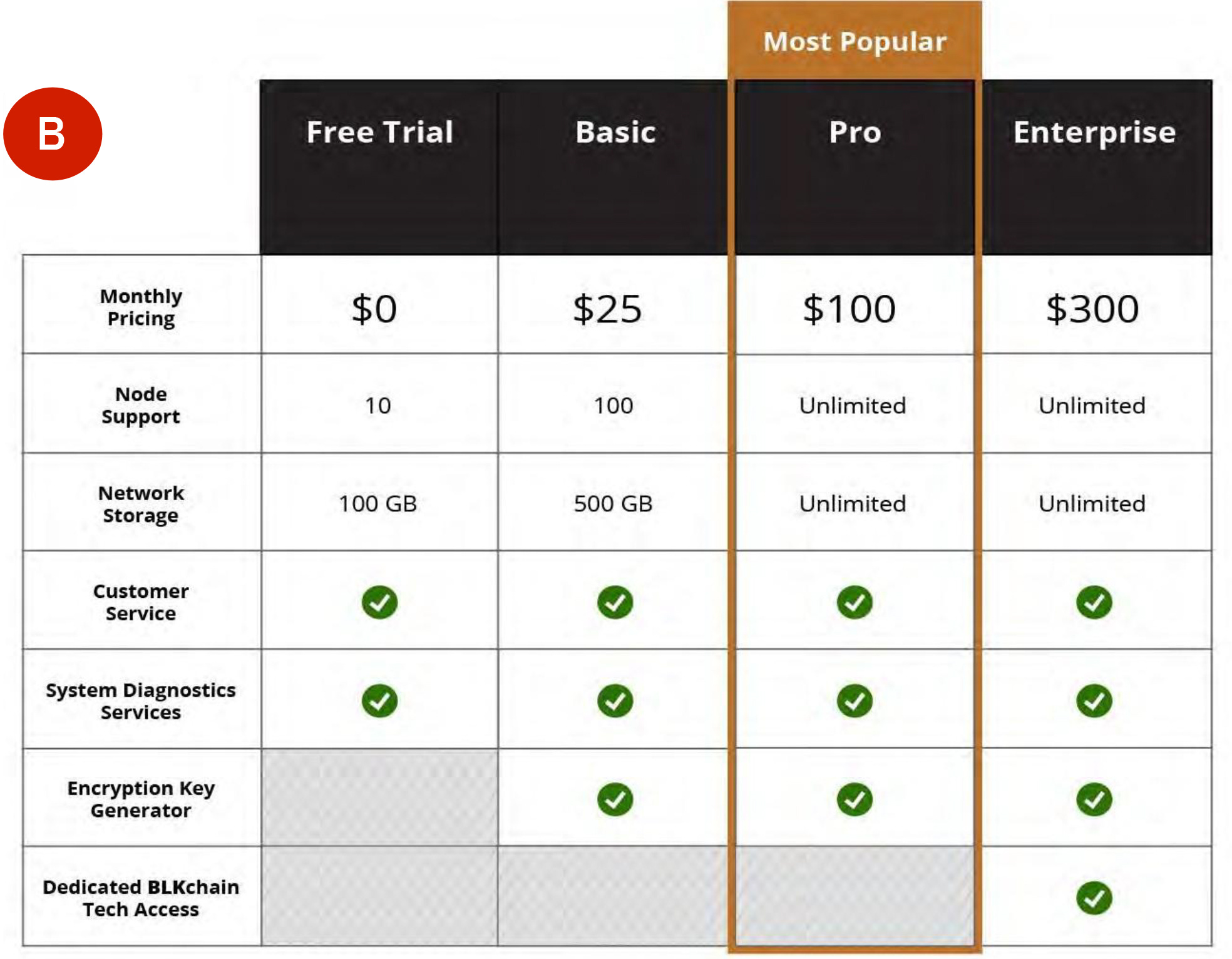
Reasoning:
A, C, and D make a critical mistake by spreading comparable items across multiple pages, making direct comparisons nearly impossible. This design approach violates both Miller's Law, by forcing users to remember details across pages, and Progressive Disclosure, by failing to present the necessary information at the right time.
Option B, on the other hand, leverages comparison tables to keep all relevant data visible on a single page. While comparison tables can sometimes feel overwhelming, they are the most effective way to enable side-by-side comparisons, particularly on larger viewports. This approach ensures users understand all of their choices and don’t need to hold a bunch of information in their working memory as they navigate back and forth between hidden content.
Question #4
Which content blocks are easiest to read?

Answer:

Reasoning:
Although Option A minimizes vertical scrolling, it sacrifices readability and usability by failing to provide clear headers. This design breaches the F-shaped Reading Pattern because users rely on headers to anchor their scanning behavior. Without headers, users are forced to read through blocks of text sequentially, which increases cognitive load and slows task completion.
Option B uses headers to organize content, improving scannability and aligning with Hick's Law by reducing complexity. While this approach increases vertical space, the trade-off is worthwhile because it significantly enhances the user’s ability to find and process information efficiently.
Question #5
Which blog page layout is better for readability?

Answer:
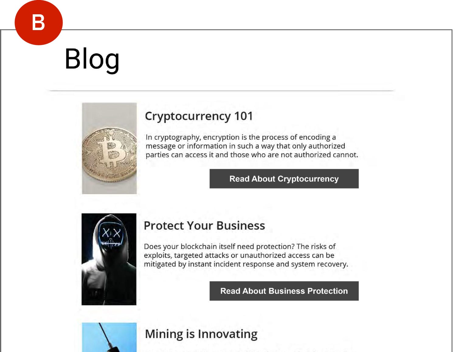
Reasoning:
Option A disrupts the natural scanning flow of the F-shaped Reading Pattern by forcing users to jump back and forth between unevenly aligned text blocks. This design increases visual fatigue and cognitive effort, making it harder for users to locate information quickly.
Option B aligns content consistently along the left edge, enabling users to scan more effectively. This design leverages the F-shaped Reading Pattern by guiding the user’s eyes down the left margin, where key information is expected to appear. This approach improves readability and ensures users can process content with minimal effort.
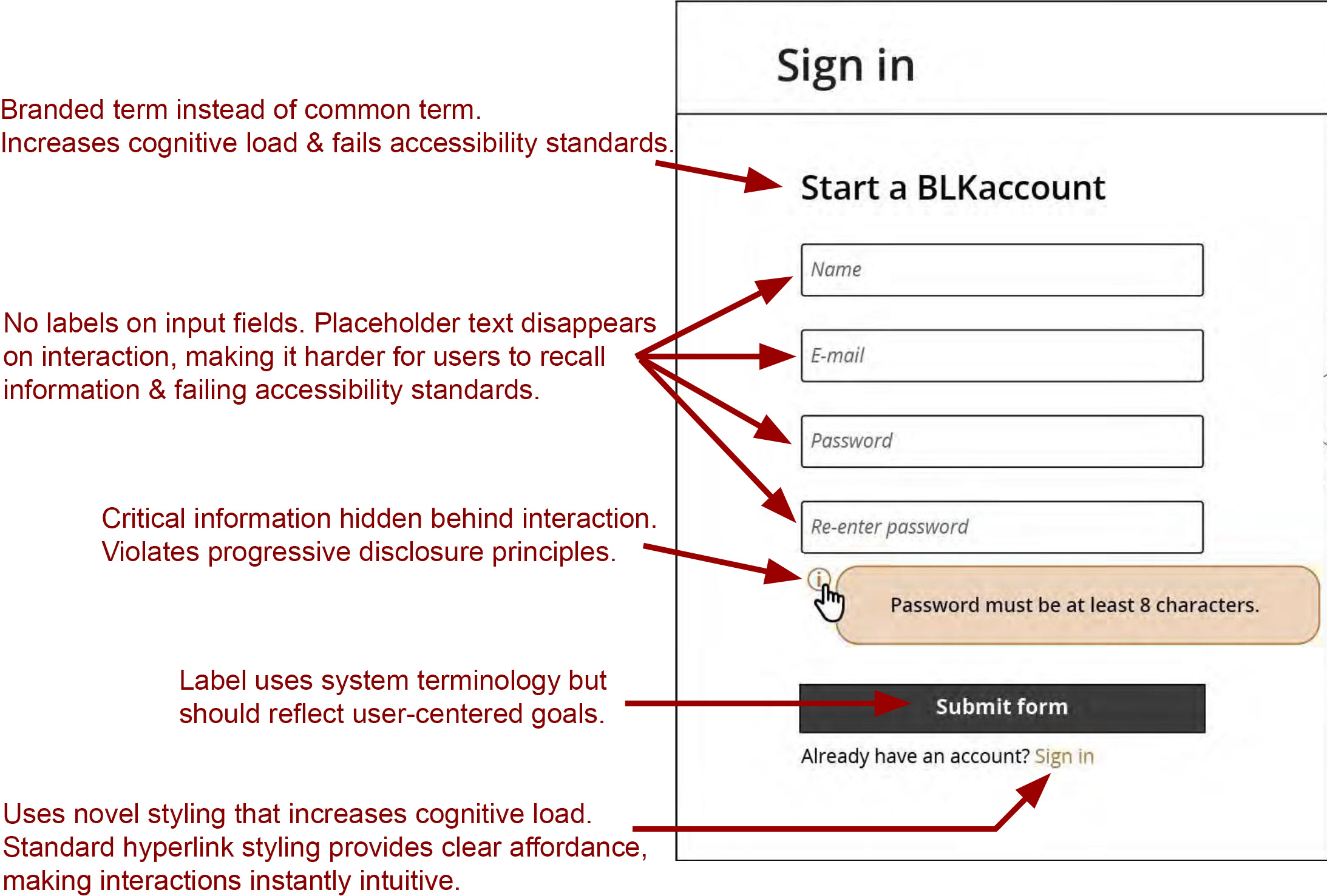
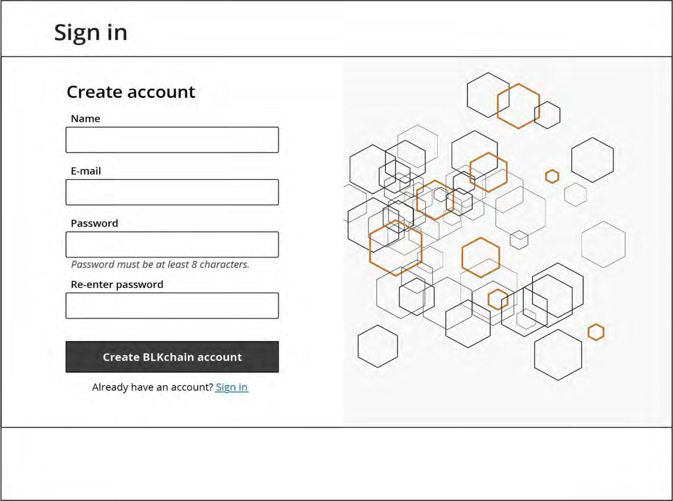
Question #6 (Final Question)
Find the eight issues with this web form. (Don’t cheat and peek!)
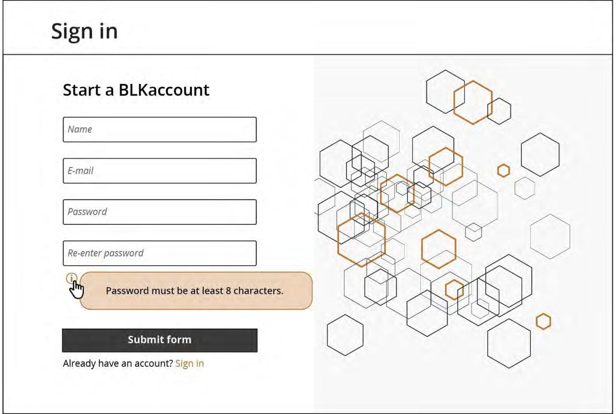
Answer and Reasoning:
Here’s what the form might look like if it were redesigned with the best practices in mind:
Conclusion
How did you do? If you’re an advanced UXer, I hope this was just a refresher. If you’re helping upskill early-career UXers, feel free to use these ideas as a starting point. I hope these examples helped to clarify things and show these highly misunderstood ideas can be used in the real world.
What reframing and contextualizing techniques do you use most in your day-to-day work? Feel free to comment here or DM me to continue the conversation. I hope this reframing is helpful. Thanks, all!