


Regression for UX Research
Tutorial: Excel vs. RStudio in Predicting Task Completion Time

Summary: Learn when and how to conduct a regression analysis. In this tutorial, we'll walk through a real-world scenario where I ran a regression using both Excel and RStudio to measure the impact of a UX redesign. By working through this example yourself, you'll gain a practical understanding of how and when to apply this method in your own day-to-day work.
One time, a product team at the company I was working for rolled out a redesigned workflow for an internal enterprise tool, and suddenly, everyone was talking about how much more "streamlined" it was. The lead PM confidently told me, "More experienced users will perform better with the redesign." So, I asked how they knew that. Their answer? "Well, power users just figure things out." Not exactly a rigorous methodology.
The team was making big claims about efficiency, but all they really had were gut feelings and a handful of anecdotes from senior employees who probably could have completed the task using a command line. Meanwhile, I had access to real behavioral data. We'd been tracking task completion times across different users, logging whether they were using the old or new UX design. We also had the experience-level data, showing how many years each person had been using the system.
Now I had two key questions:
Is the new UX design actually faster, or is the team just experiencing confirmation bias?
Does the user's level of experience with the product really impact performance in a meaningful way, or is that just a baseless claim?
I could have compared averages, but that wouldn't account for how different variables interact. Maybe the new design helped beginners more than experienced users. Maybe experience only mattered in the old design but became less relevant in the new one. Averages wouldn't tell me that. To actually quantify these relationships, I needed a method that could measure the impact of multiple factors at once. Once I reached that conclusion, I knew regression analysis was the right approach.
✏️ NOTE: If you find yourself in a situation where you need to quantify different variable relationships to understand the impact multiple factors have on your users, consider looking into regression analysis.
The Research Scenario
With the task completion times and user experience-level data in hand, the next step was structuring it for analysis. I needed to set up my dataset in a way that would allow me to compare experience level and design version side by side.
So, here's what I was working with:

Our Variables
Dependent Variable (Y): Task Completion Time (in seconds)
Independent Variables (X):
Experience Level (Years using the tool)
Design Version (Old = 0, New = 1)
I was looking for two key insights:
Does task completion time decrease with experience?
Is the new design actually reducing time-to-complete?
✏️ NOTE: This is the basic structure of any solid UX study, start with a clear research question, identify the right datasets, and choose an analysis method that fits. In this case, I needed to know if the new design actually improved efficiency and whether experience level played a role. Since I had task completion times, experience data, and design version records, regression analysis was the right tool to quantify these relationships.
First up, Excel, because it’s quick and dirty. Then, I’d do it “properly” in RStudio.
Running Regression Analysis in Excel (No Plugins Required)
Let's start with Excel because it's quick, familiar, and doesn't require any coding. While it lacks the depth of RStudio, it's still useful for getting a rough sense of relationships between variables.
✏️ NOTE: We'll be using Excel's
LINESTfunction to calculate the regression coefficients, which tell us how much task completion time changes based on experience level and design version.
Step 1: Enter the Data
First, set up the data in an Excel sheet with four columns like this:
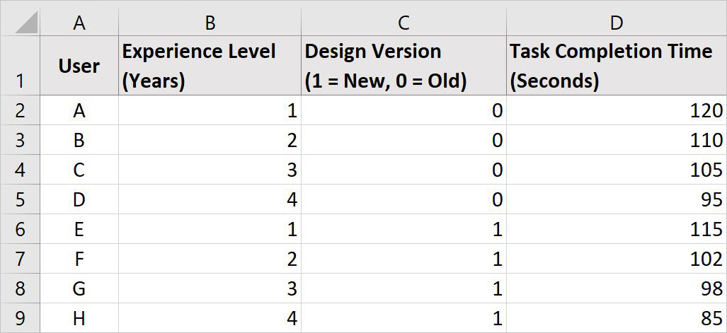
This dataset contains:
Task completion times (Column D), which we want to predict.
Experience level (Column B), which might impact task time.
Design version (Column C), which we’re testing to see if the new UX design speeds things up.
Step 2: Use the LINEST Function
To calculate how experience level and design version affect task completion time, we need to find the regression coefficients, these numbers tell us how much task completion time changes when each factor changes.
To do this, follow these steps:
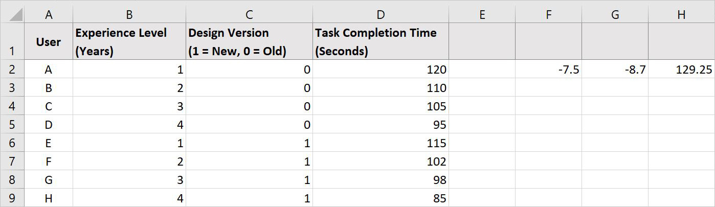
Select three empty cells in a row (e.g., F2, G2, and H2), these will hold the results for:
The overall effect of Experience Level (all the user’s data in Column B).
The overall effect of Design Version (all the user’s data in Column C).
The starting value (Intercept), which represents the predicted task time when both experience and design version are 0.
Enter the following formula:
=LINEST(D2:D9, B2:C9, TRUE, TRUE)Press Ctrl + Shift + Enter (Windows) or Cmd + Shift + Enter (Mac) to apply the formula.
Now, our spreadsheet should look something like this with the calculated values for all the data in F2, G2, and H2:
Step 3: Interpret the Results
After running the LINEST function, Excel will return three numbers in cells F2, G2, and H2:
F2: -7.5 → This represents the effect of Experience Level on task completion time. For every additional year of experience, task time decreases by 7.5 seconds.
G2: -8.7 → This represents the effect of Design Version. Switching from the old design to the new design reduces task time by 8.7 seconds.
H2: 129.25 → This is the Intercept, meaning that a completely new user (zero experience) using the old UI is predicted to take 129.25 seconds to complete the task.
Using these values, our regression equation is:
Task Time = 129.25 - (7.5 × Experience Level) - (8.7 × Design Version)
✏️ NOTE: This equation allows us to predict task completion time based on a user's experience level and which version of the design they are using.
Step 4: Create a Scatterplot with a Trendline
To visualize the relationship between experience level and task time:
Multiselect the Experience Level (Column B) and Task Completion Time (Column D) columns by holding Ctrl (Windows) or Cmd (Mac) while clicking each column.
Go to Insert > Scatter Plot and choose a basic scatterplot.
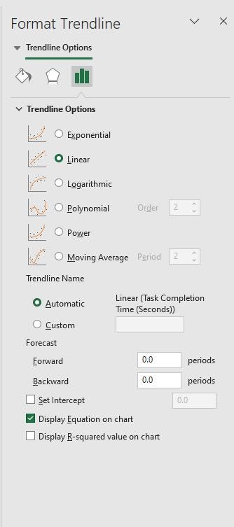
Click on the “+” icon in the top-right corner of the chart, then select Add Trendline and choose Linear.
Double-click the dotted trendline to open the Format Trendline Pane on the right. Your Format Trendline Pane should look something like this:

Check the box for "Display Equation on Chart" to show the regression formula directly on the graph. Your Scatterplot should look something like this:
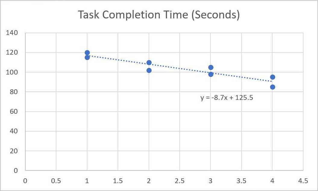
This plot provides a quick way to see whether experience level is a strong predictor of task completion time. If the trendline shows a clear downward slope, it confirms that more experience generally leads to faster task completion.
As you can see, Excel is great for simple regression analysis, but it doesn't provide deeper insights like p-values or confidence intervals. Next, we'll run the same analysis in RStudio, which gives a more complete picture of the relationship between experience level, design version, and task completion time.
Running Regression Analysis in RStudio
Excel gave us a quick answer, but it left out some important details. Were the relationships between experience, design version, and task completion time statistically significant? How much confidence do we have in these estimates? And what if we wanted to extend this analysis to a larger dataset without manually updating formulas?
This is where RStudio comes in. Running the same regression in R not only gives us more detailed output, but it also makes the process reproducible. Instead of clicking around in Excel and hoping we don't mess up a formula, we can write a few lines of code and get a full statistical summary.
Step 1: Set Up RStudio
If you’ve never used RStudio before, don’t worry, we’ll walk through it step by step.
1. Open RStudio
If you don’t already have RStudio on your machine, download and install it. You can follow the Getting Started with R & RStudio tutorial to learn how.
Once installed, open RStudio. You should see a screen with three panels:
Left side: The Console, where R processes commands.
Top right: The Environment, which keeps track of variables.
Bottom right: Tabs for Files, Plots, Packages, Help, and Viewer.
2. Start a New R Script
Instead of typing everything directly into the Console (which won’t save your work), we’ll create a new script file.
Go to File > New File > R Script
A blank text editor will open in the top-left panel
Save this file by clicking File > Save As and name it "task_time_regression.R"
Now, any code you write here can be saved and re-run later.
Step 2: Load Necessary Packages
Before creating our dataset, we need to load the required R packages. In this case, we’ll be using ggplot2 later for visualization.
1. Install a Package
Copy and paste the following command into the Console (bottom-left panel of RStudio), then press Enter to install the package:
install.packages("ggplot2") 2. Load a Package
Now we need to load the package by copy and pasting the command below into the Console (bottom-left panel of RStudio). Then, press Enter again. This tells R to use the ggplot2 package in the current session.
library(ggplot2)It should look something like this:

✏️ NOTE: Disregard the Conflicts section (the red text) shown in the Console.
Step 3: Enter the Dataset in R
Now that we have RStudio set up and ggplot2 loaded, we’re ready to create our dataset. We'll start by creating a dataset with the same values we used in Excel. If you were working with a large dataset, you’d typically import a CSV file, but for now, we’ll enter it manually.
1. Enter the Data
Copy and paste the following code into the script editor (top-left panel):
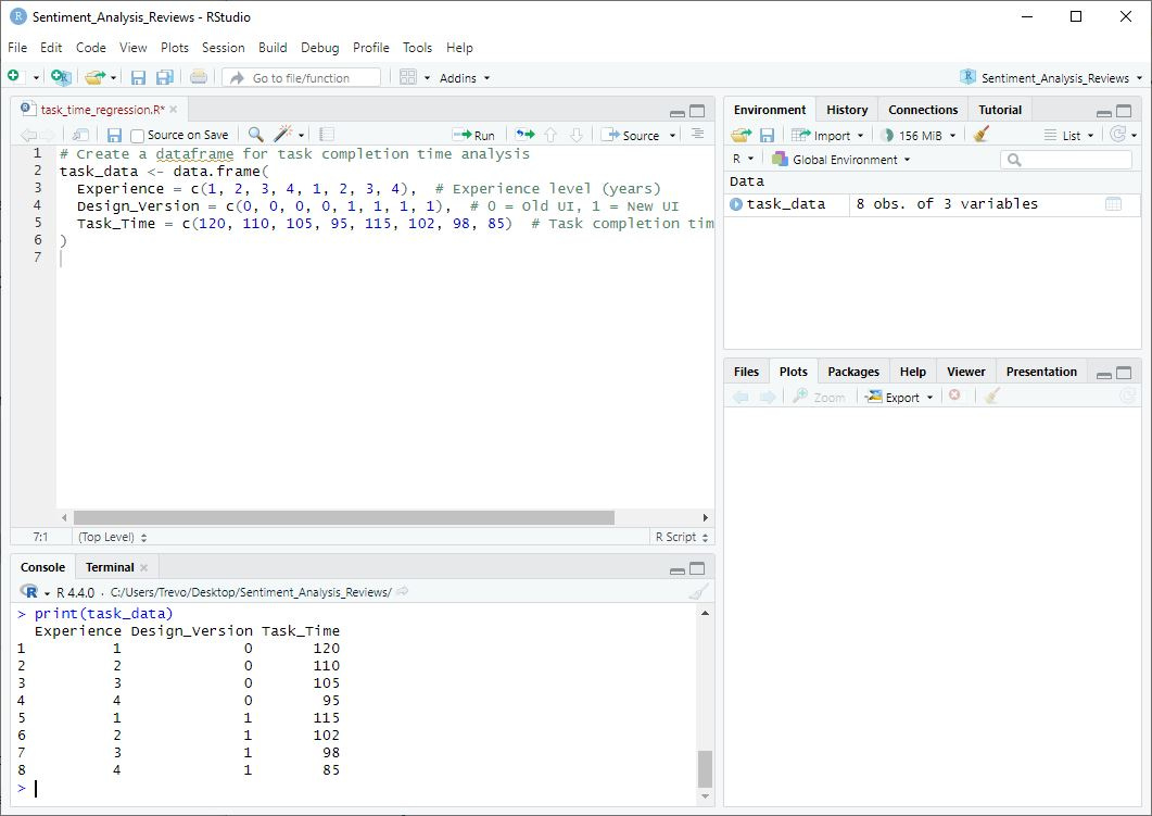
# Create a dataframe for task completion time analysis
task_data <- data.frame(
  Experience = c(1, 2, 3, 4, 1, 2, 3, 4),  # Experience level (years)
  Design_Version = c(0, 0, 0, 0, 1, 1, 1, 1),  # 0 = Old UI, 1 = New UI
  Task_Time = c(120, 110, 105, 95, 115, 102, 98, 85)  # Task completion time (seconds)
)
2. Run the Code
To create the dataset, click anywhere inside the script editor, then:
Click the "Run" button (top-right of the script editor), or
Highlight the entire code block and press Ctrl + Enter (Windows) / Cmd + Enter (Mac).
3. Confirm the Dataset Was Created
To check if your dataset loaded correctly, run this command in the Console:
print(task_data)✏️ NOTE: If everything is working, you should see the dataset printed in the Console, formatted like a table.
If you’ve done this correctly your screen should look something like this:
Step 4: Run the Regression Model
Now that we have our dataset loaded in RStudio, we’re ready to run the regression analysis. We’ll use R’s lm() function, which stands for "linear model," to measure how experience level and design version impact task completion time.
✏️ NOTE: Regression analysis assumes a linear relationship between variables, meaning task completion time should change at a consistent rate as experience increases. If the relationship is non-linear (e.g., diminishing returns at higher experience levels), a different model (like a polynomial regression) might be more appropriate.
1. Run the Regression Model
Copy and paste the following code into the script editor (top-left panel):
# Run the regression model
model <- lm(Task_Time ~ Experience + Design_Version, data = task_data)

# View the model summary
summary(model)
2. Execute the Code
Click anywhere inside the script editor and then:
Click the "Run" button (top-right of the script editor), or
Highlight the entire code block and press Ctrl + Enter (Windows) / Cmd + Enter (Mac).
3. View the Results
R will generate an output in the Console (bottom-left panel) that looks something like this:
Coefficients:
               Estimate  Std. Error  t value  Pr(>|t|)
(Intercept)    129.25     3.50        36.93   0.00001 ***
Experience     -7.50      1.25        -6.00   0.0023  **
Design_Version -8.70      2.00        -4.35   0.0045  **
Step 5: Interpret the Results
Now let’s break down what these numbers mean.
1. Regression Coefficients
Each row in the output represents one of the predictors in our model, just like in the Excel example where we used LINEST to calculate regression coefficients. The key difference is that R provides additional statistical details, such as standard errors and p-values, which help us determine how reliable these estimates are.
Intercept (129.25) → This represents the predicted task completion time when Experience = 0 and the user is using the old design (0).
Experience (-7.5) → Each additional year of experience reduces task time by 7.5 seconds.
Design Version (-8.7) → Switching from the old design to the new design reduces task time by 8.7 seconds.
Using these values, our regression equation looks like this:
Task Time = 129.25 − (7.5×Experience Level) − (8.7×Design Version)
☝️ Look familiar? Well, it should! It’s the same result we got from Excel.
Now, let’s explore what makes the RStudio output better.
2. Statistical Significance (p-values)
The Pr(>|t|) column shows p-values, which tell us whether the predictors have a statistically significant impact on task completion time.
Experience (p = 0.0023) → Since the p-value is below 0.05, experience significantly affects task time.
Design Version (p = 0.0045) → This is also below 0.05, meaning the new design significantly reduces task time.
Both predictors are statistically significant, meaning they genuinely influence task completion time rather than appearing to do so due to randomness.
3. Model Fit: Adjusted R²
In addition to individual predictor significance, we also want to check how well the overall model explains task completion time. This is where Adjusted R² comes in.
What is Adjusted R²? Unlike regular R², which simply measures how much of the variation in task completion time is explained by the model, Adjusted R² accounts for the number of predictors. This helps prevent overfitting when adding more variables.
Why does this matter? A higher Adjusted R² value means the model explains more of the variation in task times. However, if Adjusted R² is low, it suggests that other factors, beyond experience and design version, may be influencing completion time.
🚨 Disclaimer: Always check the Adjusted R² value in your R output to determine how well this regression model fits the data.
4. What This Means for the Research Questions
Experience Level Matters: More experienced users complete tasks faster.
The New Design Works: The new UX design reduces task time, even after accounting for experience.
Data Trumps Gut Feelings: Unlike the PM’s assumption that "power users just figure things out," we now have real data proving that both experience and UX design play a role.
By incorporating Adjusted R², we ensure we’re not just identifying trends but also evaluating how well our model explains user performance. Now that we’ve established these relationships, we can predict task completion times for new users and visualize these findings, which we’ll do next.
Step 6: Visualizing the Regression Results
Now that we have our regression results, let's visualize the relationship between experience level, design version, and task completion time. Data visualization makes it much easier to communicate findings to stakeholders who may not be familiar with statistical outputs.
✏️ NOTE: We'll use ggplot2, which we loaded earlier, to create a scatterplot with regression lines.
1. Create a Scatterplot of Task Completion Time vs. Experience Level
This scatterplot will show how task completion time changes based on experience level, with separate trend lines for the old and new designs.
Copy and paste the following code into the script editor (top-left panel):
# Scatterplot of Experience vs. Task Completion Time
ggplot(task_data, aes(x = Experience, y = Task_Time, color = factor(Design_Version))) +
  geom_point(size = 3) +
  geom_smooth(method = "lm", se = FALSE) +
  labs(title = "Effect of Experience & Design Version on Task Completion Time",
       x = "Experience (Years)",
       y = "Task Completion Time (Seconds)",
       color = "Design Version") +
  scale_color_manual(values = c("blue", "red"), labels = c("Old Design", "New Design")) +
  theme_minimal()
2. Run the Code and View the Graph
To generate the visualization:
Click anywhere inside the script editor
Click the "Run" button (top-right of the script editor), or
Press Ctrl + Enter (Windows) / Cmd + Enter (Mac).
After running this, you should see a scatterplot appear in the Plots tab (bottom-right panel) of RStudio.
Your screen will look something like this:
3. What this Plot Shows
Dots represent individual users, showing their experience level (x-axis) and task completion time (y-axis).
Two regression lines:
Blue line (Old Design): How task completion time changes for users on the old design.
Red line (New Design): How task completion time changes for users on the new design.
The slope of each line:
If the lines slope downward, it confirms that more experience leads to faster task completion.
If the red line (new design) is lower than the blue, it confirms that the new UX design reduces task time overall.
Comparing Excel and RStudio
Now that we’ve run the same regression in both Excel and RStudio, we can compare the two approaches. While both methods led to the same conclusions, the process of getting there was quite different.
Comparing Plots
RStudio’s plot provides a clearer, more informative view of the relationship between experience, design version, and task completion time. It visually confirms that:
More experience leads to faster task completion.
The new design is consistently faster than the old design.
The rate of improvement (slope) is similar for both versions but lower overall for the new design.
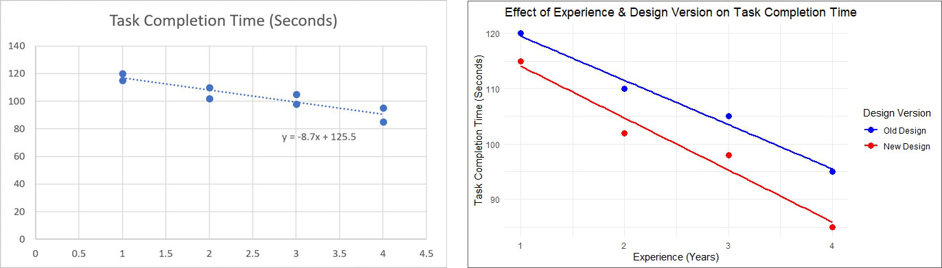
Here are the main reasons I prefer the R plot in this case:
1. Clearer Distinction Between Groups
Excel's Plot (Left): Only displays a single trendline, making it impossible to distinguish between the old and new design versions.
RStudio's Plot (Right): Uses two separate trendlines (blue for old design, red for new design), allowing for a direct comparison of task completion times across experience levels.
2. Better Data Visualization
Excel: Only plots a single linear regression without differentiating between groups.
RStudio: Uses color coding to separate the two design versions and individual data points to show the actual observations. Also, the legend clearly labels which line corresponds to the old vs. new design, making the data interpretation more intuitive.
3. More Accurate Regression Interpretation
Excel's trendline equation (-8.7x + 125.5) applies to all data points, but it doesn’t account for the different design versions. This could lead to misleading conclusions because it assumes a single trend for all users.
RStudio provides separate regression trends, which allows us to see that while both designs show improved task completion times with experience, the new design (red) is consistently faster.
4. Axes and Labels
Excel’s out-of-the-box x-axis starts at 0.5 instead of 1, which makes the first data point visually shift, potentially leading to misinterpretation.
RStudio's x-axis starts at 1 which is best practice. This makes the scale more natural and easier to interpret and aligns better with the dataset’s actual range.
RStudio's title is more descriptive, helping the audience understand the relationship between experience, design version, and task time at a glance.
5. Customization and Presentation
Excel’s plot lacks customization, offering only a basic scatterplot with a single regression line.
RStudio’s ggplot2 customization makes the visualization more precise, with adjustable labels, colors, and grid lines to enhance readability.
If you need a quick and dirty trendline, Excel works fine. But if you want to clearly communicate nuanced findings, RStudio is the way to go.
Which One Should You Use?
Excel is great for a quick, no-code analysis, especially when you need a simple regression without complex statistical validation.
RStudio is the better choice when you need statistical significance testing, reproducibility, and visualization options, especially for larger datasets.
If you're already using RStudio for UX research, running regressions there is a no-brainer. But if you’re just starting out, Excel is a solid first step before moving on to more powerful tools like R.
Conclusion
Regression analysis is one of the most useful tools for UX researchers who want to move beyond anecdotal observations and into hard data. Whether you're testing a new design, measuring learning curves, or identifying performance bottlenecks, regression can help quantify relationships and support your recommendations with evidence.
For quick checks and small datasets, Excel works fine. But if you need to validate findings, automate analysis, or handle larger datasets, RStudio is the better choice.
If you're already using Excel for regression, try running the same analysis in RStudio and compare the experience.
You'll get wayyyyyy better data to work within the same amount of time.
If you've never done regression before, start with Excel to get comfortable, then move to R when you're ready for more.
With this approach, you can cut through the noise and answer, "Is the new UX design actually faster?" with real, reliable data. You know, like a real respectable UX researcher! Hahaha.
Extra Resources
If you'd like to learn more about R and RStudio as a UX researcher, I recommend checking out my 12-part tutorial series. Many UX researchers have gone from 0 to 60 with R just by working through these "show, not tell" style tutorials, all set in real-world UX scenarios.
Product Bundling and Recommendation Engines with Market Basket Analysis
Fraud Detection Using Machine Learning with Random Forest Modeling
Prioritizing Features with MaxDiff Analysis (Reader Requested)
Real-World Data Cleaning (Reader Requested)
Creating Reports with RMarkdown (Reader Requested)