

Rethinking Correlation
Why Smart Teams Still Confuse Patterns with Causes

Summary: Correlation is one of the most powerful tools in UX research, but it is also one of the most misunderstood. This article explains how to use correlation as a signal for smarter questions and better experiments without mistaking it for proof of causation.
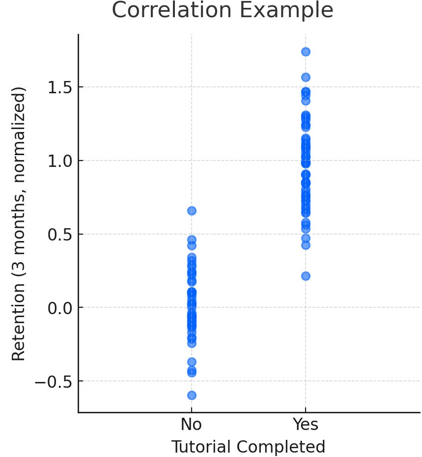
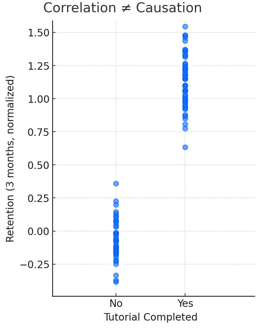
A few years back, I was doing user research on a SaaS app that had a fairly detailed onboarding tutorial for first-time users. In the data, we saw that users who completed the tutorial had much higher retention after three months. Some leaders quickly concluded that the tutorial itself was driving retention, and the immediate recommendation was to make it mandatory for all users.
On its face, that explanation made sense. If people who complete the tutorial are sticking around longer, then the tutorial must be what is driving loyalty. The reality turned out to be more complicated. Later, we learned that many of the people who completed the tutorial were already highly motivated and more invested in understanding the product in the first place. Their higher retention wasn’t necessarily the result of the tutorial itself but a reflection of the type of users who chose to go through it.
This is a good example of how even very smart teams can misinterpret correlation as causation. The danger isn’t in noticing the relationship, it is in assuming you understand what it means. In UX research, those kinds of assumptions can quickly lead to solutions that sound logical but miss the real issue.
Why This Matters in User Research
Most of the time, UX researchers work with messy, real-world data from analytics platforms, surveys, usability studies, and log files, not controlled lab setups. In the wild, correlation is often only what we have to work with. It is the signal that tells us where something interesting might be happening.
That signal, however, can be misleading and is often misinterpreted.
Stakeholders, and sometimes researchers themselves, are quick to leap from correlation to causation.
Something like this sound familiar? “Users who click ‘Learn More’ are more likely to convert, so adding more ‘Learn More’ buttons will increase conversions.” Maybe, or maybe the users who were going to convert were already motivated enough to click the extra button.
This matters because correlation is everywhere in UX research, and when it is misunderstood, it can damage credibility and push teams down the wrong path.
Correlation in the Real World
The way I like to think about correlation is as two things moving together in some way. Back to our example, if people who complete a product tutorial also tend to have higher retention, that is a correlation. It does not mean one thing directly causes the other, only that they are related in the data.
In our day-to-day work, correlations show up all the time. These patterns matter because they point us to something worth paying attention to, even if we do not yet know why it is happening.
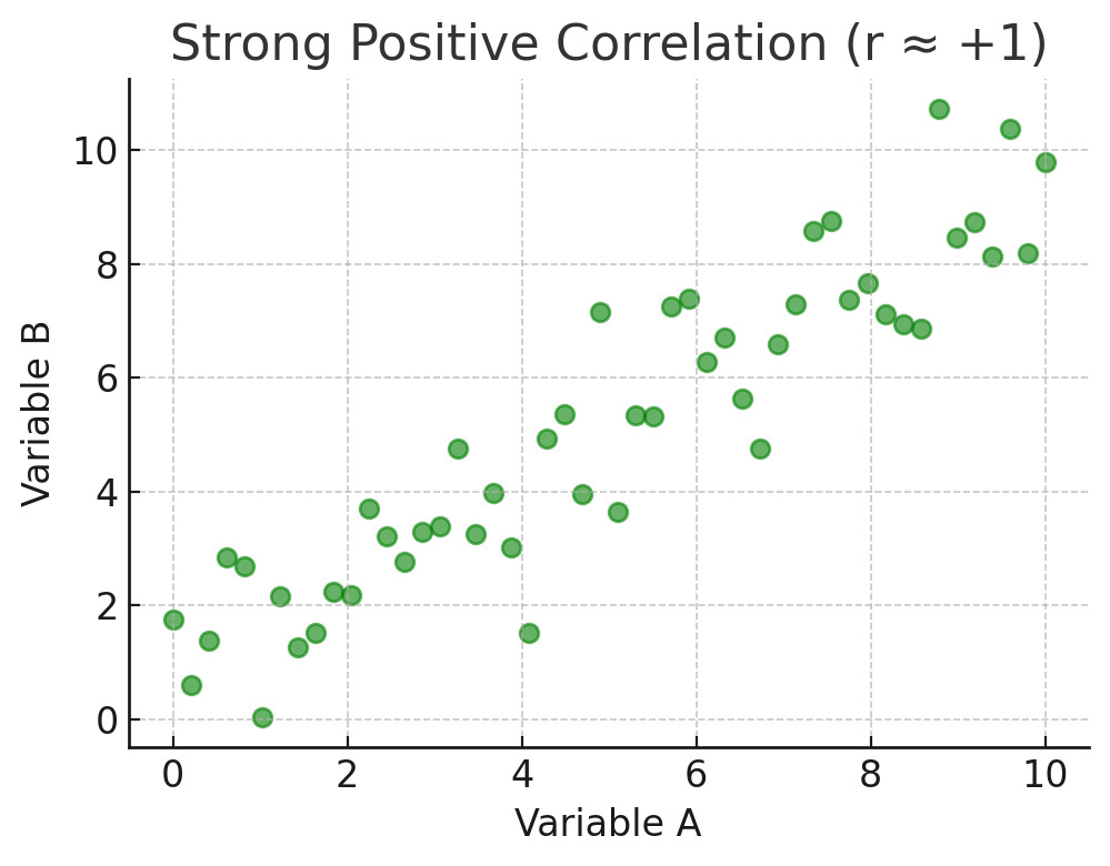
The strength of correlation is often shown with a number called “r,” which ranges from –1 to +1. Think of it as a kind of score for how closely two things are moving together.
If the number is close to +1, it means the two things go up and down together in a consistent way. An example could be the more hours someone spends using an app, the more likely they are to explore new features.

Here’s what a positive correlation looks like. If the number is close to –1, it means the two things move in opposite directions. An example could be the more bugs a user reports, the less satisfied they are likely to be.
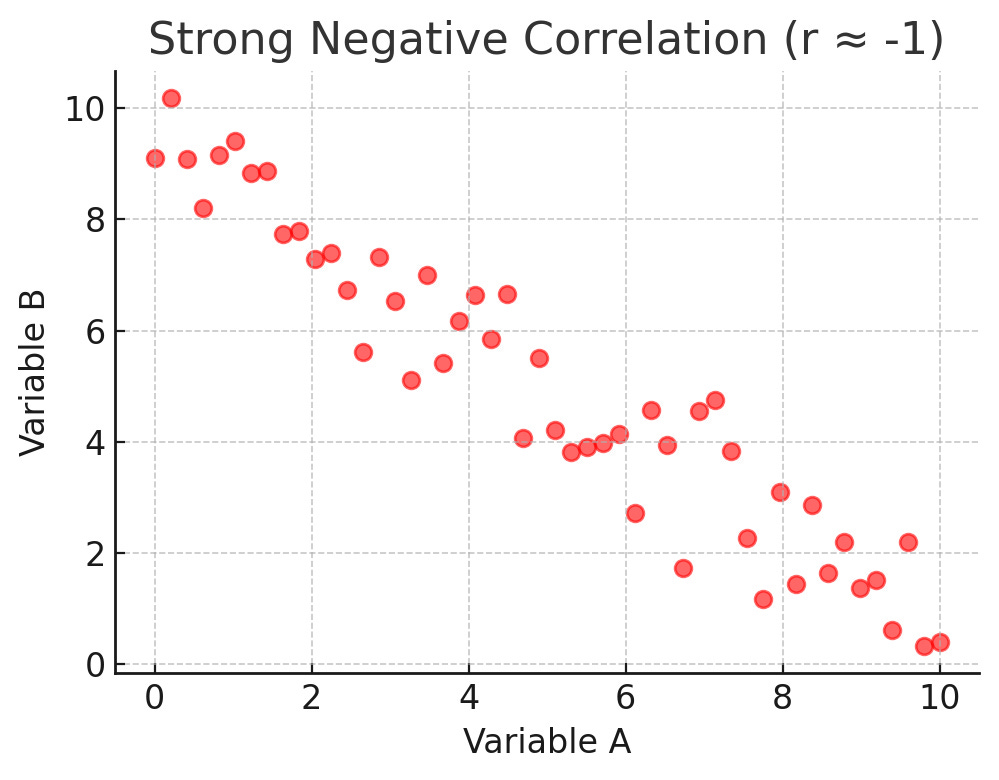
Here’s what a negative correlation looks like. If the number is close to 0, it means there is little or no clear relationship. In other words, the two things are not really connected in a way that shows up in the data.

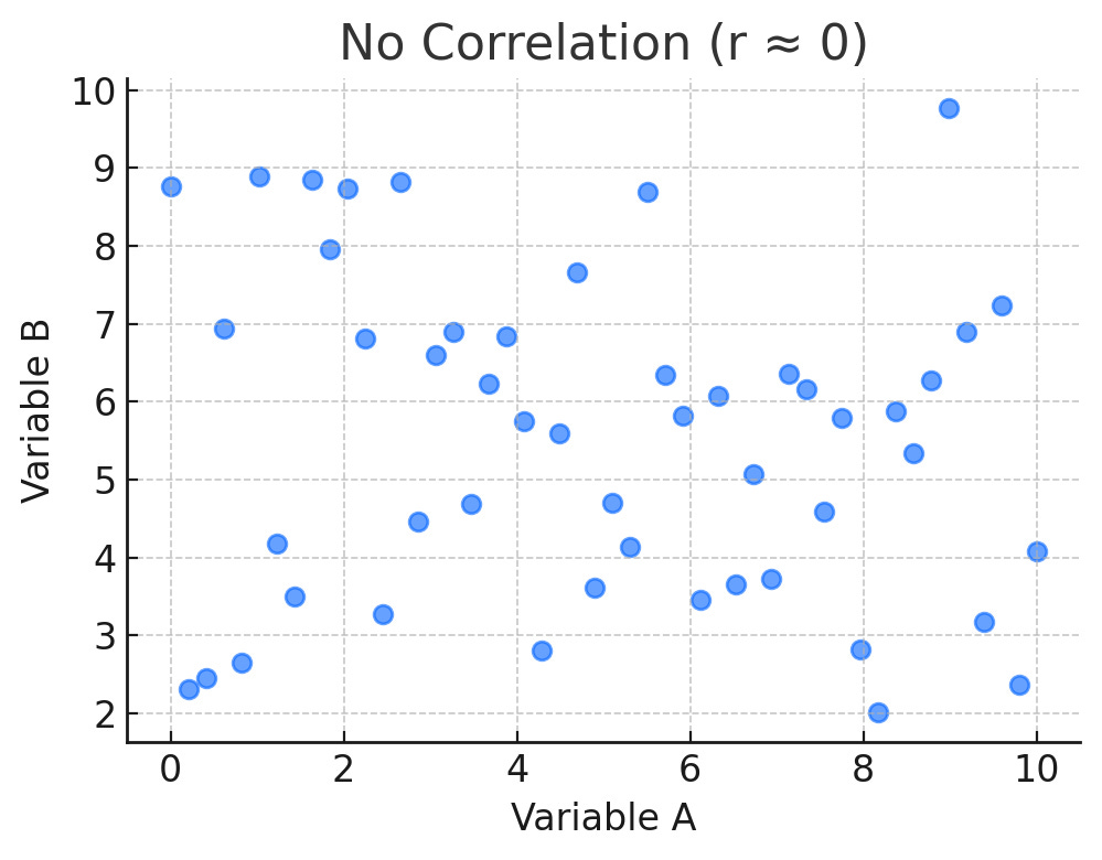
You don’t need to memorize the math. What matters for most UX researchers is the practical meaning. Strong correlations are like signals that point to relationships worth looking into more deeply, while weak correlations are more like background noise that may not be worth much attention.
Mistaking Correlation for Causation
The mistake happens when a correlation is treated as proof that one variable is driving the other. I’m sure if you think back, you can identify many, many times when this mistake has happened to you. In peeps’ defense, it is an easy trap to fall into because the logic seems intuitive. For example, if tutorial completion and retention are related, then making everyone complete the tutorial must improve retention, right? The trouble is, there may be other factors influencing these outcomes. In this case, we found that user motivation and available time likely explain both the decision to complete the tutorial and the decision to stick with the product.
Understanding this distinction matters because the actions you take are very different depending on whether the relationship is causal or not. If a tutorial truly increases retention, you double down and expand it. If the tutorial is just a proxy for motivated users, then forcing everyone through it may actually hurt the overall experience.
The Power of Correlation
Correlation helps us prioritize what to investigate and where to spend design and research time. In the tutorial case, the relationship with retention was a meaningful clue but not proof in itself.
The same applies to Net Promoter Score (NPS). Many UXers hate on NPS because the single question, “How likely are you to recommend...” seems too disconnected, and better standardized sentiment surveys exist. Although I mostly agree with the haters, NPS data has been proven to be closely correlated with perceived usability. This means NPS data is valuable info due to it’s correlation. One largescale study by MeasuringU found that usability perceptions account for roughly one-third of the movement in loyalty, and System Usability Scale (SUS) and NPS rise together with a correlation of around 0.61. Promoters average SUS scores near 82, while detractors average around 67. In practice, teams that push SUS above 80 tend to see more promoters. So the next time you feel like trashing NPS, remember these correlations.
So I always advise not to blindly discard NPS if it is the data you have. I do advocate using a better standard survey type when possible, such as SUS and SUPR-Q, and treat NPS as just another correlated indicator that you can track over time.
So in our onboarding tutorial example, if we suspect that sentiment and a specific behavior are correlated, why not look into it more? If retention doesn’t move, that simply gives you a new question to answer. Correlations like these help set up the next study, identify the right segments to study, and decide which ideas are worth shipping.
How to Talk About Correlation
Where correlation becomes dangerous is in the way it is communicated. Executives and PMs often want certainty, so when they hear that tutorial completion and retention are linked, they want a quick conclusion. That’s how seemingly random decisions like “Make the tutorial mandatory for all users” end up popping up out of nowhere. As a researcher, your job is to frame the insight in a way that makes the value clear without overstating what it means.
That usually means saying something like, “Users who complete the tutorial are more likely to stay engaged. This strongly suggests the tutorial is helping, but we don’t yet know if it’s the reason.” Then, you can propose next steps, like running an additional test to test whether requiring the tutorial actually changes retention. That strategic wording is the secret sauce for success as a UX leader. It is ultimately what you are paid to provide, and it is the best way to show value to our orgs at large.
Visuals can help here too. A simple scatterplot or side-by-side dot plot comparison shows the pattern clearly, while your explanation adds the caution that correlation does not equal causation.
And when stakeholders leap to conclusions, one of the best responses is to reframe: “That’s a great hypothesis. Here’s how we could test it.” This way, you preserve the value of the correlation as a useful signal while keeping the team honest about what it can and cannot prove.
Causation
Proving causation means showing that one thing directly leads to another. In the case of the onboarding tutorial, it would mean demonstrating that completing the tutorial itself increases retention, independent of a user’s motivation, available time, or other variables. The only way to be certain would be to design a controlled experiment, such as randomly assigning some new users to a mandatory tutorial and others to a skip option, then comparing retention between groups.
Experiments proving causation are the gold standard, but they are very rarely realistic in UX. They take a lot of time, coordination, and sometimes engineering work, which teams often do not want to prioritize or do not think is even worth doing.
That is why causation is often more of an aspiration than a daily reality in the real world. Causation is important when the stakes are extremely high, but most of the time, UX research work happens in the middle ground between correlation and causation. In that space, correlation-level evidence is usually strong enough to point teams in the right direction, but not strong enough to stand as empirical proof.
Making the Most of Correlation
So, if you aren’t proving causation, the question becomes, how do you use correlation? The answer is to treat it as a starting point, not an end.
In the tutorial example, the right move was not to declare “tutorials cause retention” but to investigate further. That could mean segmenting the data by user type to see whether the effect holds for different groups. It could mean pairing the quantitative finding with qualitative interviews to ask users why they did or did not complete the tutorial. It could also mean designing a lightweight A/B test to see whether adjusting the tutorial’s length or placement actually changes retention.
As researchers, we also need to watch for confounding factors, which are hidden variables that influence both the supposed cause and the effect. In this case, user motivation was a likely confound, affecting both the decision to complete the tutorial and the likelihood of staying engaged with the product. Calling out these possibilities early helps prevent teams from building strategies on shaky assumptions.
The goal is not to dismiss correlation but to use it wisely. It points you to the right questions, highlights where design changes might have impact, and helps prioritize future tests.
Conclusion
Correlation is not causation, but it is still one of the most useful signals in real-world UX research. In our example, the link between tutorial completion and retention was not technically proven, but it was a meaningful clue about how motivated users engage with a product.
The next time you see a strong correlation in your product data, resist the urge to assume causation. Instead, look for alternative explanations and decide if it is worth more testing. That discipline is what separates rigorous UX research from guesswork.
Have you been blindsided by stakeholders misinterpreting correlation data? If so, DM me or comment here. I’d love to hear your horror stories too. Hahahaha. Thanks, all.