

Stop Weaponizing Miller’s Law
Better Understanding 7 Plus or Minus 2

Summary: Miller’s Law has been consistently misinterpreted in UX for decades. It describes limits on how much information people can hold in their working memory at one time, not how many visible choices should appear in an interface. UX teams should stop using it to justify arbitrary limits on menus and lists and instead evaluate whether users can understand, scan, and navigate the design.
We should all know Miller’s Law by now. Miller’s Law states that people can hold about seven pieces of information, plus or minus two, in their working memory at one time. So it makes sense that we commonly hear statements like this:
“We need to reduce this menu to seven items. Miller’s Law says people cannot handle more than that.”
I have heard some version of this argument throughout my entire UX career, but the problem is that George Miller never said there should be a seven-item limit for lists and menus. In fact, that is not what he researched at all.
Miller’s 1956 research did not study websites, menus, tabs, filters, lists, or groups of controls. Still, UX professionals regularly use it to defend decisions about all of those things.
That is what I mean by weaponizing Miller’s Law. Someone takes a narrow research finding, removes it from the situation in which it was studied, and uses it to give a completely different design decision more authority than it deserves.

What Miller Actually Studied
The part of Miller’s research that gets turned into UX advice was about how much information people can hold in their working memory for a short period of time. The key term here is working memory. Working memory is the amount of information you can temporarily hold in your mind while using it to complete a task. And Miller found that this amount is smaller than people think.

For example, imagine that someone reads you a series of numbers and then asks you to repeat them without hearing or seeing them again. You have to hold the numbers in your mind long enough to give the answer. Spoiler alert, this is pretty much the memory tasks Miller discussed in his paper. Pretty simple and straightforward, right? Don’t you think that is very different from using lists in interfaces?
When a navigation menu is open, the choices are still sitting right there on the screen. No working memory needed. Users can read one label, look at the next one, return to an earlier choice, compare several options, and take their time deciding where to go. They do not have to memorize the entire menu before choosing something.
Miller did not study the ideal number of visible choices in an interface. His research does not tell us the maximum number of links, checkboxes, tabs, filters, or menu items we should show. His findings refer to the number of items you can keep in your mind. Period. That’s it.
With that said, working memory still matters in UX design, but it matters when the interface actually forces people to remember something. A user might need to remember a verification code, carry a number from one screen to another, compare information across several pages, or keep track of a series of steps without being able to see them. That’s called bad design. But those things do not apply to lists or controls. A visible menu is not the same type of problem.
How It Gets Weaponized
I see Miller’s Law misused in 2 ways:
1. A Shortcut
It is often used as a lazy shortcut. For example, a team has nine dropdown menu items, someone says the number needs to be seven because of Miller’s Law, and the discussion immediately shifts to deciding which options to remove or combine.
Nobody even bothers to ask if the items are clear or if the structure matches users’ mental models. You know, the work of UX! Instead, the number gets separated from the context and becomes more important than the designed experience.
2. A Conversation Ender
Other times, Miller’s Law is used to flat-out shut down the conversation. Once someone connects a decision to a well-known psychology study, the decision starts to sound settled. Anyone who questions it can appear to be arguing against established research, and their intelligence may be implicitly called into question. As a result, it can feel riskier to push back than to simply accept the statement as fact. This is a perfect example of weaponizing an idea.
The process often looks like this:
The team has a difficult design decision.
Someone brings up Miller’s Law.
Seven becomes the target.
Options are removed, combined, or hidden.
The team assumes the design is now easier to use.
At no point does anyone need to show that the original design was confusing, or that the new design works better.

The research is no longer helping the team understand users. It is being used to defend a preferred design decision.
4 Is Not the New Target
More recent research often places working-memory capacity closer to three or four items under certain controlled conditions. That does not mean designers should replace a seven-item rule with a four-item rule. Please, God, no! Nested misinterpretations of this research would be 2x as difficult to untangle in the real world. We still have enough trouble with the misinterpretation of the original findings. Hahahaha!

How much someone can remember depends on the information, how familiar it is, whether it can be grouped, how long it needs to be remembered, and what else the person is doing at the time. It also matters whether the information is visible and remains available to the user.
Studies have shown that someone might struggle to remember four unfamiliar numbers after they disappear. That same person can then turn around, easily scan 20 familiar list-item labels that remain visible, and complete a task without difficulty.
That said, a user might also struggle with only three choices when the labels are vague, the categories overlap, or none of the options match what they are looking for. Changing the number of items does not fix the problem!!! The mistake is treating research about working memory as a universal limit for visible interface elements.
The Mega Menus Example
Mega menus are one of the clearest real-world examples of why a seven-item limit does not make sense.
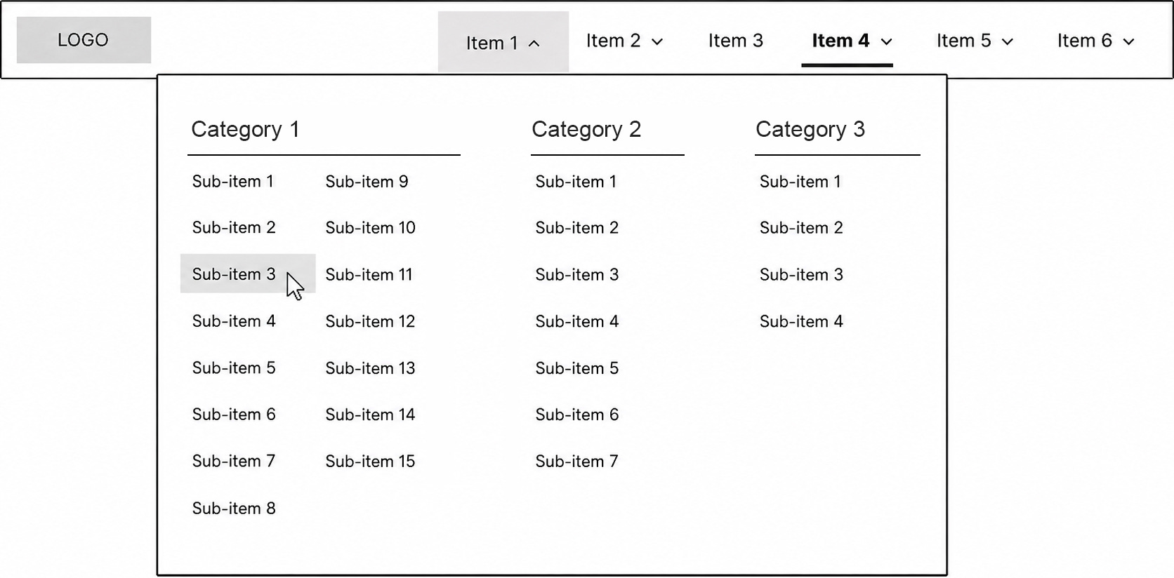
For decades, websites have successfully used mega menus containing far more than seven links. When those links are grouped into a few clear categories, organized around users’ mental models, and labeled with familiar language, people can scan long lists and find what they need without much difficulty. And it has been shown that the number of links in a category matters way less than creating user-centered categories in the first place.
The menu may contain dozens of choices, but remember users are not trying to memorize all of them. They are scanning headings, narrowing their attention, and looking for the words that match their goal. That’s the real world.
A long menu can still be badly designed, of course. Too many unrelated links, unclear headings, inconsistent categories, or vague wording can make any structure difficult to use.
The point is not that more choices are always better or worse. It is that the total number of items tells us very little by itself.
Instead of asking whether a design follows Miller’s Law, ask better questions:
Do the labels make sense to users?
Do the categories match how users think about the information?
Are similar choices clearly separated?
Are important items easy to find?
Can users quickly scan the list?
Are any categories too broad or too vague?
Are we hiding useful options just to reduce the total number?
Does combining items make the structure harder to understand?
Can users successfully complete their tasks with this structure?
🔥 Pro tip: Usability testing, tree testing, card sorting, search data, and behavioral analytics can help answer those questions.
So, the next time someone brings up Miller’s Law during a design discussion, try responding with something like this and see how it goes:
“Miller’s research was about remembering information that was no longer visible. It was about the number of items a user can hold in their working memory, not how well they can navigate a visible list. These choices will remain visible, so I recommend that we evaluate whether users can understand and navigate this specific structure.”
Hopefully, that brings the discussion back to the design in front of the team instead of allowing a misinterpretation of Miller’s Law to end the conversation.
Conclusion
Miller’s Law does not tell us how many choices to show in our interfaces. Using Miller’s Law this way makes the decision sound more research-based than it really is.
The bigger lesson here is to make sure the research studied the problem you are trying to solve before citing it. Duh! A well-known study can still be misapplied, especially when its findings have been reduced to an oversimplified law.
Have you seen Miller’s Law used to justify a design decision that had little to do with working memory? I hope this article helps you approach that conversation differently. Thanks for reading.