

The Problem With Split Buttons
My "Famous" Split Buttons Rant

Summary: Split buttons keep failing in the real world because they hide options behind a tiny, low-discoverability target and break the common mental model of one button, one action. Decades of research have already proven this, yet many UXers still insist on using them.
Split buttons almost always harm usability and accessibility. That's a statement that has gotten me into many debates over the years, but it's not a hot take. It's a fact backed by decades of moderated studies, analytics, and well-documented HCI research. I recently had three e-commerce clients ask me to "validate" their split buttons after I recommended they adopt a more standard and intuitive UI pattern. Curiously, all three pushed back on the evidence I provided. They pointed to competitors, made unfounded claims about how their users are special, and one even said, "I don't think our users will have any trouble with split buttons because they are on our site all the time." The funny part is that during a quick demo, that same person mis-clicked the dropdown indicator arrow icon themselves. (A natural study proving my point in real time. Hahahaha)
In one of the cases I did run a formal usability test and guess what happened? Their user struggled with the split button just like the rest of humanity. We were testing the end-to-end purchase workflow, not just the split buttons, and the findings were eye opening to them. What finally changed their minds was seeing with their own eyes that the foundational research I cited had accurately predicted real world behavior. Its a shame it came to that, but I will tell you what, those folks are now lifelong converts to my take on split buttons.
They got to watch video after video of participants treating the control as a single button. They got to witness the tiny dropdown indicator arrow icon being interpreted as only decorative. At one point this client even tried a few rounds of aesthetic-only adjustments to better emphasize the separation of the two actions within the single button visually, but those changes didn't alter end-user behavior at all. The client spent a lot of money learning a well-known best practice. This is what prompted me to decide to write this post.
What Are Split Buttons
Split buttons are exactly what their name sounds like they are. Split buttons look like single-button UI element, but they’re “split” into two parts and offer two separate functions. They are buttons that combine a primary labeled action with a small dropdown indicator icon, usually a down arrow, that reveals related options in a menu.
The problem with them is simple. They look like standard select controls that are more pervasive and that users interact with more often.
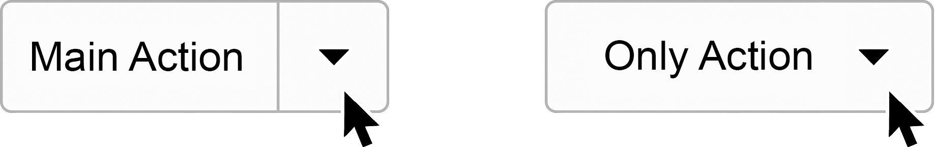
📝 NOTE: You might be looking at the image above and thinking, But Trevor, that looks pretty obviously like two separate interaction points to me. Out of context that is true. This is why we cannot rely only on static designs. We need to see how real people behave when they use them.
When this design is placed in a real task-based workflow, it consistently fails. Imagine you are on a site trying to order a specific product. You click the “Add to Cart” button, but instead it opens a dropdown with options for other items you did not need or want. Sound familiar? Anything like this ever happen to you?
On paper, it seems like an efficient use of space. One UI control with two functions, neat and tidy, just the way aesthetic-only UXers like it.
Stakeholders also tend to like split buttons because they let them avoid making hard decisions about priority. "Wait, we can put every possible action in one button? Cool, let's do that!" Hahahaha
I'm guessing this is why split buttons show up all over in e-commerce land. Someone wants a single action like Add to Cart, but they also want to expose extra paths such as Save for Later, Add to Wishlist, or Buy With a Different Payment Method. The split button feels like a compromise that saves space. Unfortunately, saving space is not the same as reducing cognitive load, and in the modern tech landscape, the cost of this compromise is real.
Here are two of the most common types of split buttons I see in the real world:
Primary action controls - UX designers often use split buttons when they cannot decide which actions deserve priority. Instead of placing two clear buttons side by side, they merge everything into one control and hide alternate options under the arrow.

Navigation menus - Many sites use split buttons for their main navigation bars, often tied to mega menus. This is especially painful on mobile, where tapping the label leads to one place and tapping the tiny arrow expands a submenu. The outcome is confusion, mis-taps, and the sense that the site/app is broken.
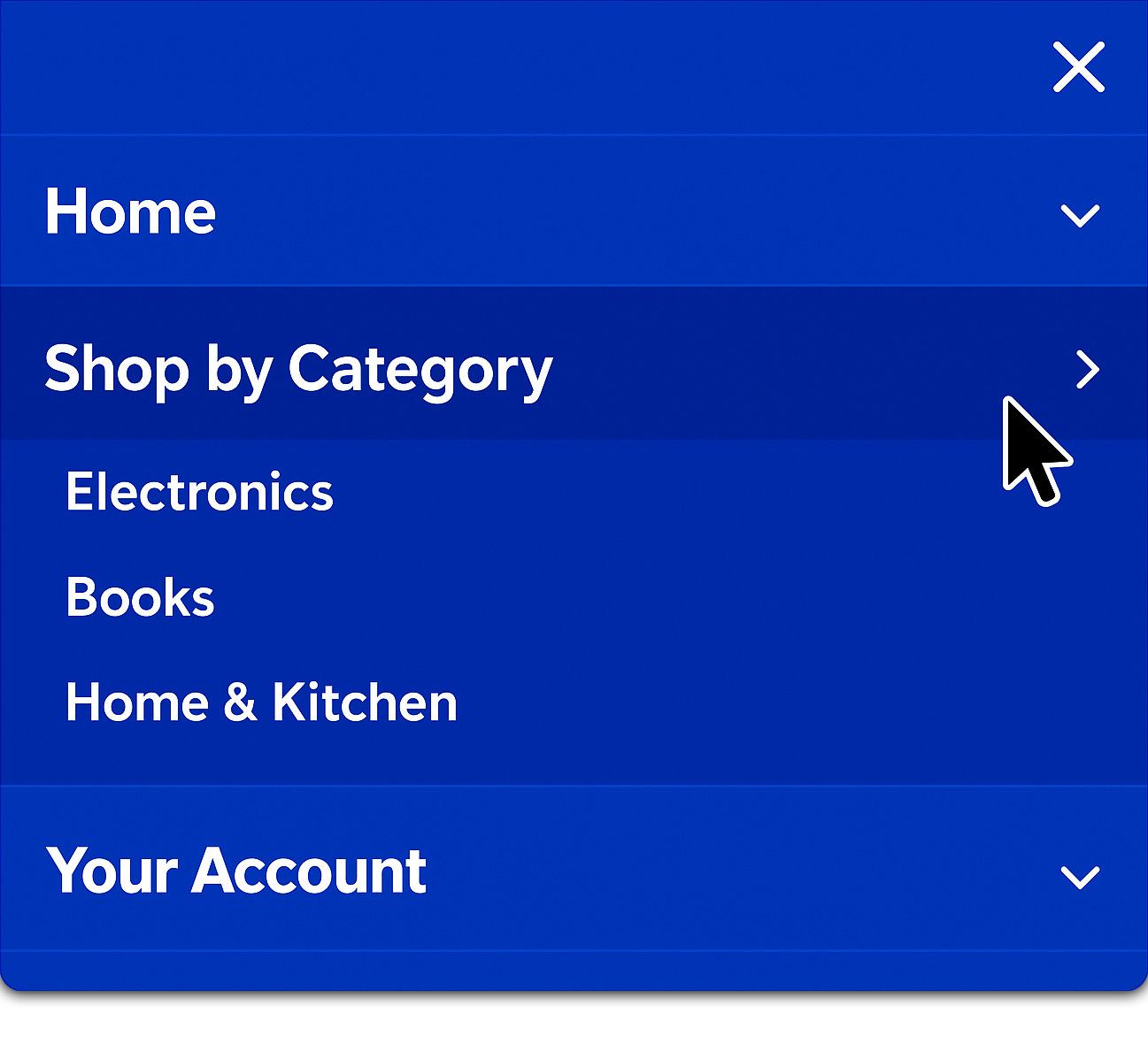


📝 NOTE: This prime nav. version of split buttons is especially egregious. I’ve seen hours upon hours of footage showing real users not understanding that the arrow opens a submenu in designs just like this example. Now that I’ve shown you this, you’ll see it everywhere. I bet millions of wasted user hours can be attributed to people selecting the label not knowing their were more specific options under the arrow icon.
What Keeps Failing
In my most recent tests, about 80% of participants clicked only the labeled side of the split button, never realizing there was more functionality hidden under the arrow icon. And of the other 20% who selected the dropdown indicator arrow icon, many of those clicks were mis-clicks that left users confused when a menu appeared unexpectedly.
The most honest comments were also the most damning, "If that was supposed to be two buttons, I totally missed it."
That quote summarized the core problem perfectly. The split button control violates a simple mental model that the web has reinforced for decades, one button equals one action. When this basic expectation isn’t accommodated, users hesitate, slow down, and begin to doubt what other buttons will do. That hesitation carries real costs in a conversion flow.
This breakdown becomes even more severe on mobile. A split button crams two undefined hit targets into a space where fat-finger errors are already common. Shrink the arrow and remove hover states, and you'll see the error rate go way up.
Screen reader users encounter another layer of frustration when the arrow is not clearly exposed in the focus order or labeled properly. The result is a control that increases interaction cost for everyone and blocks some people entirely.
So if the argument of proven bad usability doesn’t persuade you, then maybe the fact that this UI pattern is often outwardly discriminatory will.
Why Teams Like Split Buttons
So if we have decades of research proving split buttons are hard to use, why does this pattern keep showing up everywhere? I have identified two main reasons.
Aesthetics - Split buttons look clean. You can hide a lot of actions into one control, offering an interface that appeals to design sensibilities overly focused on appearances alone. That aesthetic appeal makes an interaction that is messy in practice appear sleek at first glance.

UX isn’t art, it needs to work in the real world. Competitive mirroring - Teams often point to peers and competitors who use the pattern, which gives a false sense of safety. Jakob's Law is often cited here, but it is misapplied. The law states that users prefer familiarity because "users spend most of their time on other sites," so they expect your product to work similarly. It does not mean repeating bad design patterns is a good idea. If the prevailing model for buttons on the web is that a label triggers a single action, then split buttons contradict that model.

Both justifications are understandable. They stem from a desire not to overwhelm stakeholders with too many choices or too many visible interaction points. But neither justification prioritizes what users need most which is clarity. Aesthetic cleanliness and the illusion of simplicity are poor trade-offs when people are forced to slow down, hesitate, or misinterpret what a control will do. NN/g's guidance on progressive disclosure makes this very clear. Rarely used features should be deferred or simplified, not hidden behind ambiguous controls.
What to Use Instead
Trust me, you do not need a clever novel control. What you need are clear, predictable choices that match how people think and how they move through tasks. Patterns that have tested well across many products all share the same basic principle.
Show common choices directly and move rare choices into a single, predictable location. This approach keeps the number of selections low for the typical path and reduces surprises for everyone else.
Here are simple, proven UI patterns:
Primary button plus a secondary button - Use this when two actions are both frequent. Keep the primary visually dominant and give the secondary a clear label. Most importantly, place them side by side as separate buttons, not connected inside one control. People succeed faster because there is no hidden behavior to discover.
Primary button plus a plain menu button - Use this when one action is frequent and a few related actions are rare. A menu button has one target and one behavior, which removes the guesswork of which side to select.
Inline options as visible chips or buttons - Use this when the "option" is the decision itself, such as size, quantity, or shipping speed. If users need to choose it often, expose it directly.
Step-in flow on mobile - Use this when there are several related actions that would crowd the page. Let the primary action move the user forward, then present the full set of related options on the next screen with large, accessible targets.
Each of these patterns respects the one button, one action expectation. Each provides space to meet target-size requirements without squeezing two behaviors into one tight space. Each is easy to explain to a stakeholder who wants to know what will happen when a user goes to select something.
⚠️ Disclaimer: There is one rare situation where a split button can make sense. It happens in repeat-use desktop software with power users, where a single command is used far more often than the others. In those cases, a split button can speed up experts without harming novices.
Even then, it only works if all of the following conditions are met:
The default action covers the vast majority of use.
The visual divider is always visible.
The arrow and label both meet modern target-size guidance.
Labels use clear text, not icons alone.
It is never used for navigation.
If any of these conditions are not true, the safer path is to use two separate buttons side by side.
The Split Button Debate
I thought it would be helpful to share how, earlier in my career, I mishandled the communication part of the split button debate. My hope is that by telling you how I messed up, you will be less likely to repeat my mistakes. I once told a product manager that split buttons "just don't work" and then fired off links to NN/g articles as proof. The problem was not the evidence, it was the way I delivered it. I made the team feel like they were being lectured rather than supported. As you might guess, that didn't win over anyone's hearts and minds. Instead, they just dug in deeper. That experience stuck with me, and over time, I realized that if you want to influence design decisions, you have to meet teams where they are.

The better way is to ground the decision in frequency. Start by asking everyone to write down the single most common action for the screen. If the next most common action is nearly as frequent, expose both as separate buttons side by side. If it is not, keep one clear primary action and move the rest into a single menu button or a step-in screen. This method keeps the discussion focused on actual user behavior rather than abstract design debates. And if someone starts arguing that "users will learn the arrow's behavior over time," that is your cue to remind the group that you are no longer talking about user tasks, you are talking about user training.
Any UI element that requires training for users to figure it out is already a failed design.
Sometimes you will still face resistance. If a stakeholder still insists on keeping the split button, measure it honestly instead of trying to convince them you are correct.
The easiest way to do that is to track the details that reveal how the control performs in the real world with real users:
Separate label button clicks from arrow icon button clicks.
Track mis-clicks and immediate backtracks.
Compare completion times against a design that uses two explicit buttons.
Watch mobile closely, because that is where error rates spike.
If arrow usage is low or mis-clicks are high, you have the hard evidence you need to argue for change.
The final piece is to close the loop with teams in a way that avoids the mistake I made early on. Do not just say "the research proves it." Show them the behavior. (The "show-not-tell" model seems to always work better.) Play clips of real users pausing, sighing, and mis-clicking. Recommend alternatives that preserve a clean look but avoid hiding functionality. The safer bet is always the pattern that produces the most predictable outcomes, not the one that looks neat in a screenshot. When a team sees the gap between how they thought the button worked and how it actually slowed down a real person, the argument tends to resolve itself.
Split Buttons Checklist
Here's a quick checklist you can use in your own work. I learned some of these lessons the hard way, so consider these shortcuts to help you communicate the right solutions without repeating my mistakes.

Ask if two separate buttons side by side would solve the problem more clearly.
Confirm the single most common action for the screen and expose it as the primary button.
If a second action is nearly as common, show it as its own button, not hidden in a dropdown.
Move rare actions into a single plain menu button or a step-in flow.
On mobile, make everything one tap equals one action. (Remember, hover doesn't exist on mobile.)
On mobile, check target sizes against accessibility guidelines to avoid fat-finger errors.
When in doubt, test with real users and measure arrow usage, mis-clicks, and hesitation.
Conclusion
We have known for years that split buttons underperform on the web. They hide options behind small targets, break a simple mental model, and slow down mobile users who just want to finish a task. My latest projects did not teach me anything new. They simply confirmed what the discipline already understands and what the literature has said for a long time.
The real surprise is how often a pattern like this still ships, usually because it looks clean or because a competitor uses it. If you care about clarity, surface frequent choices directly and put the rare ones where people expect them. If you believe your case is the exception, measure it carefully and be ready to replace the control when user behavior tells you the truth.
Most of all, ask yourself whether all this fuss is worth fighting for just to add the rare split button that might serve users well, or if it is better to go with what we know will work and focus on bigger things. My guess is your stakeholders would ultimately prefer to spend less time on novel interaction experiments and more time building things that work in the real world.