


Summary: Too many teams are calling concept tests usability tests. This article explains how that mix-up leads to fake validation, wasted user time, not the best data, and what to do instead.
I've noticed a pattern over the 19+ years I've been doing UX. A UXer says they ran a usability test, but when you look at the study, it turns out they just showed users a design and asked, "How do you think this would work if it existed?" or worse, "Do you like this?"
That's not a usability test. That's a concept test. And while concept tests aren't exactly useless, they're not giving you the kind of insight you probably think you're getting. The issue is that we're burning through limited time with real users and getting back... feelings. Or as the kids say these days, vibes. Hahahaha. And mostly just guesses about future behavior. Aka. Data that isn't that useful in the real world.
Moderated usability testing, on the other hand, is a behavioral research method. It's designed to help you understand how someone goes about actually completing a task in the real world, not whether they think they could do something in a contextless, hypothetical vacuum. That distinction matters a lot more than most teams realize.
If you've got access to users, and you're going to spend the time and money to study them, you might as well conduct the kind of research that shows you what they do, not just what they say. This post is about why moderated usability testing should almost always be your default method for answering research questions like this.
Why Moderated Usability Testing Works
Moderated usability testing isn't some new PM-style agile ritual. It's a method born out of behavioral science. The earliest versions were rooted in cognitive psychology and human-computer interaction, not marketing, branding, or the recent surge of pseudo-research coming out of product management. Researchers like John D. Gould, Clayton Lewis, Jakob Nielsen, and Robert Virzi weren't interested in opinions. They were focused on how people actually behaved when they tried to use a system.
That's still the gold standard of user research today. A proper usability test shows you what real users do when faced with a real goal in the real world. It exposes friction, uncovers decision points, and highlights the gap between how something is designed and how users understand it.
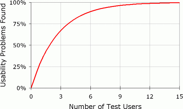
And, you don't need a bunch of study participants to get good actionable data. Virzi's research in the early '90s found that just 4 or 5 participants were enough to uncover around 80% of the usability issues in a given interface. That finding has held up for decades.
So if you're only going to test with a few people (which, let's be honest, is almost all the time), you want to get as much value out of that session as possible. Moderation is what makes that a reality.
Also, with a live moderator in the mix, you're not just collecting screen recordings. You're seeing mismatched mental models in real time. You're catching the workarounds, the pauses, the "I thought this would..." moments that no unmoderated tool is going to give you. And you can adjust on the fly.
With moderated usability testing, if something is clearly broken in your design, you don't have to wait until test number 12 to realize it.
You're watching the breakdown happen right in front of you. And after the task-based testing is over, you can ask follow-up questions about moments when participants hesitated or fumbled. And of course, after all of that, you can still ask what they think about something if you want to.
That kind of data, which is observed behavior in context, is exponentially more valuable than a sentence or two about what someone thinks of a design. When it comes to user-centered design, behavior is almost always the most important thing we can learn about.
What Good Looks Like
A real usability test isn't just "talk to a user and hope something insightful happens." It's structured. It's deliberate. And it starts before anyone even touches a screen.
Step one is figuring out what people are actually trying to do. That means doing a task analysis. You don't start with the UI. You start with the user goals. What are the top tasks this product is supposed to support? What does success look like in the real world?
That task list becomes the foundation of your test. And this is where a lot of usability tests go off track. People write the wrong kind of instructions.
1. Bad instructions describe the interface. They steer users toward the "right" answer without meaning to.
Examples of poor task instructions:
"Click the download button."
"Find the profile page and update your settings."
These are not usability tests. They are guided tours.
2. Good instructions focus on intent. They describe what the user wants to achieve, without giving away how to do it.
Examples of better task instructions:
"You want to keep a copy of this for your records."
"You need to change something about how the system notifies you."
That might sound easy, but here’s the advanced part. You also want to avoid using words that appear in the UI itself.
Why? Because users will naturally try to match the wording. They will scan the screen for anything familiar, find that word, and click. Not because the interface made sense. Not because they understood the flow. But because your task wording gave them the answer.
If your task says "download" and there is a "Download" button on the screen, you are not testing usability anymore. You are testing their ability to match words. Believe it or not, I see this error made by moderators all the time, even by senior-level UXers.
Sometimes that is hard to avoid, and that is okay. But if you can find a way to describe the task without repeating UI text, do it. Frame the instruction based on why the user is doing something, not what they are supposed to click.
This level of care in test design makes a big difference. You are no longer asking if users can follow directions. You are asking if they can figure it out on their own. That is the entire point of usability testing.
Thoughts on Concept Testing
Concept testing has a place in the world of UX research. Sometimes you're working with early-stage ideas. You want to know if the general direction makes sense. That is a reasonable question. That is when a concept test can help.
But most of the time, teams use concept testing in situations where usability testing would give them much better data.
A concept test is when you show someone a design and ask questions like:
"Walk me through how you imagine this would work."
"What do you think this button does?"
"Would you use something like this?"
The answers to these questions can feel helpful. People will nod along, say "yeah, that makes sense," and often start offering suggestions on how to "fix" your design. But here is the problem. You are not learning whether the design actually works. You are asking if they like the idea of using it.
That is a big difference. One is hypothetical. The other is behavioral.
The danger is that concept feedback often sounds confident. People will say they understand something even when they do not. They will say they would use something when they probably would not.
We have known this in UX for decades. Self-reported behavior is not reliable.
People are terrible at predicting what they will do later, especially when they are trying to be agreeable or helpful in a test session.
That is why moderated usability testing gives you a better signal. It asks people to actually use the thing. And when they cannot, you find out exactly where and why it breaks down.
As I said earlier, I am not here to throw out concept testing completely. There are legitimate use cases. Comparing two very different design directions, checking base assumptions, or exploring how people explain an idea back to you can all be useful. But those are exceptions. I'm arguing concept testing should not be the default method.
So if you have access to users and you are setting up time with them, ask yourself this. Do I want them to describe a thing, or do a thing?
The Confusion
A big part of the confusion around usability testing comes from how the word gets thrown around. People will say, "We did a usability test," when what they really mean is that they showed someone a design and asked what they thought. And the biggest misunderstanding that comes out of that is the idea that you can prove a design is intuitive by running a concept test. Spoiler alert, you can't.
Real intuitiveness is not a feeling; it is a measurable outcome.
It is not about what a user says they understand. It is about whether they can actually figure something out without training, help, or hand-holding. That is what usability testing is for.
Real usability testing is about watching someone try to complete a task using your design. You do not give them clues, and you do not guide them toward the right answer. If the design is intuitive to them, they will succeed. If it is not, they will hesitate, make mistakes, or get stuck.
But because concept testing feels fast and easy, people treat it like a shortcut to the same kind of data you’d get from a usability test. I have seen teams run a concept test, show a static screen, ask a few questions, and then report back, "Users said the design was intuitive." That might sound promising. The problem is, it is absolutely meaningless.
Just because someone says something looks intuitive does not mean they would know what to do with it in practice. They are 100% guessing. They are trying to be helpful. They are filling in the blanks based on what they think should happen. And when teams take that kind of soft feedback and treat it like real usability validation, the quality of the output suffers.
Even worse, it creates a false sense of confidence. People believe they have tested the usability of something, when all they have done is ask for opinions. It is the research equivalent of a placebo. It feels productive, but it does not actually teach you anything that useful.
Here is a quick gut check. If you are doing any of the following, you are probably running a concept test, not a usability test:
You're asking, "How would you imagine something working?"
You're asking, "What do you think of this?" or "Would you use this?"
You're gathering quotes instead of observing actions.
You're testing a design that users aren't interacting with.
You're reporting "everyone thought it was intuitive," without anyone having actually used it.
Again, concept tests aren't useless. They're fine for directional feedback, especially early in the process. But they are not testing for the usability of a design.
Treating concept tests like usability tests has caused more harm than good. It gives teams a false sense of confidence, with designs that seem validated but haven’t been proven through actual use.
Conclusion
If you're trying to learn whether a design is intuitive, usable, and capable of supporting real user tasks, then you need to observe people using it. That means a real-deal, old-school usability test. Anything else is just guessing.
So, the next time you're planning a study, ask yourself what kind of insight you really need. If you want to know whether people can use your design without friction, then give them a realistic task and watch what happens.
If you are going to take up someone's time for a research session, make it count. Do not walk away with vague opinions when you could be getting real evidence.
The only way to know if a design is intuitive is to stop talking and start watching.