


UX Research Starts with Tasks
A 3-Step Plan to Ground Research in Real Behavior

Summary: Learn a practical, research-backed method for creating a Top Task List that anchors your UX work in real user behavior. This simplified approach to task analysis helps teams focus their research, streamline usability testing, and design with confidence, even when working under tight deadlines.
I first learned how to do a full task analysis the old-fashioned way. I was working on a massive enterprise tool. It was one of those internal platforms that had grown layer by layer over 10 years of backlogged feature requests and last-minute stakeholder asks. It was a product that looked like it had never once been designed around the actual work users needed to do. Don't judge. It was the early 2000s. Hahahaha
So, I did what they teach in the foundational HCI literature. I ran contextual inquiries, observed real users navigating complex workflows, and broke those workflows down into granular subtasks. I drew diagrams, mapped dependencies, and traced each user's goal back to the specific interface steps they had to take to accomplish it. It was time-consuming, sure. But it was also eye-opening. We uncovered tasks that looked nothing like what the product team assumed. We found repeated workarounds, skipped steps, and even complete tool-switching to external systems. All of it lived under the surface until we broke things down and made the actual work visible.
This is what a traditional task analysis is designed to do.
At its core, task analysis is a method for understanding what users are trying to achieve, how they go about it, and where the system helps or gets in the way.
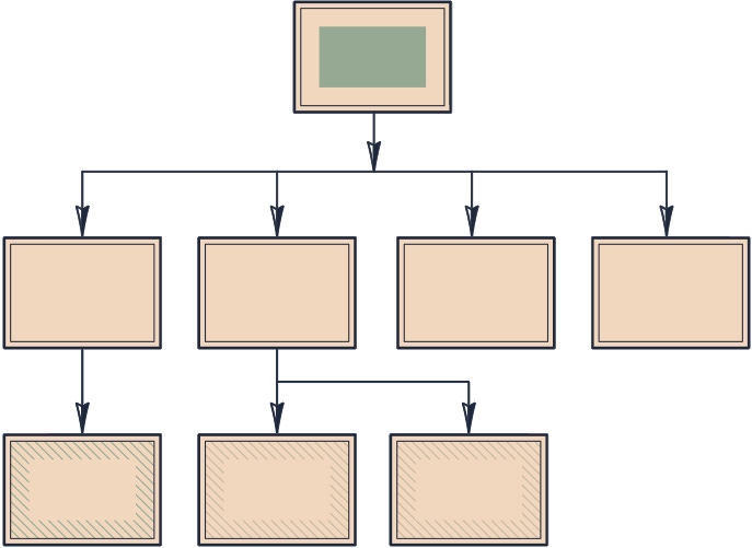
It's a structured approach rooted in old human-computer interaction research methods called Hierarchical Task Analysis (HTA).
Peter Hornsby described HTA as a method for exposing every decision point and manual step a user must take, even when those steps seem trivial. The Interaction Design Foundation outlines a task analysis process that guides teams through goal identification, step-by-step decomposition, and flow diagramming, all with the intent of aligning the system to the user's mental model. And as Oleksandr Sukholeyster argued in his piece on task-driven UI design, task-based thinking is essential to avoid falling into the trap of CRUD-based interfaces that support data but not decisions. Together, these resources show that task analysis isn't a nice-to-have. It's a cornerstone of truly usable, enterprise-grade design.
The only problem is conducting a traditional task analysis is slow. It takes a lot of planning, cross-functional alignment, and time in the field. In an ideal world, we'd all be doing it. But I've rarely worked in an ideal world. I've worked with shipping deadlines, budget constraints, and teams who needed research answers fast. I work in the real world.
So I created a faster method. Something that keeps the spirit and structure of formal task analysis but trims it down to the parts that matter most. I call it the Top Task List. (I'm sure I didn't come up with this name, but that's what I was told these are called.)
This approach draws inspiration from Jakob Nielsen's concept of discount usability. It's a method for getting high-quality insights with lower effort by focusing on what matters most. A Top Task List applies the same idea that make task analysis great. It gives you a fast, practical way to figure out what users are trying to do, which tasks are most important, and most importantly how to design or future UX research around them.
The Process
I use a simple 3-step process to quickly identify an interface's Top Task List. Usually, I walk the primary stakeholders through it in a short working session. Here they are:
Step 1: Identify the Most Common Tasks
Start by figuring out what users do most often. Think about the 80/20 rule. A small number of workflows usually account for the majority of user activity. These are your high-frequency, high-impact tasks.
The best way to do this is with real data. Use product analytics, telemetry, click tracking, or whatever logs you've got. If you don't have analytics or usage data, go straight to the source. Try a few quick, guerrilla-style contextual inquiries. Spend time quietly observing real users work in your product. Even an hour or two of observation across a few users can reveal the top workflows that actually matter and cross reference those with your stakeholders to make sure all the business needs are accommodated as well.
💡 Pro Tip: When it comes to this step, don't guess. Don't ask users to guess either. Go get the real deal data in any form you can.
Step 2: Add the Most Critical or Risky Tasks
Next, you need to cover the edge cases that matter. Some tasks may not happen every day, but when they do, they carry real weight. These are often compliance-related, time-sensitive, or high-risk actions. For example, maybe there's a screen buried in the system where a user can permanently delete a record. Or maybe there's a task that kicks off a workflow for a dozen other people. These tasks may not show up in your common tasks list, but they belong in your research plan.
You're looking for anything that's essential to the system working or for the user getting value out of the product. Think of it like this: If something going wrong here could cause a major issue, it deserves a spot on the list.
Step 3: Deduplicate and Check Coverage
Now clean things up by doing a standard deduping pass. Identify any overlapping or super similar workflows and consolidate them into a single best-representative task. I explain this to others by saying:
When 2 tasks are alike, choose the one that touches more screens, UI elements, or interaction points across the system, or the one that better reflects the user's goals.
This is also the step where you build what I call your Coverage Map. Lay out your list of top tasks and check whether they reach across different areas of the interface. You don't want every task focused on the same two screens. You want a spread that reflects the full product experience. If you traced these taskflows across the full system, they should touch a wide range of components and sections. That way, your research or testing has a better chance of uncovering issues in more places, not just in one narrow slice of the product.
💡 Pro Tip: As a general rule, I aim for 10 to 15 tasks. That range is small enough to manage but broad enough to represent the core experience. It's not a hard limit, just a rule of thumb that has held up well across a lot of different projects.
The Value
By the end of this process, you'll have a clear, prioritized list of what users are trying to do and how they do it. Now you have the foundation to conduct any other behavioral-based research. Need a moderated usability test? Great. You already know the top tasks to base the test script on. Want a time-on-task estimate using a GOMS-KLM calculation? Perfect. You already know the tasks and steps that need to be included. You can apply this as the first step to any future research. That way, all of your research stays user-centered and grounded in real-world behavioral patterns by default.
You won't need a full HTA diagram to get value. You'll already be ahead of most teams just by knowing what really matters to your users and framing your work around it.
That's the power of a Top Task List. It gives you the core benefits of a full task analysis, delivered in a way that fits the messy, fast-moving world most of us work in.
List Done, Now What?
Once you have your Top Task List, the rest of your research doesn't just become easier. It becomes focused. You're no longer trying to test, review, or measure everything in the interface. You're concentrating your energy on what matters most, which is what users are actually trying to get done. It's user-centered UX, built in by default.
This isn't just a convenience. It's a multiplier for every other research method.
According to the Interaction Design Foundation, one of the core values of task analysis is that it "helps designers identify opportunities to improve the flow of the task, and to ensure each interaction supports user goals in context." When that analysis is skipped or superficial, the risk isn't just wasted time. It also leads to gathering insights that are disconnected from reality.
You've probably seen this play out before. A team runs a usability test, but the tasks are vague or invented on the fly. Or they conduct a heuristic evaluation without defining what the user is even trying to accomplish on a screen. Or they build a survey asking about features without first knowing which tasks those features support. All of these lead to results that are hard to interpret or act on.
Oleksandr Sukholeyster, writing in UXmatters, described how CRUD-style design often leads teams to build UIs around data structures instead of task flows. He emphasized that aligning interfaces to actual user tasks produces cleaner designs and more meaningful outcomes. That same logic applies to UX research.
If the interface should be organized around tasks, then so should the research.
A Top Task List gives you that structure. It gives you the verbs. The motivations. The entry and exit points. And once you've built it, you've got a shared foundation the whole team can use to align testing scenarios, structure interviews, define what success looks like, and even plan releases.
Conclusion
A Top Task List may sound simple, but it's one of the most effective ways to anchor your UX research in the real world. It doesn't take weeks of prep or a complex methodology. It just takes asking the right questions, prioritizing the right work, and making sure your research is grounded in what users are actually trying to do.
You don't need to get every step perfect. You just need to stop guessing. Stop inventing test scenarios based on stakeholder assumptions. Stop running research in a vacuum.
A well-built Top Task List can guide everything from design critiques to success metrics, and it can do it without slowing down your process.
If you're working on an enterprise tool, an internal system, or any product with complexity under the hood, this is your first step. Not because it's trendy or new, but because it works. Again and again.
Start with the tasks. The rest will fall into place.
References
Hornsby, Peter. "Hierarchical Task Analysis." UXmatters, 2012.
https://www.uxmatters.com/mt/archives/2010/02/hierarchical-task-analysis.php
Interaction Design Foundation. "How to Improve Your UX Designs with Task Analysis" Interaction Design Foundation.
https://www.interaction-design.org/literature/article/task-analysis-a-ux-designer-s-best-friend
Sukholeyster, Oleksandr. "Task-Driven User Interfaces." UXmatters, 2013.
https://www.uxmatters.com/mt/archives/2014/12/task-driven-user-interfaces.php
Nielsen, Jakob. "Discount Usability: 20 Years." Nielsen Norman Group, 2009.
https://www.nngroup.com/articles/discount-usability-20-years/
Fantastic article, thank you so much for sharing this!