

Why Your Navigation Stinks
How to Use Information Scent to Guide Users Naturally

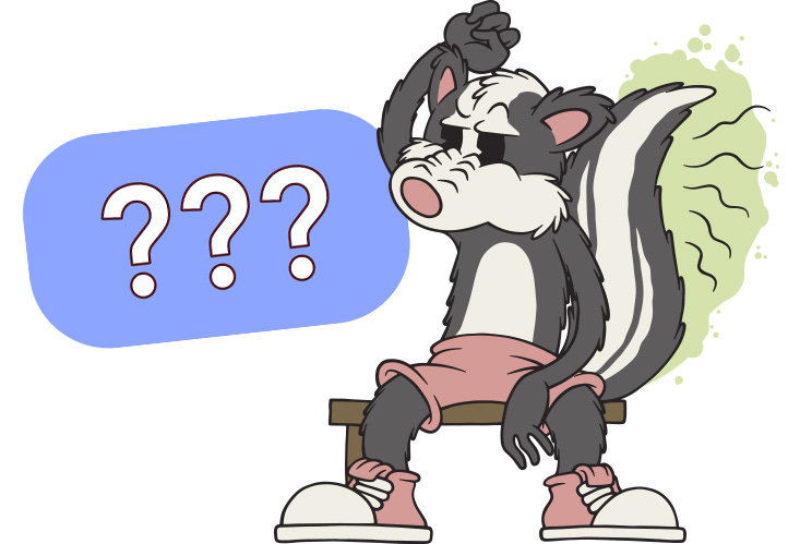
Summary: If users can’t smell the path to what they need, they won’t follow it. This article breaks down how weak information scent and poor navigation design lead to user confusion and shows how UX researchers can address it.
Over a decade ago, I ran a moderated usability test for a new enterprise dashboard. The goal was simple: watch users try to find the login page and get to a list of open tasks. That was it.
We recruited actual end users. People who used the tool regularly. People who should’ve had zero trouble with this flow.
Five participants in a row failed to find the login. Not one of them even made it to the login screen.
The button was right there. Large font. High contrast. Good visual hierarchy. All the stuff design systems brag about.
But the label? … “Access Gateway Portal” 😬
Not “Log in.” Not “Sign in.” Not even “My Account.” Just... Access Gateway Portal.
Of course, one user selected it. A few hovered and hesitated. One said out loud something like, “I don’t know what this is, but I don’t want to break anything.”
That was the moment I started talking about information scent in every project I touched. Truth is, it doesn’t matter how pretty your UI is. If users can’t smell the trail, they will not follow it.
How Users Hunt for Information
Information foraging theory comes from research by Peter Pirolli and Stuart Card, who studied how people search for information the same way animals search for food. The idea is simple. People, like animals, want the most value for the least amount of effort.
Online, that means users follow a trail of clues that suggest what content or action lies ahead. This trail is what we call information scent.
Information scent is how users decide whether something is worth clicking. It’s not just about the words in a link. It includes the surrounding context, the layout, and how close nearby headings are to the content users are trying to find.
When the scent is strong, users feel confident. “View My Invoices” tells me exactly what I’ll get. “Manage Solutions” could mean anything.
Weak information scent causes hesitation. Users scan, make a quick decision, and if a link looks like a bad bet, they skip it.
If they take a chance and it leads somewhere unhelpful, they might try again. But more often, they back out or leave.
Good scent creates a sense of control. Bad scent makes your product feel unpredictable and effortful.
You can design the most beautiful layout in the world, but if the scent trail doesn’t match what users are looking for, they won’t follow it. They’ll assume they’re in the wrong place and look elsewhere.
UX Principles That Back This Up
If you’ve studied even the basics of UX, none of this should feel unfamiliar. Information scent is really just a framing device for what we already know works.
Let’s start with match between system and the real world. That’s Nielsen’s way of saying, “Talk like a human, not a product manager.” Users look for terms they already know. They expect labels that reflect their intent.
Then there’s recognition over recall. When users are scanning a screen, they shouldn’t have to stop and think, “What does that mean again?” Clear, recognizable wording reinforces scent. Vague, branded, or clever phrasing weakens it.
Consistency and standards also play a big role. If your nav says “Billing” in one section and “Payments” in another, users start to second-guess themselves. If your buttons all use different verbs for the same action, scent gets muddy. See Jakob’s Law of the Internet User Experience.
What we are really talking about here is basic information architecture. A good IA doesn’t just organize content logically. It creates scent trails. It helps users make intuitive guesses about where to go next.
When the structure aligns with user expectations, every click feels intentional. When it doesn’t, every click feels like a gamble.
Where Scent Goes to Die
Let’s talk about where things fall apart. Because in most products, bad scent isn’t the result of sabotage. It’s the result of compromise.
Somewhere along the way, a perfectly good label gets rewritten to fit a marketing push. Or a category name gets changed to reflect the org chart. Or a designer swaps in an icon because it “looks cleaner” without text.
Before you know it, you’ve got an interface full of landmines.
Here are a few of the most common scent killers I see:
Overly broad or vague labels. “Explore,” “Solutions,” “Resources,” and “Experience” are common offenders. These words might mean something internally, but they give users nothing to go on.
Icons without text. A little gear or lightning bolt might look cool, but without a label, it’s a guessing game.
Duplicated or overlapping categories. I once tested a site that had “Help Center,” “Support Articles,” and “FAQs” all in separate sections. All three linked to the same page.
Branded language that doesn’t match user vocabulary. Calling your checkout “The Pipeline” might fit your brand voice, but if users are looking for a cart or billing page, you’ve just made their life harder.
IA based on how teams are structured, not how users think. This is probably the biggest one. When your navigation reflects departments instead of mental models, the scent trail goes cold real fast.
If users have to stop and ask, “Would that be under Features or Services?” then the scent is already gone.
How to Spot Bad Scent and Fix It
The good news? Scent problems are fixable. And you don’t need a huge budget or a six-month redesign to make progress.
Start by watching how people move through your product. You can learn a lot just by looking at where they hesitate, where they click back, and where they abandon the flow entirely.
Here are a few tools and techniques I use regularly:
Tree tests and card sorts to see if your IA matches user expectations
5-second tests to find out if users can identify what a link or section is about
Click tracking to identify high-bounce areas and confusing link paths
Direct quotes from usability tests that reveal confusion like “I wouldn’t have clicked that, I didn’t think it was related”
Once you know where scent is breaking down, the fix usually comes down to one or more of these:
Use plain language that matches what users are actually searching for
Make key tasks visible and obvious from the main entry points
Combine or rename categories that are too similar or too broad
Add supporting context like short explanatory text to guide the user
If using icons, always pair them with labels
Nothing about information scent is revolutionary. It’s just a reminder that information architecture is a living system, not a one-time deliverable. And scent is how you keep that system honest.
Researcher Takeaways
One of the best things about information scent is that it gives you language stakeholders can understand.
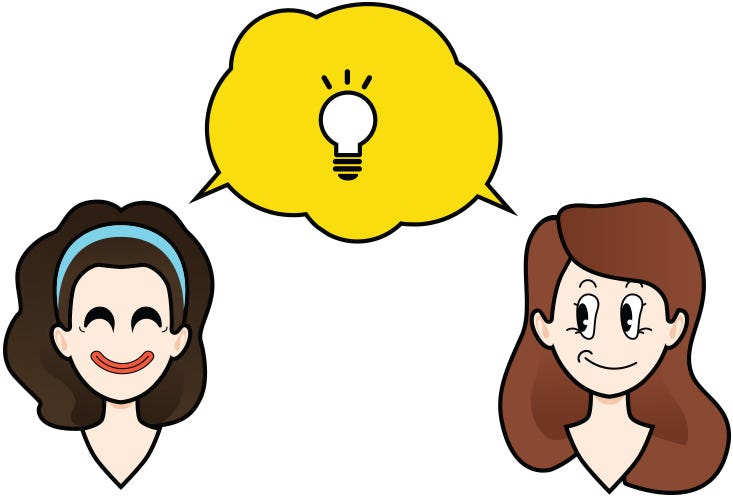
You’re not just saying “users were confused.” You’re showing them the trail users were trying to follow, and where it went cold.
This is especially useful when you’re dealing with internal resistance around labeling, navigation, or copy changes.
You’re not asking teams to trust your gut. You’re showing evidence that users are sniffing around for something specific and not finding it.
You can also use scent as a framing tool in your research reports. Instead of just listing usability issues, walk teams through what the user saw, what they expected to find, and why they clicked away.
It reframes the problem from “users didn’t try hard enough” to “the product failed to give off the right signals.”
And it works both ways. Strong scent can validate design decisions. Weak scent can help explain bounce rates, rage clicks, or task failures that don’t make sense at first glance.
The key is to shift the conversation away from surface-level design preferences and toward the invisible signals that guide user behavior.
When you do that, you’re not just fixing a nav label. You’re rebuilding trust in the user’s ability to navigate the product with confidence.
Conclusion
Information scent is what helps users decide where to click and whether to trust what’s on the other side. When it’s strong, users move forward with confidence. When it’s weak, they hesitate, backtrack, or give up entirely.
In UX research, scent gives you a clear way to explain behavior that might otherwise seem irrational.
You don’t need a full redesign to make improvements. Start by checking if the paths to your most important tasks are obvious from your key entry points. If they aren’t, fix the labels, strengthen the signals, and remove the guesswork. It’s that simple, so let’s start prioritizing IA again, shall we?
How have you used information scent in your work? Any advice for others? DM me or comment below to start a deeper conversation. I know many of us UX researchers are struggling with this topic, so I'm curious to hear what I might have missed or what tactics have worked for you. Thanks for reading!
References
Pirolli, P., & Card, S. (1995). Information Foraging. Xerox Palo Alto Research Center.
Nielsen, J. (1994a). Match Between the System and the Real World. Nielsen Norman Group.
Nielsen, J. (1994b). Recognition vs. Recall in UX. Nielsen Norman Group.
Nielsen, J. (1994c). Consistency and Standards. Nielsen Norman Group.
Nielsen, J. (2023). Jakob’s Law of the Internet User Experience. Jakob Nielsen, PhD Substack.
Kalbach, J., & Nielsen Norman Group. (2020). Information Architecture: Study Guide. Nielsen Norman Group.
I enjoyed reading this Trevor! Thank you.
I recently worked on the redesign of a legacy app, what worked for me was ensuring that the terminologies matched the real world use cases.
One difficulty we encountered was that sometimes, some teams call an action different things which made it difficult to narrow down to a specific one. Is this something you’ve encountered as well? How have you handled it?