

How Primary Nav Bars Should Work
A Free Reference Guide for Interaction Design, Accessibility, and Implementation

Summary: This week’s article is based on official documentation that explains how primary navigation bars should work. This is all you’ll ever need to know about proper interaction design for primary navigation bars.
Over the last 10+ years, I’ve written essentially the same series of documents for different orgs around interaction design and accessibility best practices for primary navigation bars.
I finally sat down and combined all those documents into this master best-practice guide. This is intended to be more of a reference guide, and I’m happy to share it because, if you’re anything like me, you hate wasting time going back and forth with your front-end devs on all the little nuances that go into doing something as foundational as a nav bar.
My hope is that many of you bookmark this article, just like I will, and send the link anytime you need to share guidance with others.
This guide details the following topics:
Navigation bar interaction behavior
Dropdowns, mega menus, and mobile menus
How to think about hover
How to handle parent-child relationships
All the different UI component interaction states
Keyboard and screen-reader navigation
Proper semantic HTML and ARIA execution
📌 2 Ways to Use This Document
As a reference document: The best way to use this document is to press Control + F and find specific guidance around the primary navigation bar topics you care about.
As source material for Gen AI tools: This kind of document has also been used as source material for Gen AI tools that generate UI designs, interaction specs, or front-end code.
When the tool has clear guidance up front, the first output is more likely to follow better primary navigation bar behavior around links, buttons, hover, focus, keyboard interaction, semantic HTML, and ARIA.
If you want more general information about how to design a primary navigation bar, start with this article: Why Your Navigation Stinks.
The Purpose of This Guide
This document defines interaction design standards for the UI pattern primary navigation bar. Primary navigation bars must help users move between major feature areas, understand where they are, and predict what will happen when they activate an item. The interaction model should remain consistent across desktop and mobile, even when the layout changes across breakpoints.
The goal is to make primary navigation predictable, scannable, keyboard operable, and understandable without requiring users to guess how each item behaves.
⚠️ Disclaimer: For this pattern guide, “activate” means an intentional user action using a mouse, touchpad, touch gesture, Enter key, Space key, or similar input method, depending on the item type.
Hover is not activation. Hover may provide visual feedback, but in this navigation pattern, hover must not open, close, reveal, or dismiss navigation menus.
This is intentionally stricter than some general web guidance because this navigation system prioritizes predictable behavior across cursor, keyboard, and touch input.
2. Core Principles
2.1 Use clear information scent
Items must help users predict what they will find or what will happen after activating them.
A primary navigation item should clearly communicate one of the following:
A destination
A major feature area
A user task
A meaningful content category
A parent category that exposes related child destinations
Item labels should match the language users expect within the web application. They should not rely on internal team names, implementation structure, roadmap language, or terminology that only makes sense to the organization.
❌ Avoid labels that are too broad, abstract, or internally meaningful to create a clear expectation for users. If a label could reasonably mean several different things, it likely does not provide enough information scent.
A user should be able to scan the primary navigation and make a confident choice without needing to pause and interpret what the item might contain.
2.2 Support recognition over recall
Primary navigation should not require users to remember where something lives from prior experience.
Users should be able to recognize available paths by scanning:
Visible labels
Group headings
Dropdown indicators
Parent-child relationships
Current page indicators
Visual grouping inside dropdown menus or mega menus
Do not rely on hidden meaning, icon familiarity, or prior training. If an item opens a child menu, the UI should make that behavior visible. If an item sends the user directly to a page, the UI should make that behavior feel different from a Menu item.
2.3 Maintain consistent interaction behavior
Items with the same function must behave the same way throughout the application.
Primary navigation items should follow one of two interaction models:
Destination behavior: The item takes the user directly to a page or route.
Disclosure behavior: The item opens or closes a child menu.
✔️ Requirements:
Destination items use link behavior.
Menu items use button behavior.
Menu items include a dropdown indicator.
Destination items do not include a dropdown indicator.
Parent items that expose child menus should not also act as direct destination links.
Parent landing pages should be represented as child overview links when needed.
Menus must open only through intentional activation.
Menus must close only through intentional dismissal behavior.
Hover must not open, close, reveal, or dismiss a menu in this navigation pattern.
❌ Avoid interaction ambiguity. A user should not have to determine whether activating the label does one thing and activating the dropdown indicator does another.
2.4 Keep the hierarchy as flat as practical
Primary navigation should reduce unnecessary hierarchy.
Each additional level creates more interaction cost and more abstraction for the user to understand. A flatter structure makes it easier for users to scan available destinations and make a confident choice.
❌ This does not mean every destination must appear at the top level. It means child menus should expose terminal nodes clearly and avoid unnecessary nested categories.
A good primary navigation structure should:
Make major feature areas visible.
Group related destinations under meaningful parent items.
Expose terminal nodes inside dropdown menus or mega menus.
Avoid forcing users through multiple nested levels before they can reach a destination.
3. Primary Navigation Anatomy

3.1 Navigation landmark
Primary navigation must be represented as a semantic navigation landmark.
From an interaction design perspective, this matters because users of assistive technology need a predictable way to identify and move to the primary navigation region.
✔️ Recommended default:
<nav>
  <!-- Primary navigation items -->
</nav>
If the page includes only one navigation landmark, an accessible name is optional. If the page includes more than one navigation landmark, each landmark should have a clear accessible name.
Use distinct names when navigation landmarks serve different purposes, such as Primary, Utility, Breadcrumb, or Footer.
If the same navigation is repeated in more than one place with identical links, the repeated landmarks may use the same accessible name.
✔️ Preferred naming order:
Use a visible or visually hidden heading with
aria-labelledby.Use
aria-labelonly when no visible or referenceable label is available.
Example when a referenceable heading exists:
<h2 id="primary-navigation-heading" class="visually-hidden">Primary</h2>

<nav aria-labelledby="primary-navigation-heading">
  <!-- Primary navigation items -->
</nav>
Example when no visible or referenceable label exists:
<nav aria-label="Primary">
  <!-- Primary navigation items -->
</nav>
Do not use aria-label=”Primary navigation” as the default. This is usually redundant rather than a severe accessibility failure, because screen readers already announce the landmark as navigation. The accessible name should usually identify which navigation it is, not repeat the word navigation.
3.2 Navigation list
Primary navigation should use a list structure when presenting a set of related items.
✔️ Recommended structure:
<nav>for the navigation landmark<ul>and<li>for the item collection<a>for destination items<button type=”button”>for Menu items
The interaction design rule is straightforward:
If the item moves the user to a destination, it is a link.
If the item opens or closes a child menu, it is a button.
This distinction should be reflected in both the interaction behavior and the visual design.
3.3 Item types
Primary navigation items must be one of two types.
1. Destination item
A destination item takes the user directly to a page or route.
✔️ Interaction requirements:
Activating the item navigates to the destination.
The item does not open a child menu.
The item does not include a dropdown indicator.
The item may show current page state if it represents the currently displayed page or route.
Hover may show an over state, but it must not trigger navigation.
✔️ Implementation requirement:
Use an
<a>element.
Example:
<a href="/path">Item label</a>2. Menu item
A Menu item opens or closes a child menu.
✔️ Interaction requirements:
Activating the item opens the child menu.
Activating the same item again closes the child menu.
Hovering over the item must not open the child menu in this pattern.
Hovering out of the item must not close the child menu in this pattern.
The item includes a dropdown indicator.
The item has distinct expanded and collapsed states.
The child menu appears in a predictable spatial relationship to the item.
The child menu can be dismissed through expected dismissal behaviors.
✔️ Implementation requirements:
Use a
<button type=”button”>element.Use
aria-expanded.Use
aria-controlsonly when the control-to-menu relationship needs to be explicit.aria-expandedis the essential ARIA state for the Menu item.
Example:
<button type="button" aria-expanded="false">
  Item label
</button>
3.4 Stronger code example
The following example shows the preferred structure for a primary navigation landmark, one current destination item, and one Menu item with a child menu.
<h2 id="primary-navigation-heading" class="visually-hidden">Primary</h2>

<nav aria-labelledby="primary-navigation-heading">
  <ul class="primary-nav">
    <li>
      <a href="/dashboard" aria-current="page">Dashboard</a>
    </li>

    <li>
      <button
        type="button"
        aria-expanded="false"
        aria-controls="reports-menu"
      >
        Reports
        <span aria-hidden="true">▾</span>
      </button>

      <ul id="reports-menu" hidden>
        <li><a href="/reports/overview">Reports overview</a></li>
        <li><a href="/reports/activity">Activity reports</a></li>
        <li><a href="/reports/compliance">Compliance reports</a></li>
      </ul>
    </li>
  </ul>
</nav>
This example demonstrates the expected implementation model:
The navigation region uses a semantic
<nav>landmark.The landmark is named by a referenceable heading.
The item collection uses a list structure.
Destination items use native links.
Menu items use native buttons.
The disclosure button uses
type=”button”.The disclosure button exposes its open or closed state with
aria-expanded.This example includes
aria-controlsbecause the controlled submenu has a stable id.aria-expandedremains the essential ARIA state for the disclosure button. Ifaria-controlsis used, it must reference the menu controlled by the disclosure button.The closed child menu uses hidden so it is removed from the visual interface and the accessibility tree.
When toggling a menu, update hidden, keyboard focusability, and
aria-expandedtogether so the visual state, keyboard state, and accessibility tree stay synchronized.If the menu is animated, the transition must not leave focusable content hidden from sighted users or visible content hidden from assistive technologies. Animation cannot break synchronization between visual state, focusability, hidden, and
aria-expanded.The dropdown indicator is decorative and hidden from assistive technology with
aria-hidden=”true”.
4. Information Architecture Standards
4.1 Parent-child relationships
A parent item must represent a meaningful category. Child items must belong logically under that parent.
The parent-child relationship should be clear from the user’s point of view, not just from the organization’s point of view.
Good parent-child relationships are based on:
User tasks
User goals
Feature areas users recognize
Common workflows
Expected content groupings
❌ Avoid using the primary navigation to mirror internal departments, feature team ownership, or implementation structure.
4.2 Terminal nodes
A terminal node is an item that takes the user to a page or route.
In a dropdown menu or mega menu, the primary activatable child items should usually be terminal nodes. This lets users move from the menu to a destination without needing to understand additional hidden layers.
Terminal nodes may include:
Landing pages
Overview pages
Feature areas
Filtered results pages
Task-specific pages
Settings pages
Reports or dashboard views
❌ Avoid menu structures that require users to move through several abstract layers before finding a destination.
✔️ Preferred pattern:

Primary navigation item
  Child destination
  Child destination
  Child destination
❌ Avoid:
Primary navigation item
  Category
    Subcategory
      Sub-subcategory
        Destination
4.3 Parent landing pages
If a parent category has a landing page, do not use split-button behavior.
The parent item should not behave as both:
A link to the parent landing page
A Menu item that opens a child menu
That interaction model creates ambiguity because the same row appears to have two different functions.
For this navigation system, hybrid parent link plus disclosure behavior is not allowed. The restriction is a design-system rule intended to preserve one clear interaction purpose per row.
✔️ Required pattern:
Make the parent item a Menu item.
Add a child destination item labeled
[Parent Category]Overview.
Example structure:
Parent Category
  Parent Category Overview
  Child Destination
  Child Destination
In this pattern:
Activating the parent item expands or collapses the child section.
Activating the overview item navigates to the parent landing page.
The row has one interaction target.
The dropdown indicator is not a separate interaction target.
The user does not need to understand a split-button interaction.
This pattern should apply consistently across levels of the primary navigation hierarchy. Do not use the split-button UI control.
4.4 Duplicate destinations
A destination should generally appear only once in primary navigation.
Duplicating the same destination in multiple navigation areas can make users question whether the items lead to the same place or different places.
❌ Avoid duplicate destination items unless user research shows users strongly expect the same destination in more than one category.
When a destination could reasonably belong in more than one place, choose the location that best matches the user’s mental model.
4.5 Child item grouping
Child items should be grouped by user expectations.
❌ Do not group items by:
Internal team ownership
Feature architecture
System architecture
Department names
Release structure
Roadmap structure
✔️ Groups should be:
Descriptive
Mutually distinct
Medium-granularity
Ordered intentionally
❌ Use medium-granularity groups. Avoid very large groups that take too long to scan. Also avoid very small groups that create too many headings and make the menu feel fragmented.
Group order may be based on:
Task frequency
Workflow sequence
User importance
Natural conceptual order
If none of those apply, place the most commonly used or most important group in the top-left area of the mega menu.
5. Navigation Labeling Standards
5.1 Label clarity
Item labels must clearly describe the destination, task, or category.
A strong label should answer the user’s basic question:
What will I find if I activate this?
❌ Avoid labels that are too broad to create a clear expectation. Labels should not require users to know internal terminology, team ownership, feature history, or implementation details.
A label is too vague when it could plausibly contain several unrelated destinations or when users would need to open it just to understand what it means.
5.2 Label consistency
Use the same term for the same concept across the application.
Do not alternate between similar labels unless each term has a distinct user-facing meaning.
If multiple related terms are needed, each term should represent a distinct concept and appear in the navigation only where that distinction is meaningful to users.
5.3 Label differentiation
Items in the same set should be easy to distinguish from one another.
❌ Avoid placing labels near each other if users are likely to read them as overlapping categories.
Each label should create a distinct information scent trail.
5.4 Icon labels
Icons in primary navigation must include visible text labels.
Do not use icon-only primary navigation items. (buttons/links)
Icons may support recognition, but they should not carry the meaning on their own. This applies to desktop and mobile navigation.
For mobile primary navigation, the menu control should include a visible text label such as Menu. The menu icon may appear with the label, but the icon should not be the only visible cue.
6. Desktop Primary Navigation Behavior
6.1 Opening menus
Dropdown menus and mega menus must open only by intentional activation.
For this primary navigation pattern, hover must not open, close, reveal, or dismiss dropdown menus, mega menus, or child navigation items.
✔️ Required behavior:
Activate a Menu item: open the child menu.
Activate the same Menu item again: close the child menu.
Activate another Menu item: close the current menu and open the activated menu.
Activate a destination item: navigate to the destination.
Hover over an item: show only the visual over state.
Hover out of an item: remove only the visual over state.
This interaction model gives users control because menus open based on intentional activation, not cursor movement.
6.2 Hover behavior
Hover state may indicate that an item is interactive.
✔️ Hover may change:
Background
Text decoration
Border
Color
Elevation
Dropdown indicator styling
❌ In this pattern, hover must not:
Open a menu
Close a menu
Reveal child items
Dismiss child items
Replace focused state
Replace current page state
Trigger behavior that changes the available navigation structure
Hover is visual feedback only. It should communicate that an item is interactive, but it must not change menu visibility.
6.3 Hover out behavior
Hover out removes the hover state.
Hover out must not close a dropdown menu or mega menu in this pattern.
Users must be able to dismiss an open menu through deliberate actions, not through cursor movement. This prevents fragile interaction paths where a menu closes unexpectedly because the cursor moved slightly outside the menu boundary.
✔️ Required rule:
If a menu was opened by activation, it remains open until the user intentionally dismisses it.
6.4 Menu dismissal
Users must be able to close an open dropdown menu or mega menu by using deliberate dismissal methods.
✔️ Required dismissal methods:
Activate the Menu item again.
Activate outside the menu.
Press the
Esckey.Move focus out of the open navigation region, when this dismissal behavior is intentionally defined. Moving focus from the Menu item into its child menu must not dismiss the menu.
Activate another Menu item.
Activate a destination item.
When the Esc key closes the menu, focus must return to the Menu item that opened it.
This keeps the user oriented and prevents keyboard users from losing their place in the navigation.
6.5 Animation timing
Dropdown and mega menu animations should be brief.
✔️ Recommended duration:
100 to 150 milliseconds
Animation may help users understand that a menu has opened or closed, but it should not slow down navigation.
❌ Avoid animations that:
Delay access to child items
Make the interface feel less responsive
Create unnecessary motion
Interfere with focus visibility
Make it harder to track the current state
Ignore user motion preferences
Desynchronize hidden, keyboard focusability, and
aria-expandedduring open or close transitions
6.6 Motion preferences and reduced motion
Navigation animation must not create unnecessary motion or make the interface harder to use.
If menu animation is used, implementation should respect user motion preferences, including prefers-reduced-motion.
✔️ Requirements:
Animations must not delay access to child items.
Animations must not interfere with visible focus indicators.
Animations must not be required for users to understand whether a menu is open or closed.
When users request reduced motion, non-essential menu animation should be reduced or removed.
Open, closed, expanded, collapsed, focused, and current page states must remain clear even when animation is reduced or removed.
When animation is used, visual visibility, keyboard focusability, hidden, and
aria-expandedmust remain synchronized throughout the open and close behavior.
Reduced motion should not change the interaction model. Menus still open by activation and close through defined dismissal behavior.
7. Dropdown Menu and Mega Menu Behavior
7.1 Dropdown indicators
Menus must include a dropdown indicator.
Acceptable indicators include:
Down chevron
Disclosure arrow
Caret
The dropdown indicator communicates that activating the item will expose child navigation items.
Destination items must not include dropdown indicators.
This distinction helps users tell the difference between:
Items that navigate directly
Items that open child menus
Dropdown indicators should be visually consistent across the primary navigation system.
The dropdown indicator should not behave as a separate interaction target. Activating the label area or the indicator area should perform the same disclosure action.
7.2 Open state
When a dropdown menu or mega menu is open:
The Menu item must show an open visual state.
The Menu item must use
aria-expanded=”true”.The child menu must be visible.
The child menu must appear in a predictable spatial relationship to the Menu item.
The dropdown indicator should visually reflect the expanded state.
The menu should remain open until intentionally dismissed.
The open state should make it clear which top-level item controls the visible menu.
Opening a menu must be triggered by activation, not hover.
7.3 Closed state
When a dropdown menu or mega menu is closed:
The Menu item must show a collapsed visual state.
The Menu item must use
aria-expanded=”false”.The child menu must be hidden visually.
The child menu should be hidden from assistive technology unless there is an intentional reason not to do so.
The dropdown indicator should visually reflect the collapsed state.
The closed state should communicate that child items are available, but not currently visible.
Closing a menu must be triggered by intentional dismissal behavior, not hover out.
7.4 Esc key behavior
When the user presses the Esc key while a menu is open:
The menu closes.
Focus returns to the Menu item that opened the menu.
The Menu item updates to
aria-expanded=”false”.The visual state updates from expanded to collapsed.
This behavior should be consistent for all dropdown menus and mega menus in the primary navigation.
7.5 Focus behavior
When a menu opens, focus behavior must be predictable and consistent.
The design team should choose one focus model and apply it consistently across primary navigation menus.
Acceptable patterns:
Focus remains on the Menu item: The menu opens, and the user can continue forward through the tab order into the child items.
Focus moves into the opened menu: Focus moves to the first focusable item inside the opened menu.
In either pattern:
Open menu items must be reachable by keyboard.
Users must be able to move focus out of the menu.
Focus should not be trapped inside standard desktop dropdown menus or mega menus.
Focus order must follow the visual and logical order of the menu.
Escmust close the menu and return focus to the Menu item.Focus movement may dismiss the menu only when that dismissal behavior is intentionally defined. Moving focus from the Menu item into the opened child menu must not dismiss the menu.
Focus behavior should not depend on hover.
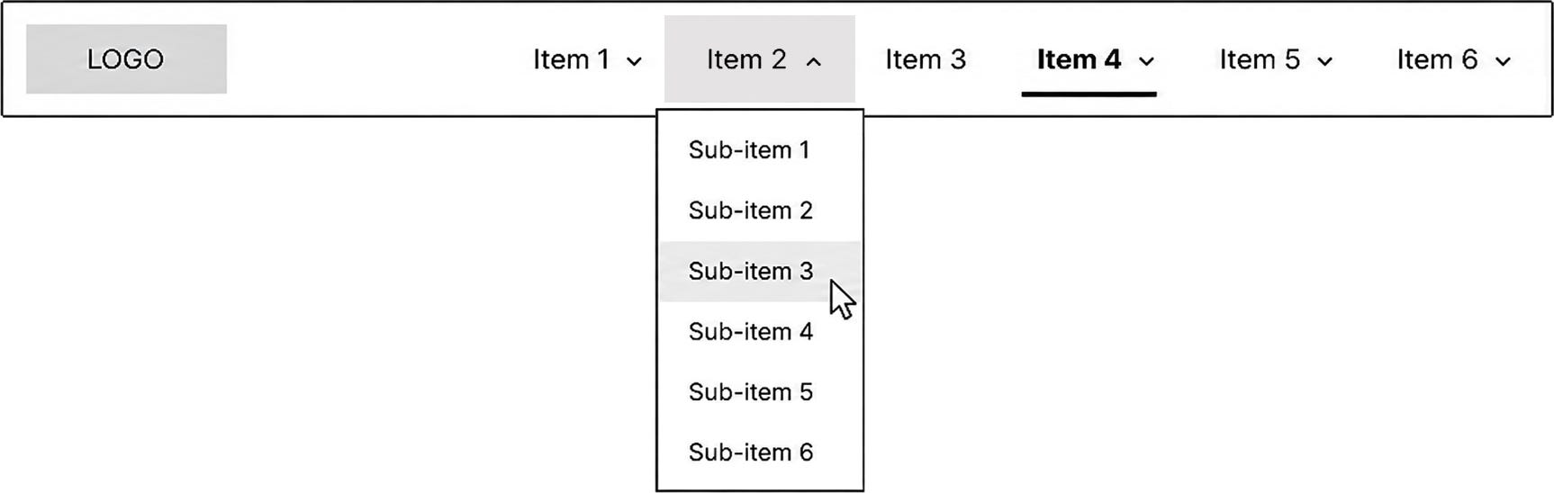
7.6 Mega menu layout
Mega menus should organize terminal nodes into visible groups.
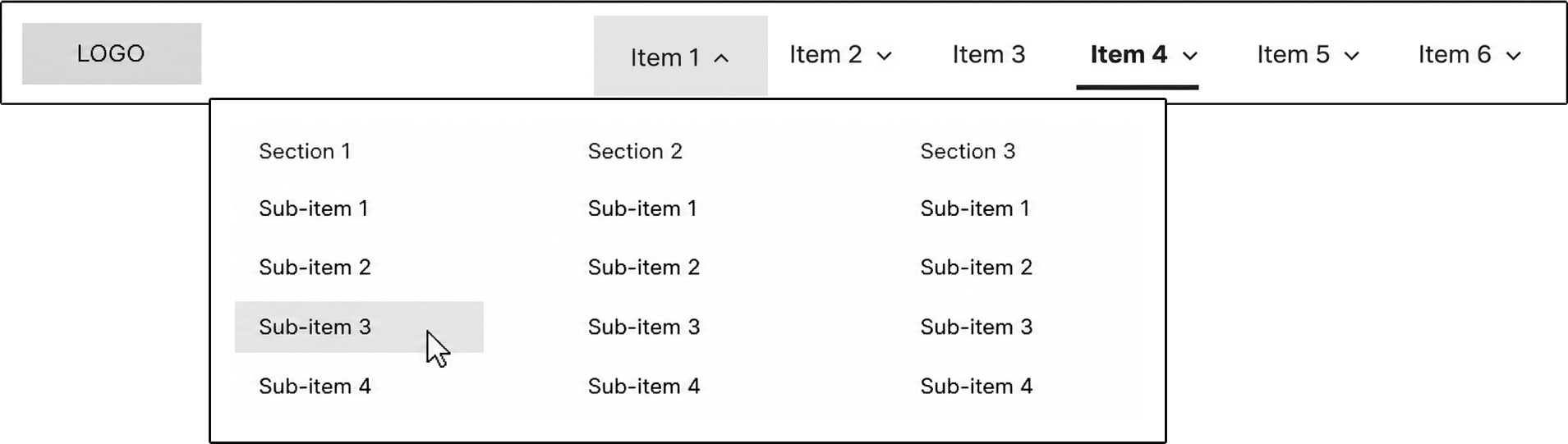
Each group should include:
Descriptive group heading
Related destination items
Clear visual separation from other groups
Logical reading order
✔️ Preferred structure:
Primary navigation item
Mega menu
Group heading
Destination item
Destination item
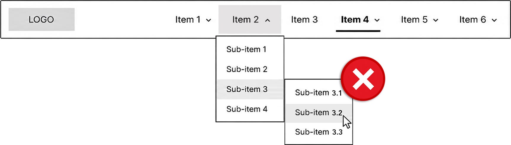
Destination item❌ Avoid deep nested structures inside mega menus:
Primary navigation item
  Mega menu
    Category
      Subcategory
        Sub-subcategory
          Destination item
Mega menus work best when they expose meaningful destination choices in a scannable layout. They should not become a complete site map or a visual representation of the full feature architecture.
7.7 Current page inside a dropdown or mega menu
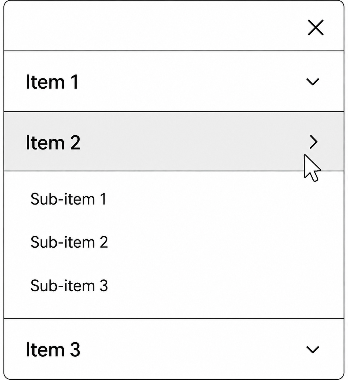
If the currently displayed page is represented by a child item inside a dropdown or mega menu, the child item should receive the current page indicator.
Example structure:
Parent Item
  Child Destination
  Child Destination ← current page
  Child Destination
In this pattern:
The current child destination receives the current page indicator.
The current child destination uses
aria-current=”page”.The parent item may receive a visual parent-active treatment.
The parent item should not use
aria-current=”page”unless the parent item itself is the current page.
The parent-active treatment helps users understand which primary navigation section contains the current page. It should be visually distinct from the child item’s current page indicator.
8. Mobile Primary Navigation Behavior
8.1 Menu control
The mobile primary navigation control must include a visible text label.
✔️ Preferred label:
Menu
The menu icon may appear with the label, but the visible text label must remain present.
❌ Avoid icon-only mobile primary navigation controls. The menu control should not rely on users recognizing the hamburger icon or remembering what it means.
The control should clearly communicate that activating it opens the primary navigation.
The Menu control and any close control must provide a target area large enough for accurate cursor and tap activation. Use at least 24 by 24 CSS pixels unless a valid exception applies. This is a minimum, not the ideal target size. In practice, mobile menu controls, close controls, and accordion rows should be larger than the minimum whenever layout allows.
8.2 Opening and closing mobile navigation
Mobile navigation must open and close by intentional activation or defined keyboard dismissal.
✔️ Required behavior:
Activate Menu: open primary navigation.
Activate Menu again or activate a close control: close primary navigation.
Press Esc: close primary navigation when keyboard focus is inside the menu.
Focus returns to the menu control when the menu is dismissed.
Hover must not open, close, reveal, or dismiss mobile navigation or child navigation sections in this pattern.
The open and closed states should be visually clear.
When the mobile menu is open:
The menu control should show an open state or be replaced by a clear close control.
The navigation panel or menu region should be visible.
The first available item should be reachable through the expected tab order.
The user should be able to dismiss the menu without activating a destination.
If the mobile navigation panel blocks interaction with the rest of the page, treat it as a modal-style experience: prevent background interaction, provide a clear close control, support Esc, and restore focus to the Menu control when dismissed. If the panel does not block interaction with the rest of the page, focus should remain free to move through the page and should not be trapped inside the navigation.
8.3 No split-button behavior
Mobile navigation rows must not use split-button behavior.
❌ Avoid this pattern:
Text label navigates to a parent landing page.
Adjacent chevron opens a child menu.
This creates two interaction targets within what appears to be one navigation row. Users may not understand that the label and chevron perform different actions.
✔️ Required pattern:
Each row has one interaction target.
A row either navigates to a destination or opens a child section.
A row must not do both.
If the row opens a child section, the whole row should operate as the Menu item. The dropdown indicator may remain visible, but it should not be a separate interaction target.
8.4 Parent category with landing page
If a parent category has a landing page, include that landing page as a child destination item.
✔️ Required pattern:
The parent row opens or closes the child section.
The parent landing page appears as the first child destination item.
The parent landing page uses an explicit overview label.
Example structure:
Parent Category
  Parent Category Overview
  Child Destination
  Child Destination
This keeps the parent row’s interaction simple and gives users a clear way to reach the parent landing page.
8.5 Accordion behavior
Mobile child navigation should use disclosure or accordion behavior.
✔️ Required behavior:
Activate parent row: expand child section.
Activate the same parent row again: collapse child section.
Expanded state is visually indicated.
Expanded state is programmatically exposed with
aria-expanded.Child items appear directly under the parent row.
The dropdown indicator visually reflects expanded or collapsed state.
Accordion behavior should preserve the parent-child relationship visually. Child items should appear close enough to the parent row that users can understand the relationship without relying on memory.
Hover must not expand or collapse accordion sections in this pattern.
8.6 Mobile current page indication
The currently displayed page, section, or route must have a visible current page indicator in mobile navigation.
✔️ Requirements:
The current page indicator must be visible when the relevant navigation section is displayed.
The indicator must be persistent and not depend on hover or focus.
The current destination item must use
aria-current=”page”.If the current page is inside a collapsed parent section, the parent row may receive a visual parent-active treatment.
The parent row should not use
aria-current=”page”unless the parent row itself represents the current page.
This allows users to reopen the mobile navigation and understand where they are within the application structure.
9. Keyboard Interaction Requirements
9.1 Tab order
Tab order must follow the visual and logical order of the primary navigation.
The goal is for keyboard users to experience the navigation in the same order that sighted cursor users visually scan it.
✔️ Recommended order:
Logo or home link, if present
Top-level primary navigation items
Open child menu items
Utility items, if present
Main page content
When a dropdown menu or mega menu is closed, its child items should not be included in the tab order.
When a dropdown menu or mega menu is open, its child items must be reachable through the keyboard.
Tab order should not jump unexpectedly between unrelated areas of the page. Users should be able to move through the navigation predictably and understand where they are at each step.
Hover must not affect tab order. Child items should enter or leave the tab order based on the menu’s activated open or closed state, not cursor position.
9.2 Keyboard commands
Primary navigation must support standard keyboard behavior.
Keyboard behavior should match the item type.
Destination items behave like links:
Enter activates the item.
The user is taken to the destination.
Menu items behave like buttons:
Enter activates the item.
Space activates the item.
The child menu opens or closes.
Keyboard activation is intentional activation. A menu may open or close through Enter or Space on a Menu item. A menu must not open or close because the cursor is hovering over the item while it has focus.
9.3 Focused state
Every interactive item must have a visible focused state.
The focused state tells keyboard users where they are in the navigation. It should be treated as a required interaction state, not a visual enhancement.
Focused state must be:
Clearly visible
Persistent while the item has focus
Distinct from hover state
Distinct from current page state
Distinct from expanded and collapsed states
Distinct from active / pressed state
Not dependent on color alone
Do not remove browser focus styling unless it is replaced with an equally clear or stronger focused state.
The focused state should work across:
Top-level items
Child items
Dropdown indicators when they are part of the same disclosure control
Menu controls
Close controls, if present
Focused state must not automatically open a dropdown menu or mega menu. If a Menu item receives focus, it should show focused state only. The menu opens only when the user activates the Menu item.
9.4 Focus management
Focus behavior should help users stay oriented.
When a menu is opened by activation, the team should choose one focus model and apply it consistently.
Acceptable patterns:
Focus remains on the Menu item: The menu opens, and the user can continue forward through the tab order into the child items.
Focus moves into the opened menu: Focus moves to the first focusable child item inside the opened menu.
In both patterns:
Child items must be keyboard reachable.
Users must be able to move focus out of the menu.
Focus should not be trapped inside standard dropdown menus or mega menus.
Escmust close the menu and return focus to the Menu item that opened it.Focus order must match the visual and logical order of the menu.
Focus behavior must not depend on hover.
Focus should only be trapped when the navigation is intentionally presented as a modal experience, such as a full-screen mobile menu that blocks interaction with the rest of the page. In that case, prevent background interaction, provide a clear close control, support Esc, and return focus to the Menu control when dismissed. If the mobile menu does not block the page, do not trap focus inside the navigation.
If focus movement is used as a dismissal method, it must be intentionally defined and consistent. Moving focus out of the open navigation region may dismiss the menu; moving focus from the Menu item into its child menu must not dismiss it.
10. Cursor Interaction Requirements
10.1 Hover / over state
Hover state may indicate that an item is interactive.
Hover state may change:
Background
Text decoration
Border
Color
Elevation
Indicator styling
⚠️ Hover is visual feedback only.
In this pattern, hover must not:
Open a menu
Close a menu
Reveal child items
Dismiss child items
Change expanded or collapsed state
Change tab order
Replace focused state
Replace current page state
Trigger behavior that changes the available navigation structure
The user may hover over an item and see an over state, but the navigation structure must not change until the user intentionally activates an item.
10.2 Hover out
Hover out removes the hover state.
Hover out must not close a dropdown menu or mega menu in this pattern.
Users should not have to move the cursor through a narrow path or maintain exact cursor placement to keep a menu open. That creates fragile navigation behavior and increases accidental dismissal.
✔️ Required rule:
If a menu was opened by activation, it remains open until the user intentionally dismisses it.
Open menus should close through deliberate dismissal methods, such as:
Activating the Menu item again
Activating outside the menu
Pressing the
EsckeyMoving focus out of the menu, when defined
Activating another Menu item
Activating a destination item
10.3 Activate outside
Activating outside an open menu should dismiss the menu.
This applies to:
Dropdown menus
Mega menus
Mobile navigation panels, when appropriate
Activate outside behavior should not interfere with destination activation. If the user activates a valid destination item, the destination action should take priority.
Activating outside is intentional dismissal. Hovering outside the menu is not dismissal.
10.4 Cursor movement
Menus must not depend on precise cursor movement.
❌ Avoid interaction paths where minor cursor movement causes the menu to close unexpectedly.
This is especially important when:
A child menu appears below or beside the parent item
The menu has multiple columns
The user must move the cursor across spacing between the parent item and child menu
The menu contains visual groups
The user should be able to move from the parent item into the child menu without fighting the interaction model.
Cursor movement may change hover / over state. Cursor movement must not change whether the menu is open or closed.
10.5 Target size
Interactive targets in primary navigation must be large enough to activate accurately with cursor and touch input.
Minimum target guidance:
Primary navigation links, disclosure buttons, mobile menu controls, close controls, and accordion rows should provide a target area of at least 24 by 24 CSS pixels unless a valid exception applies. Treat this as the minimum threshold, not the preferred size. For mobile menu controls, close controls, and accordion rows, aim larger than the minimum whenever layout allows.
Adjacent targets should have enough spacing that users are not likely to activate the wrong item by accident.
The visible label, icon, or dropdown indicator may be smaller than the target area, but the interactive target area itself must be large enough.
Do not rely on tiny chevrons or icons as the only practical target for expanding or collapsing navigation sections.
This requirement supports cursor, tap, motor accessibility, and general usability. It is especially important for mobile navigation, dense desktop navigation bars, and any close or menu control.
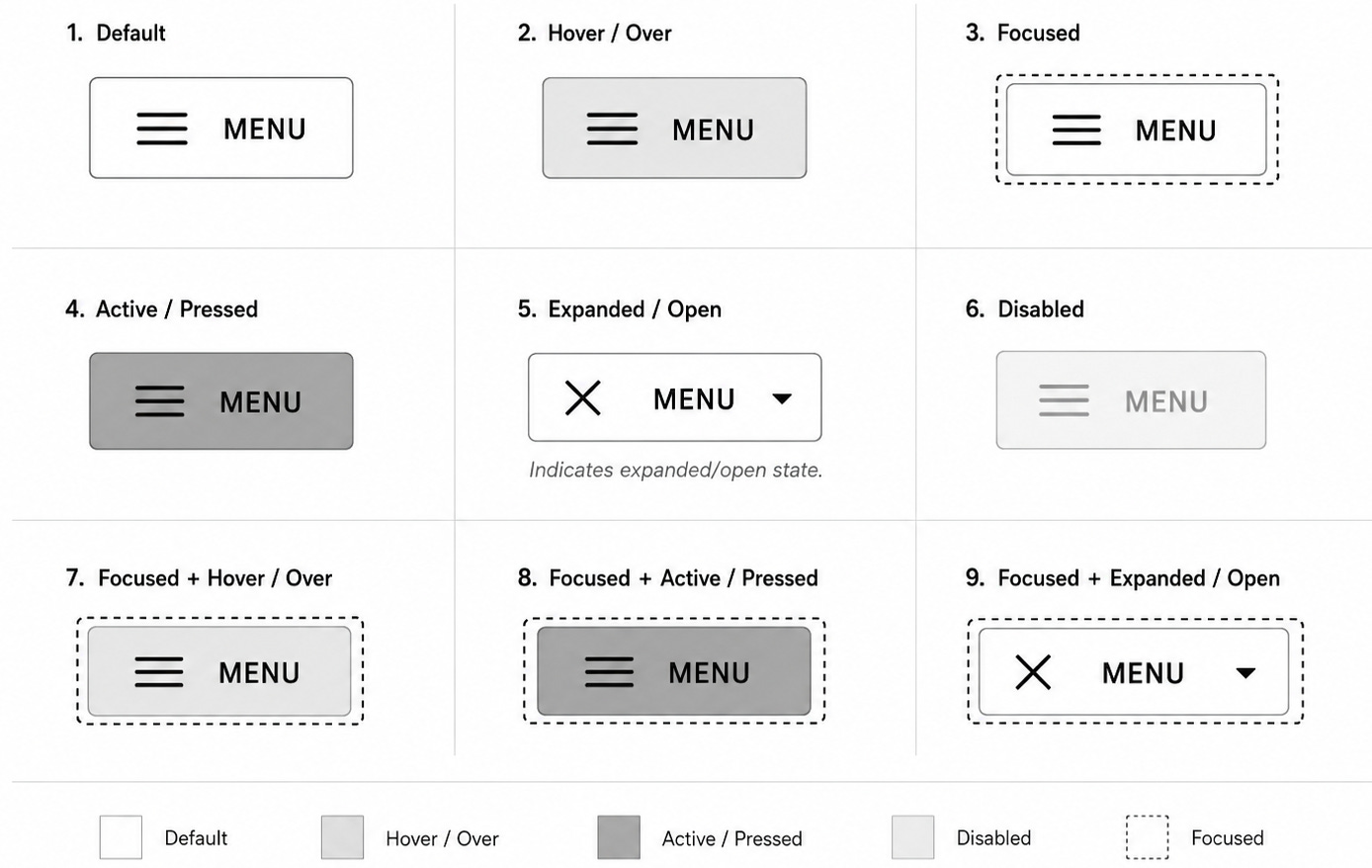
11. Interaction States
Each interactive item should define the following states as applicable.
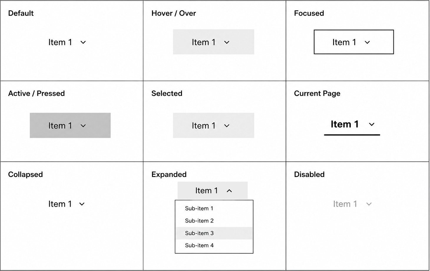
The visual system must also define how states combine. A single item can be focused and hovered, focused and active, focused and current, hovered and current, focused and expanded, or focused and disabled. Combined states should not be treated as new semantic roles. They are visual combinations of existing states.
For example, focused + active means the item has keyboard focus and is currently being activated. It does not mean the item has a special hybrid role. focused + current page means the item represents the current page and currently has focus. It does not mean the current page state and focused state are the same thing.
11.1 Default state
Default state is the base visual treatment for an available item before temporary interaction states such as hover, focus, active, or pressed are applied.
For Menu items, the default visual treatment may appear together with collapsed state. A collapsed Menu item can still be in its default visual presentation.
✔️ Requirements:
Default state should make the item readable.
Default state should make the item appear available.
Default state should not visually compete with current page state.
Default state should not be confused with disabled state.
Default state should not imply that a child menu is open.
11.2 Hover / over state
The cursor is over the item.
✔️ Requirements:
Hover state must visually indicate interactivity.
Hover state must be visually distinct from focused, current page, expanded, and active / pressed states.
Hover state must be subtle enough that it does not compete with the current page indicator.
Hover state must not open, close, reveal, or dismiss a menu in this pattern.
Hover state must not change expanded or collapsed state.
Hover state is visual feedback only.
11.3 Focused state
The item has keyboard focus.
✔️ Requirements:
Every interactive item must have a visible focused state.
Focused state must be clearly visible.
Focused state must not rely on color alone.
Focused state must be visually distinct from hover, current page, expanded, and active / pressed states.
Focus must follow the defined tab order.
Focused state must not automatically open a menu.
Focused state should always answer the user’s question:
Where am I right now?
A focused Menu item opens or closes its child menu only when the user activates it with Enter or Space.
11.4 Active / pressed state
The item is actively being activated.
This state occurs during intentional activation, such as when the user presses the mouse buttons, Enter, or Space.
✔️ Requirements:
Active or pressed state should provide immediate visual feedback.
Active or pressed state should be temporary.
Active or pressed state should not be used to represent the current page.
Active or pressed state should not be confused with focused state.
Active or pressed state should not be confused with current page state.
This state communicates that the user’s input has been received.
Hover does not create active or pressed state. The item enters active or pressed state only during intentional activation.
11.5 Current page state
The item representing the currently displayed page, section, or route must have a visible current page indicator.
✔️ Requirements:
The current page indicator must be visually persistent.
The current page indicator must be visible without hover or focus.
The current page indicator must be visually distinct from hover, focused, expanded, and active / pressed states.
The current page indicator must not rely on color alone.
The current destination item must use
aria-current=”page”.Only one item in the same navigation set should use
aria-current=”page”.
Example:
<a href="/current-path" aria-current="page">Current item</a>If the current page is represented by a child item inside a dropdown menu or mega menu, the child item should receive the current page indicator.
Example structure:
Parent Item
  Child Destination
  Child Destination ← current page
  Child Destination
In this pattern:
The current child destination receives the current page indicator.
The current child destination uses
aria-current=”page”.The parent item may receive a visual parent-active treatment.
The parent item should not use
aria-current=”page”unless the parent item itself is the current page.
The parent-active treatment helps users understand which top-level section contains the current page. It should be visually distinct from the child item’s current page indicator.
Current page state must not depend on hover, focus, or menu open state.
11.6 Selected state
Selected state should not be used as the normal way to represent the current page in primary navigation.
Use selected state only when the component supports selection as a state separate from navigation.
Examples of appropriate selected state:
A selected item inside a picker
A selected item inside a switcher
A selected item inside an application-style component
A selected tab in a tablist
✔️ Requirements:
Selected state must be visually distinct from hover, focused, current page, expanded, and active / pressed states.
Selected state must not be used as a substitute for current page state.
Do not use
aria-selectedfor standard primary navigation links.Use
aria-selectedonly for components with true selection semantics, such as tabs, listboxes, grids, or tree views.
For standard primary navigation, the user is usually not selecting an item into a persistent selection set. They are navigating to a location. In that case, use current page state instead.
If a visual state guide uses the phrase Selected (Current Page), the implementation should still treat that state as current page state and expose it with aria-current=”page”, not aria-selected.
11.7 Expanded state
The Menu item’s child menu is open.
✔️ Requirements:
Expanded state must be visually indicated.
The Menu item must use
aria-expanded=”true”.The dropdown indicator should visually reflect the expanded state.
Expanded state must be visually distinct from hover, focused, current page, and active / pressed states.
Expanded state must result from intentional activation, not hover.
Expanded state should answer the user’s question:
Which item opened this menu?
11.8 Collapsed state
The Menu item’s child menu is closed.
✔️ Requirements:
Collapsed state must be visually indicated.
The Menu item must use
aria-expanded=”false”.The dropdown indicator should visually reflect the collapsed state.
Collapsed state should still communicate that child items are available, usually through the dropdown indicator.
Collapsed state must result from initial page state or intentional dismissal behavior, not hover out.
11.9 Disabled state
The item is visible but not currently available.
Use disabled navigation items sparingly.
✔️ Requirements:
Disabled items must not be activatable.
Disabled state must be visually distinct from default state.
Disabled state must not rely on color alone.
Disabled items should not receive keyboard focus unless there is a specific accessibility reason.
Disabled items must not open, close, reveal, or dismiss menus.
Hover over a disabled item may show a disabled visual treatment, but it must not trigger behavior.
📝 Implementation note: Standard links do not support the native disabled attribute. If a destination is unavailable, prefer removing it, explaining the unavailable state nearby, or implementing an intentionally disabled pattern with clear visual, keyboard, and screen reader behavior. If aria-disabled=”true” is used, the implementation must still prevent activation and communicate the disabled state visually.
When possible, avoid showing disabled items unless the unavailable option helps users understand status, permissions, or workflow constraints.
If users cannot do anything with the item and do not need to know it exists, consider removing it from the navigation instead of showing it as disabled.
11.10 Combined interaction states
Interaction states can combine. The design system should document these combinations visually so implementation teams know which cue takes priority.
Common combinations include:
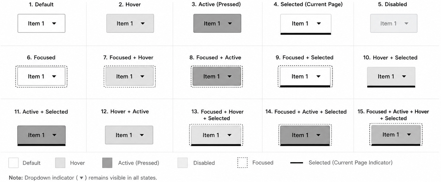
✔️ Requirements:
Combined states must preserve focus visibility.
Combined states must preserve the current page indicator.
Combined states must not imply that focus, current page, active, or selected are the same concept.
Combined states must not create a hybrid interaction model.
Combined states must not change whether an item behaves as a destination item or Menu item.
If the dropdown indicator is present for a Menu item, it should remain visible across applicable states.
The attached primary navigation item state guide should be treated as a visual reference for documenting state combinations. The language in this pattern should describe these as combinations, such as Focused + Hover or Focused + Active + Current Page, not as single blended states.
12. Accessibility Requirements
12.1 Semantic HTML first
Use semantic HTML before ARIA.
From the interaction design perspective, semantic HTML matters because it gives users expected behavior for free. Links behave like links. Buttons behave like buttons. Navigation landmarks behave like navigation landmarks.
✔️ Required:
Use
<nav>for the primary navigation landmark.Use
<a>for destination items.Use
<button type=”button”>for Menu items.Use
<ul>and<li>for item collections when appropriate.Use visible text labels wherever possible.
❌ Avoid:
Styling
<div>or<span>elements as links or buttons.Adding
role=”button”to non-button elements unless there is no native option.Adding redundant ARIA to native HTML elements.
Using ARIA as a substitute for correct HTML structure.
The interaction rule should come first:
If the item navigates, use a link.
If the item opens or closes something, use a button.
Menu items must be activated intentionally. Do not create custom hover-triggered disclosure behavior for this pattern.
12.2 ARIA use
ARIA should only be used when semantic HTML does not provide the required name, state, or relationship.
Use ARIA to communicate missing information, not to recreate native behavior that already exists.
ARIA must stay synchronized with the visual state.
For example:
If the menu is visually open, the Menu item should use
aria-expanded=”true”.If the menu is visually closed, the Menu item should use
aria-expanded=”false”.
Hover must not change ARIA state in this pattern. aria-expanded should change only when the menu is opened or closed through activation or defined dismissal behavior.
When a menu opens or closes, hidden, keyboard focusability, and aria-expanded should be updated together so users do not encounter hidden focusable content or visible content that is missing the correct expanded state.
12.3 Accessible names
Every interactive item must have an accessible name.
✔️ Preferred order:
Visible text label
Visible text referenced with
aria-labelledbyaria-labelonly when no visible label or referenceable text is available
Do not use aria-label as the default labeling method.
Visible labels are preferred because they create the same cue for sighted users and screen reader users. This keeps the interaction model consistent across users.
12.4 Menu roles
Do not use role=”menu” or role=”menuitem” for standard primary navigation unless the component intentionally follows application menu behavior.
Most primary navigation should use native links, buttons, lists, and disclosure behavior.
Use application menu roles only when the component behaves like an application menu and supports the expected keyboard model for that pattern.
For standard web application primary navigation, application menu roles usually add unnecessary complexity.
Menu roles must not be used to justify hover-triggered behavior. The interaction model must still support intentional activation, keyboard operation, clear focus behavior, and predictable dismissal.
12.5 Target size
Frontend implementation must provide cursor and tap targets that are large enough to activate accurately.
✔️ Requirements:
Interactive navigation targets should be at least 24 by 24 CSS pixels unless a valid exception applies. This is the minimum threshold, not the preferred size. Mobile menu controls, close controls, and accordion rows should be larger than the minimum whenever layout allows.
Adjacent interactive targets should include enough spacing to reduce accidental activation.
The whole disclosure row should usually be the target when a row expands or collapses a child section.
Dropdown indicators should communicate state, but they should not become the only small target users must hit.
Mobile menu controls, close controls, accordion rows, top-level links, and disclosure buttons must all be reviewed for target size.
12.6 Reduced motion
Navigation must remain understandable and usable when motion is reduced or removed.
✔️ Requirements:
Non-essential animation should respect prefers-reduced-motion.
Reduced motion should reduce or remove menu, panel, accordion, and indicator animations when appropriate.
State changes must still be clear without relying on animation.
Focus visibility must not be weakened by animation or by reduced-motion behavior.
Reduced-motion behavior must not change the underlying keyboard, cursor, or tap interaction model.
13. Responsive Behavior
13.1 Preserve interaction logic
Interaction logic should remain consistent across breakpoints.
The layout may change from a horizontal desktop navigation bar to a mobile menu, but the meaning of each item should not change.
Across desktop and mobile:
Destination items navigate directly.
Menu items open child menus.
Menu items include indicators.
Destination items do not include indicators.
Parent landing pages appear as overview child items.
Split-button behavior is avoided.
Menus and child sections open by activation only.
Hover does not open, close, reveal, or dismiss navigation content in this pattern.
A user should not need to relearn what an item does because the viewport changed.
13.2 Preserve navigation meaning
Responsive layouts must preserve:
Label clarity
Parent-child relationships
Destination availability
Current page indication
Keyboard access
Screen reader access
When primary navigation collapses into a mobile menu, users should still be able to understand:
Which section they are in
Which parent item contains the current page
Which items navigate directly
Which items expose child items
How to open and close child sections
Do not simplify the mobile version by removing important destinations unless there is a clear, user-centered reason.
13.3 Preserve current page indication
The current page indicator must work across breakpoints.
On desktop:
The current destination item should show the current page indicator.
If the current item is inside a dropdown or mega menu, the parent item may receive a parent-active treatment.
On mobile:
The current destination item should show the current page indicator when visible.
If the current item is inside a collapsed section, the parent row may receive a parent-active treatment.
Opening the parent section should reveal the child item with the current page indicator.
The user should be able to open primary navigation and understand where they are in the application.
Current page indication must be persistent. It must not depend on hover, focus, or whether the user has recently interacted with the menu.
13.4 Preserve dismissal behavior
Menu dismissal behavior should remain predictable across breakpoints.
Users should be able to dismiss open navigation UI by:
Activating the menu control again, when applicable
Activating a close control, when provided
Activating outside the navigation panel, when appropriate
Pressing the
EsckeyActivating a destination item
When dismissal occurs through the Esc key, focus should return to the item that opened the menu or panel.
Hover out must not dismiss open navigation UI on any breakpoint in this pattern.
14. Common Anti-Patterns
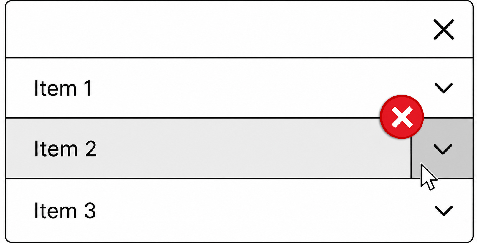
14.1 Hover-triggered dropdown menus
❌ Problem:
Do not design patterns where the menu opens, closes, reveals, or dismisses based on hover interactions.
Why this fails in this pattern:
The menu can open unintentionally.
The menu can close unintentionally.
Touch users cannot rely on hover.
Keyboard users may not receive equivalent access.
Users have less control over when the menu opens or closes.
Cursor movement becomes part of the interaction logic instead of simple visual feedback.
✔️ Correction:
Use activation-triggered disclosure behavior for this navigation pattern.
Keep hover as visual feedback only.
Do not use hover to change menu visibility in this pattern.
14.2 Icon-only mobile menu control
❌ Problem:
Do not design patterns where the primary navigation on mobile is hidden behind an unlabeled icon.
Why this fails in this pattern:
The icon may not be recognized by all users.
The control depends on recall or learned convention.
The interaction has weaker information scent.
The accessible name may not match the visible UI.
✔️ Correction:
Use a visible Menu label.
The icon may remain as a supporting visual cue.
14.3 Split-button navigation row
❌ Problem:
Do not design patterns where one row contains separate targets for navigation and submenu expansion.
Why this fails:
Users may not understand that the label and indicator perform different actions.
The row appears to have one function but actually has two.
The smaller target is easier to miss.
Behavior becomes less predictable on mobile.
The pattern makes users determine whether the text, icon, or surrounding row is the correct target.
✔️ Correction:
Use one interaction target per row.
If the parent category has a landing page, include it as an overview child item.
Activating the parent row should either navigate or disclose child items, not both.
The dropdown indicator should communicate disclosure state, not act as a separate control.
14.4 Vague item labels
❌ Problem:
Do not design patterns where the item label does not clearly communicate the destination, task, or category.
Why this fails:
Users have to interpret the label before activating it.
The item may appear to overlap with other items.
Users may open the item only to understand what it means.
The navigation becomes harder to scan.
✔️ Correction:
Use plain, descriptive, user-recognizable labels.
Use labels that describe what the user will find or do after activating the item.
Avoid labels that depend on internal terminology or feature team language.
14.5 Duplicated destinations
❌ Problem:
Do not design patterns where the same destination appears in multiple primary navigation areas.
Why this fails:
Users may wonder whether the items lead to the same place or different places.
The structure becomes harder to learn.
The navigation may appear larger and more complex than it is.
✔️ Correction:
Place each destination in the most user-expected location.
Duplicate destinations only when research shows users strongly expect the same destination in more than one category.
14.6 Deep nested navigation
❌ Problem:
Do not design patterns where users must move through multiple levels before reaching a destination.
Why this fails:
Each level adds interaction cost.
Each level requires users to interpret another abstraction.
The path becomes easier to abandon or misunderstand.
✔️ Correction:
Flatten the hierarchy where practical.
Expose terminal nodes more directly.
Use grouped mega menu layouts when many destinations need to be visible.
14.7 Non-semantic controls
❌ Problem:
Do not design patterns where non-interactive element is styled to behave like a link or button.
Why this fails:
Keyboard behavior may not work correctly.
Screen reader behavior may be incorrect or incomplete.
Focus behavior may be missing.
Users may receive false cues about what the item does.
✔️ Correction:
Use native
<a>elements for destination items.Use native
<button type=”button”>elements for Menu items.Use ARIA only when semantic HTML does not provide the required name, state, or relationship.
14.8 Missing expanded state
❌ Problem:
Do not design patterns where the menu opens visually but does not expose expanded or collapsed state.
Why this fails:
Screen reader users may not know whether the child menu is open.
The state of the item becomes unclear.
The visual UI and programmatic UI are out of sync.
✔️ Correction:
Use
aria-expandedon the Menu item.Keep
aria-expandedsynchronized with the visual state.Update expanded state only when the menu is opened or closed through intentional activation or dismissal.
14.9 Defaulting to ARIA instead of semantic HTML
❌ Problem:
Do not design patterns where ARIA is used to recreate behavior that native HTML already provides.
Why this fails:
The implementation becomes more fragile.
Native keyboard behavior may be lost.
Assistive technology behavior may become less predictable.
The team may accidentally create a custom component with incomplete interaction support.
✔️ Correction:
Use semantic HTML first.
Use ARIA only to communicate missing names, states, or relationships.
14.10 Misusing selected state
❌ Problem:
Do not design patterns where selected state is used to represent the current page in standard primary navigation.
Why this fails:
Selection and current location are different concepts.
aria-selectedcommunicates selection semantics, not current page location.Users of assistive technology may receive the wrong cue.
✔️ Correction:
Use current page state for the current route.
Use
aria-current=”page”on the current destination item.Reserve selected state and
aria-selectedfor components with true selection semantics.
14.11 Treating combined states as new interaction types
❌ Problem:
Do not design patterns where a combined visual state is documented as though it were a new standalone interaction type.
Why this fails:
It can blur the difference between focus, hover, active, current page, expanded, collapsed, selected, and disabled.
It can make implementation teams think the component needs additional semantic states.
It can make accessibility state management more complicated than it needs to be.
✔️ Correction:
Document combined states as combinations of existing states.
Preserve the semantic meaning of each state.
Use
aria-current=”page”for current page state.Use
aria-expandedfor disclosure state.Do not use
aria-selectedfor standard primary navigation links.Do not treat focus combinations as hybrid interaction patterns.
15. Validation Checklist
15.1 Information architecture
Parent-child relationships are clear.
Child items belong logically under their parent items.
Terminal nodes are easy to identify.
The hierarchy is as flat as practical.
Child items are grouped by user expectations.
Duplicate destinations are avoided.
Parent landing pages are represented as overview child items.
15.2 Desktop behavior
Menus open by activation only.
Hover does not open menus in this pattern.
Hover does not close menus in this pattern.
Hover does not reveal child items in this pattern.
Hover does not dismiss child items in this pattern.
Hover state is visual feedback only.
Menu items include dropdown indicators.
Destination items do not include dropdown indicators.
Menus can be dismissed by
Esc, activate outside, moving focus out of the open navigation region when defined, trigger toggle, or activating another item.Animations are brief and do not delay access to child items.
Non-essential animation respects reduced-motion preferences.
Escreturns focus to the item that opened the menu.
15.3 Mobile behavior
Mobile menu control has a visible Menu label.
Icon-only primary navigation controls are not used.
Mobile navigation opens by activation only.
Mobile navigation closes by activation or defined dismissal behavior.
Split-button behavior is not used.
Each row has one interaction target.
Parent landing pages are included as overview child items.
Accordion sections expand and collapse by activation only.
Accordion state is visually and programmatically exposed.
Current page indication is preserved in the mobile menu.
Menu and close controls meet target-size requirements and are larger than the minimum whenever layout allows.
Accordion rows provide a target area large enough for touch input and are larger than the minimum whenever layout allows.
Panel and accordion animation respects reduced-motion preferences.
If a mobile navigation panel blocks background interaction, it is treated as a modal-style experience with intentional focus management,
Escsupport, background-interaction prevention, and focus restoration.
15.4 Keyboard behavior
Tab order follows the visual and logical structure.
Every interactive item has a visible focused state.
Enter activates links and buttons.
Space activates buttons.
Escdismisses open menus.Focus returns to the triggering item after dismissal.
Focus is not trapped inside standard dropdown menus or mega menus.
Focused state alone does not open a menu.
15.5 Cursor behavior
Hover / over state is visual feedback only.
Cursor movement does not open menus.
Cursor movement does not close menus.
Cursor movement does not reveal child items.
Cursor movement does not dismiss child items.
Hover out removes only the hover state.
Activate outside dismisses open menus when appropriate.
Interactive targets are at least 24 by 24 CSS pixels unless a valid exception applies, with larger mobile targets used whenever layout allows. The 24 by 24 size is the minimum threshold, not the preferred target size.
Adjacent targets include enough spacing to reduce accidental activation.
15.6 Interaction states
Default state is defined as the base visual treatment for an available item.
Hover / over state is defined as visual feedback only.
Focused state is defined.
Active / pressed state is defined.
Current page state is defined.
Selected state is defined only where selection semantics apply.
Expanded state is defined.
Collapsed state is defined.
Disabled state is defined only where needed.
Common combined states are documented visually.
Combined states preserve focus visibility.
Combined states preserve the current page indicator.
Combined states do not create new semantic roles.
Combined states do not imply hybrid interaction behavior.
Current page state is visually distinct from hover, focused, selected, expanded, and active / pressed states.
The currently displayed page, section, or route has a visible current page indicator.
The current page indicator is persistent and does not depend on hover or focus.
Parent items may receive visual parent-active treatment when the current page belongs to their child menu.
Expanded and collapsed states change only through activation or defined dismissal behavior.
15.7 Accessibility
Primary navigation uses semantic HTML by default.
Destination items use native
<a>elements.Menu items use native
<button type=”button”>elements.Visible labels are used wherever possible.
aria-labelledbyis preferred when a visible or visually hidden label needs to be referenced.aria-labelis used only when no visible or referenceable text is available.aria-label=”Primary”is preferred overaria-label=”Primary navigation”when labeling the primary navigation landmark directly.Current page state uses
aria-current=”page”.Menu items use
aria-expanded.aria-controlsis optional and used only when an explicit control-to-menu relationship is needed.aria-expandedchanges only when the visual menu state changes.Hover does not change ARIA state in this pattern.
aria-selectedis not used for standard primary navigation links.ARIA does not replace semantic HTML.
Visual state and programmatic state stay synchronized.
When menus open or close, hidden, keyboard focusability, and
aria-expandedstay synchronized.Animated menu transitions do not leave focusable content hidden from sighted users or visible content hidden from assistive technologies.
Disabled links are not implemented with a native disabled attribute. Unavailable destinations are removed, explained, or intentionally implemented with clear disabled behavior.
Interactive navigation controls meet target-size requirements, with larger mobile controls used whenever layout allows.
Non-essential navigation animation respects reduced-motion preferences.
Navigation remains understandable when animation is reduced or removed.
16. Final Acceptance Criteria List
The primary navigation bar meets these specifications when:
Users can distinguish destination items from Menu items.
Dropdown menus and mega menus open only by intentional activation.
Hover does not open, close, reveal, or dismiss dropdown menus, mega menus, or child navigation items in this pattern.
Hover / over state is visual feedback only.
Menu items include dropdown indicators.
Destination items do not include dropdown indicators.
The dropdown indicator is not a separate interaction target.
Open menus can be dismissed through
Esc, activate outside, trigger toggle, moving focus out of the open navigation region when defined, or activating another item.Pressing
Esccloses the menu and returns focus to the item that opened it.The currently displayed page, section, or route has a persistent visible current page indicator.
The current page indicator is visually distinct from hover, focused, selected, expanded, and active / pressed states.
The current destination item uses
aria-current=”page”.Parent Menu items may receive visual parent-active treatment when the current page belongs to their child menu.
Parent Menu items do not use
aria-current=”page”unless the parent item itself is the current page.The mobile menu control includes a visible Menu label.
Mobile navigation opens by activation only.
Mobile navigation does not use split-button behavior.
If a mobile navigation panel blocks background interaction, it is treated as a modal-style experience with intentional focus management and focus restoration.
Parent landing pages are available as overview child items.
Accordion sections expand and collapse by activation only.
All interactive items are keyboard operable.
All interactive items have visible focused states.
All interactive navigation targets provide at least 24 by 24 CSS pixels of target area unless a valid exception applies, with larger mobile targets used whenever layout allows. The 24 by 24 size is treated as the minimum threshold, not the preferred target size.
Adjacent interactive targets include enough spacing to reduce accidental activation.
Focused state alone does not open a menu.
Disclosure state is exposed with
aria-expanded.aria-controlsis optional and used only when an explicit control-to-menu relationship is needed.aria-expandedstays synchronized with the visual open or closed state.When menus open or close, hidden, keyboard focusability, and
aria-expandedstay synchronized.Animated menu transitions do not leave focusable content hidden from sighted users or visible content hidden from assistive technologies.
Hover does not change
aria-expandedin this pattern.Item labels are clear, consistent, and user-recognizable.
The navigation hierarchy avoids unnecessary nesting.
Terminal nodes are clearly exposed within child menus.
Primary navigation uses semantic HTML by default.
aria-label is used only when no visible or referenceable label is available.
aria-label=”Primary”is preferred overaria-label=”Primary navigation”when directly labeling the primary navigation landmark.ARIA is only used to communicate missing names, states, or relationships that semantic HTML does not provide on its own.
Non-essential navigation animation respects prefers-reduced-motion.
Navigation state remains clear when animation is reduced or removed.
Selected state is not used as a substitute for current page state.
aria-selectedis not used for standard primary navigation links.Combined visual states are documented as combinations of existing states, not as new semantic states.
Focus combinations do not imply a hybrid interaction pattern.
Disabled navigation items are used sparingly and only when they help users understand status, permissions, or workflow constraints.
Disabled links are not implemented with a native disabled attribute. Unavailable destinations are removed, explained, or intentionally implemented with clear disabled behavior.